
Jan 6, 2025
Think of your website as the storefront of a bustling shop on a busy street. Just as a well-organized, attractive storefront draws in customers, a well-designed website invites visitors to explore further. If the storefront is cluttered, confusing, or outdated, potential customers are likely to walk right past without a second glance. Similarly, poor website design services can turn away visitors before they even have a chance to see what you offer.
Because your website is often the first impression you make on potential customers, it’s crucial to get it right. In this blog, we’ll explore some common website design mistakes and provide practical tips on how to avoid them, ensuring your online presence is as inviting and effective as possible.
Even the best websites can fall victim to common design pitfalls that hinder user experience and overall effectiveness. These mistakes can be subtle but have a significant impact on how visitors perceive and interact with your site. In this section, we’ll explore some of the most frequent errors in web design services and provide practical solutions to help you avoid or fix them, ensuring your website remains user-friendly and engaging.
The Mistake
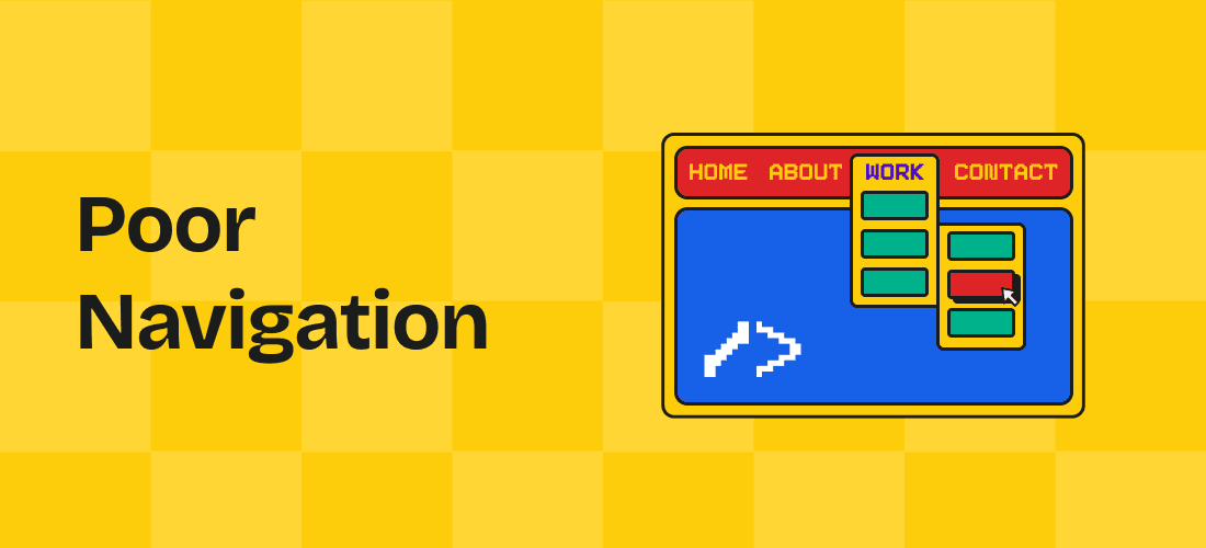
Poor navigation is one of the most common mistakes in website design services, and it can severely impact user experience. When users can’t easily find what they’re looking for, they’re likely to become frustrated and leave the site, leading to higher bounce rates and lower conversions. Confusing menus, overcrowded navigation bars, or hidden links can all contribute to poor navigation, making it difficult for users to explore your website.
The Fix
To avoid this mistake, ensure that your website’s navigation is intuitive and user-friendly. Use clear, descriptive labels for menu items, and keep the navigation bar simple with only the most important links. Implement a logical structure that guides users effortlessly through your site, and consider using tools like breadcrumbs or a search function to further assist users in finding the content they need.
The Mistake
Slow load times can severely impact user experience, causing frustration and leading visitors to abandon your site. Users expect websites to load almost instantly. If your site takes too long to load, it can result in higher bounce rates, lower search engine rankings, and, ultimately, lost revenue.
The Fix
Optimize your website by compressing images, minimizing code, and leveraging browser caching. Ensure that your hosting service is robust enough to handle traffic demands. Regularly monitor your website’s performance and make adjustments as necessary to maintain optimal load times.

The Mistake
A call-to-action (CTA) is a crucial element that guides users toward the next step; it’s where the sale happens, whether it’s making a purchase, signing up for a newsletter, or contacting your business. A lack of good CTAs or poorly designed ones can leave users confused about what to do next, resulting in missed opportunities and lower conversion rates. Without clear CTAs, even a well-designed website can fail to achieve its goals.
The Fix
To avoid this mistake, ensure that your CTAs are prominently placed, visually appealing, and clearly communicate the action you want users to take. Use simple and action-oriented language, such as “Get Started” or “Sign Up Now,” and make sure the buttons stand out against the background. Consistently review and test your CTAs to optimize their effectiveness.
Note: Choosing the best web design services for your website can be challenging; like how do you know whom to approach? Our advice, recognize agencies that can give you rounded services. From web design services to consent marketing and SEO optimization. Like Red Baton, a leading agency in UX UI design and marketing.
The Mistake
While popups can be effective for capturing leads or promoting offers, using too many can overwhelm and frustrate users. Excessive popups interrupt the browsing experience and form a negative perception of your website. When users are bombarded with popups, they’re more likely to leave the site rather than engage with the content.
The Fix
To avoid this, website design services should use popups sparingly, strategically, and only if necessary. Limit the number of popups to one or two per session and ensure they are relevant to the user’s journey. Timing is key—consider triggers like time on site or exit intent to display popups when they are most likely to be effective without disrupting the user experience.
The Mistake
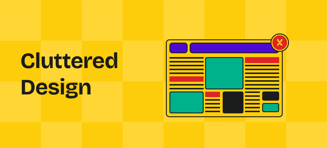
A cluttered design overwhelms visitors with too much information, images, and text, making it difficult for them to find what they’re looking for. This lack of visual hierarchy can lead to confusion and frustration, causing users to leave your site quickly. A cluttered design compensates the brand message for overused elements.
The Fix
Simplify your design by prioritizing content and creating a clear visual hierarchy. Use white space effectively to give elements room to breathe and guide users’ attention to key areas. Focus on the essentials and remove any unnecessary elements that don’t contribute to the user’s experience or your brand’s message. A clean, organized design makes your website more user-friendly and visually appealing.
Note: A major secret benefit of clean designs is affordable web design services. Cleaner designs with a minimal aesthetic are cheaper to build than their loud website counterparts.
The Mistake
Failing to implement adaptive design can severely impact the usability and accessibility of your website across different devices. Unlike responsive design, which adjusts fluidly, adaptive design creates specific layouts for various screen sizes. Without it, users on smaller devices may struggle with navigation.
The Fix
Website design services should implement adaptive layouts for different screen resolutions. Test your site on various devices to guarantee that content and features are accessible and user-friendly, no matter the screen size. Using adaptive design can significantly improve the user experience, making your website more engaging and effective across platforms.
Also Read – Web Design Trends to Innovate, Inspire, and Impress
The Mistake
Accessibility is often overlooked in website design, leading to sites that are difficult or impossible for users with disabilities to navigate. This can include issues like small text, poor color contrast, and the absence of alt text for images. The impact of these oversights is significant, as they can alienate a large portion of your audience.
The Fix
To ensure your website is accessible, follow the Web Content Accessibility Guidelines (WCAG). Use tools to test for accessibility issues, such as color contrast analyzers and screen reader simulators. Incorporate features like keyboard navigation, descriptive alt text for images, and clear, readable fonts.
The Mistake
Failing to prioritize security on your website can lead to severe consequences, including data breaches, loss of customer trust, and legal issues. Security vulnerabilities, such as outdated software and unsecured data transmission, leave your website and its users exposed to cyberattacks. A compromised site can damage your reputation.
The Fix
To avoid security issues, ensure that your website uses up-to-date software, implements SSL certificates, and follows best practices for data protection. Regularly update all plugins and platforms, and enable two-factor authentication if required.
Note: Ensure that the best web design services that you have chosen for your website are updated on how to effectively secure your site.
The Mistake
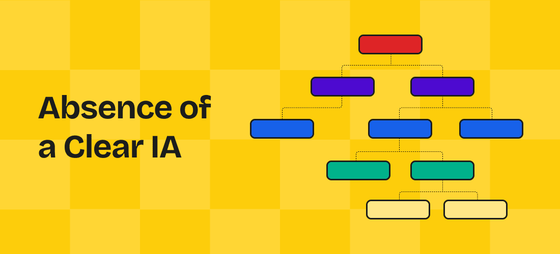
A clear Information Architecture (IA) is the backbone of a well-organized website. Without it, users struggle to find the content they need, leading to frustration and high bounce rates. Poor IA results in a disjointed user experience, where the site’s structure feels confusing and counterintuitive, making it difficult for users to navigate and understand the content hierarchy.
The Fix
To fix or avoid this mistake, website design services start by building the foundation of your site through a well-researched IA. Through user research, they understand how your audience seeks information and organizes content logically into categories and subcategories.
Note: Regularly test the IA with real users to ensure it meets their needs and supports an intuitive, seamless browsing experience.
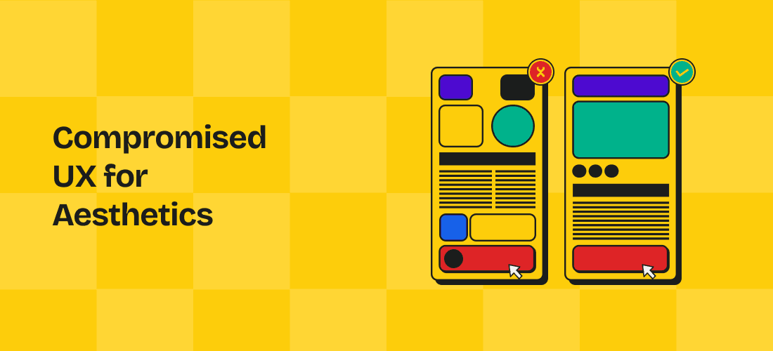
The Mistake
Prioritizing aesthetics over user experience (UX) can lead to a visually stunning website that’s difficult to navigate and frustrating to use. While an eye-catching design is important, if it complicates the user journey, visitors may quickly leave.
The Fix
Balance is key. Ensure that your website’s design enhances the user experience rather than hindering it. Prioritize intuitive navigation, fast loading times, and accessibility. Use visual elements to complement functionality, not overshadow it. Conduct usability testing to identify potential issues and make necessary adjustments to align aesthetics with a seamless UX.
Good website design services are built on a foundation of key principles that ensure a website is both functional and visually appealing. First, simplicity is essential—an uncluttered layout helps users find information quickly without feeling overwhelmed. Consistency across all pages enhances user experience, making navigation intuitive. Accessibility is another crucial principle, ensuring that all users, regardless of their abilities, can interact with the site. Visual hierarchy guides users’ attention to the most important elements, while mobile responsiveness ensures the site looks great on all devices. By adhering to these principles, designers can create websites that are user-friendly, effective, and engaging and provide affordable web design services. Because quality does not have to be expensive.