


Dec 5, 2025
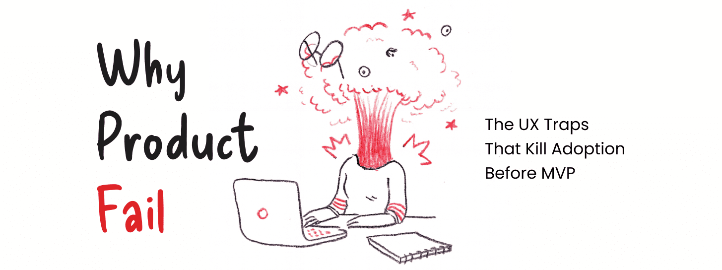
The phenomenon of the “leaky bucket” in early-stage product development represents one of the most significant financial risks for modern organizations. It is common for high-growth startups to observe a pattern where significant resources are directed toward user acquisition, resulting in healthy sign-up volumes, yet the retention curve remains distressingly steep. The product technically functions as intended, the marketing messaging aligns with the market need, and the value proposition is logically sound. However, the anticipated “aha moment”—the point where a user internalizes the product’s value—remains elusive for the vast majority of the cohort. This disconnect is rarely a failure of the core idea or the engineering feasibility; rather, it is a failure of the interaction layer to facilitate a path of least resistance to the product’s utility. When a user logs into a platform and fails to return within twenty-four hours, the failure is often rooted in the cognitive friction encountered during the initial five minutes of the experience.
The failure of a Minimum Viable Product (MVP) is frequently attributed to a lack of product-market fit, yet empirical observation of user behavior suggests that many products fail much earlier in the lifecycle, specifically at the interaction layer. If the path to value requires a user to navigate an unfamiliar architectural logic, the product will be abandoned long before its core value can even be evaluated.
In the context of early-stage SaaS, the “aha moment” is the specific instance where a user realizes the functional benefit of the software in relation to their personal or professional goals. When activation rates remain below the 20% threshold, it indicates that the onboarding process has failed to guide the user to this realization quickly enough. Many products technically fulfill the requirements defined in the initial product spec, but the interaction design introduces enough friction to prevent the user from reaching the value event. A delay in this experience is often fatal. If a B2B platform requires five configuration steps and three third-party integrations before a single data visualization is generated, the user often concludes that the tool is too complex for their current needs, regardless of the tool’s eventual power.
The activation rate is a primary indicator of whether the product’s design is facilitating or obstructing its mission. When teams focus purely on functional completeness, they often overlook the time-to-value (TTV) metric. TTV measures how long it takes a new or existing user to reach a defined value event, such as a first dashboard insight or a first automated workflow running. A shorter and more predictable TTV correlates strongly with higher activation and long-term retention. Conversely, when users sign up but never reach this moment, the product’s utility is effectively zero in their minds, leading to immediate churn.
There is a pervasive belief among product teams that adoption issues can be solved by adding missing features. In practice, the most common reason for failure is not what the product cannot do, but how it does what it already claims to do. A product that simplifies a workflow by removing two steps will consistently outperform a competitor that adds ten new features but maintains a high-friction interaction model. Founders often overvalue the validation of their core “idea” while undervaluing the interaction complexity required to execute that idea.
User interviews may validate that a problem exists, but they rarely reveal the cognitive friction that occurs when a real human attempts to navigate a complex interface in a high-stress work environment. The difference between an interviewed preference and a lived behavior is often the Interaction Layer. Research suggests that the interaction complexity—how many steps it takes to achieve a goal—is a greater predictor of abandonment than the actual feature set. Many products fail because the path to value requires too many cognitive decisions, causing users to abandon the platform long before they evaluate the core value proposition.
| Priority | Strategy | Outcome |
| Feature-First | Adding capabilities to meet every user request. | Increased complexity, higher cognitive load, slower navigation. |
| Workflow-First | Optimizing the sequence of tasks to reach value. | Faster activation, lower churn, improved perceived simplicity. |
The “ship fast and iterate” mantra has become a cornerstone of startup culture, yet it carries a significant risk if the foundational interaction model is flawed. Iteration is a tool for refinement, not for fixing a fundamentally broken user journey. If the core UX foundation is structurally unsound, rapid iteration only serves to build UX debt, which compounds over time and makes the product increasingly difficult to repair.
UX debt occurs when shortcuts are taken in the design phase—such as ignoring information architecture or bypassing usability testing—to meet engineering deadlines. While this may result in a faster launch, the cost of fixing these foundational flaws later is exponentially higher. When the core interaction model is incorrect, every subsequent iteration is built upon a flawed premise. This makes future features harder to integrate and more confusing for the user. Professional designers, such as those at Redbaton, often find that founders undervalue the “interaction design” early on, assuming it can be polished later. This mistake is costly because UX debt reduces engineering velocity as developers struggle to fit new features into a navigation system that was never designed to scale.
A significant portion of usability issues stems from interfaces built around backend system architecture rather than user mental models. When engineers lead the design of the interface, the result is often a UI that reflects the logical structure of the database or the API. While this is efficient for the system, it is often nonsensical to the end-user. The interface becomes a mirror of the system’s logic, requiring the user to learn how the computer thinks rather than the computer adapting to how the user works.
Redbaton has noted that system architecture often drives the interface instead of user tasks in engineering-led projects. For example, a user looking to “invite a team member” should not have to understand that team members are stored in a “Permissions Hierarchy” sub-menu under “Account Settings.” A task-led interface would place the invitation trigger where the user is currently working. This architectural misalignment is a silent killer of product adoption because it forces users to exert mental energy on navigation rather than on the task at hand.
The pressure to launch quickly often leads teams to ship incomplete products. While this is the essence of an MVP, the “minimum” should refer to the feature set, not the usability. Iteration works effectively only when the core interaction model—the primary way users navigate and interact with the system—is correct. If the foundation is broken, iterating on the UI is like painting a house with no foundation. The product may look better, but it will still fail under the weight of real-world use.
The “feature creep” trap is perhaps the most dangerous pitfall for product leaders. When engagement metrics stagnate, the instinctive reaction is to add more functionality in the hope that one specific feature will finally unlock retention. This strategy often has the opposite effect, increasing the complexity of the product and further burying the core value proposition under layers of UI clutter.
Teams often keep adding features hoping engagement improves, but this only masks the underlying UX problems. The added complexity increases the mental load required to use the product, which in turn decreases the likelihood of a user reaching the “aha moment.” Feature prioritization frameworks rarely consider cognitive load; instead, they focus on business value, engineering effort, and customer requests. Very few teams evaluate how each new feature increases user decision complexity.
Many MVP interfaces appear simple on the surface but hide complexity behind ambiguous navigation, unclear terminology, and poorly structured information. This “fake simplicity” is a major barrier to adoption. A clean aesthetic does not necessarily equal a usable product. If the user is unsure what an icon means or where a specific setting is hidden, the visual minimalism is a hindrance, not a help.
Real simplicity is achieved through like clarity and speed to value. Clarity refers to how quickly users understand what is happening and what to do next. Speed to value is the measure of how fast users reach a meaningful outcome. When these are sacrificed for a “minimalist” look, the product creates mental load, which kills adoption faster than visual clutter.
| Metric | Definition | High-Performance Signal |
| Clarity | Speed of understanding current state. | Users correctly predict the outcome of a click. |
| Effort | Mental and operational work required. | Minimal steps, no backtracking, low decision fatigue. |
| Confidence | User certainty in their actions. |
Low error rates and minimal “double-checking”. |
Cognitive load is the total amount of mental effort being used in the working memory. In product design, the goal is to minimize “extraneous” load—the effort required to figure out how the interface works—so the user can focus on the “intrinsic” load of the task itself.
Every time a user has to make a choice, they consume mental energy. If an onboarding flow presents ten different paths, the user faces decision fatigue before they ever experience the product’s core benefit. Reducing cognitive load involves minimizing the amount of information users need to process at once. Breaking down complex tasks into smaller, manageable steps is a core strategy for maintaining momentum.
In the context of [cognitive load in enterprise UX], this is particularly critical. Enterprise tools are inherently complex, but the interface should not add to that complexity. A well-designed system uses progressive disclosure—showing only the information necessary for the current task—to prevent overwhelming the user.
When an interface follows system logic, it often requires the user to translate their real-world goal into the system’s language. This translation layer is a major source of cognitive friction. For example, a salesperson wants to “close a deal,” but the system might require them to “Update Opportunity Stage to 100% and Trigger Invoice Workflow.” This creates a “mental gap” that slows down the user and increases the chance of error.
A task-first architecture maps the user’s “Jobs to be Done” (JTBD) directly to the interface. By framing the experience around the progress a user wants to make, the agency helps founders create products that feel intuitive from the first login.
Consistency in design is essential for reducing cognitive load. If the “Save” button is in a different place on every screen, the user has to “find” it every time. Established design guidelines ensure that once a user learns an interaction pattern, they can apply it throughout the app. This is why [design systems for scalable products] are not just a “nice to have” for MVPs; they are a functional necessity to prevent cognitive friction as the product grows.
The “Activation Gap” is the distance between a user signing up and that same user performing the key action that demonstrates the product’s value. Most startups focus heavily on top-of-funnel marketing but ignore the massive drop-off that occurs within the product itself.
It is a common frustration: marketing spend increases, traffic grows, but the activation rate remains stagnant. This is because marketing can only sell the promise of value; the product UX must deliver it. If there is a disconnect between the marketing message and the product experience, the user feels misled and abandons the trial.
For many organizations, the activation rate stays below 20%. The product technically works, but the onboarding does not guide users to value. Redbaton’s approach to [product UX strategy] focuses on defining the fastest path to the “aha moment” to bridge this gap.
Founders often believe they have “validated” their idea through interviews. However, user interviews validate problems, not interaction complexity. A user might agree that they need a better way to track expenses, but that doesn’t mean they will tolerate a high-friction interaction layer once the product is in their hands. Real users behave differently than research subjects because they are trying to get work done, not just give feedback. This is where [UX research for product teams] must shift from “Do you want this?” to “Can you do this?”.
Decision fatigue in onboarding is a silent killer of activation. When a product tries to explain everything at once, it forces the user to make too many decisions about what to learn first. A more effective strategy is to limit choices and guide the user through a single, high-value path. This builds the user’s confidence and increases the likelihood they will return to explore more advanced features later.
Product abandonment is rarely the result of a single bug; it is usually the result of “death by a thousand cuts”—a series of minor UX frictions that eventually exceed the user’s patience.
Many teams attempt to fix a confusing interface by adding a complex onboarding tour or a library of documentation. This is a “band-aid” approach. If the interface is intuitive, the onboarding should be minimal. High-performance onboarding doesn’t explain the buttons; it guides the user to a result. Redbaton’s philosophy is that a product that removes two steps from a workflow will always outperform one that adds ten new features and a tutorial.
Interfaces that present too many options simultaneously lead to decision paralysis. This is especially true in early-stage products where the user has not yet built a habit. By analyzing decision points and interaction redundancy, agencies can reduce the mental effort required to complete tasks, thereby increasing the retention rate.
Many products fail because the interaction layer introduces cognitive friction that early interviews did not reveal. For instance, a platform might require users to configure multiple integrations before seeing any data. This “empty state” problem is a major cause of abandonment. A better UX approach might be to introduce demo data or defer integrations until after the user has experienced the core value.
When an agency like Redbaton is engaged to solve an adoption problem, the process is systematic and focused on identifying the specific points of friction that kill momentum.
Instead of starting with screens, the agency maps out the user’s jobs to be done and the specific task sequences required to achieve them. This “task-first” product architecture ensures that the interface follows the user’s mental model, not the system’s logic.
The team defines the fastest path to the “aha moment.” Key questions include:
What must users experience within the first 5 minutes?
Which steps can be removed or automated?
How can we get the user to a “win” as quickly as possible?
The agency conducts an audit to analyze decision points, navigation complexity, and terminology clarity. The goal is to identify where the user has to “think” too hard to move forward. Reducing this mental effort is critical for increasing activation.
Workflows are translated into a clear information hierarchy and consistent interaction patterns. Only after this architectural foundation is set does the visual design begin. This ensures that the final product is not just “pretty,” but is functionally optimized for adoption.
Short, targeted usability sessions test task completion speed and onboarding clarity. Even testing with five participants can reveal 80% of the most critical friction points, allowing for rapid refinement before a single line of code is written.
A SaaS platform required users to configure multiple third-party integrations before they could see any dashboard data. Consequently, activation was below 25%. Without design intervention, the engineering team added more tutorials. Redbaton reframed the experience by deferring the integrations and introducing demo data. This allowed users to see the platform’s value immediately, resulting in a significant increase in activation.
A marketplace platform launched with strong buyer interest but suffered from zero seller engagement. The root cause was a listing workflow that required too many steps and had unclear manual formatting requirements. By streamlining the listing UX and reducing the steps to post a service, supply participation increased dramatically.
An AI analytics platform suffered from low engagement because the initial dashboard showed complex insights before users knew what to do. The UX fix involved reframing the experience into a “question-first” interface with guided analysis and progressive disclosure. This simplified the entry point and improved engagement dramatically.
Why do most MVPs fail to gain user adoption? Most MVPs fail because users cannot quickly experience the product’s core value. The path to value often involves too many steps, decisions, or configurations. Even if the product solves a real problem, poor UX prevents users from reaching the “aha moment”.
What is the biggest UX mistake startups make? The biggest mistake is designing interfaces around system architecture instead of user tasks. When the UI reflects how the product is built rather than how users think, workflows become confusing and adoption suffers.
Can poor UX kill a good product idea? Yes. Many strong product ideas fail because users abandon the product before understanding its benefits. UX determines whether users can quickly grasp and experience the value proposition.
How early should UX design happen in product development? UX should happen before engineering begins, not during or after development. Early UX design defines workflows, information architecture, and interaction models that guide the entire product build.
How can founders identify UX problems early? Early indicators include low activation rates, high onboarding drop-offs, repeated support questions, and users abandoning tasks midway. Usability testing with a small group of target users often reveals these problems quickly.


