


Feb 2, 2024

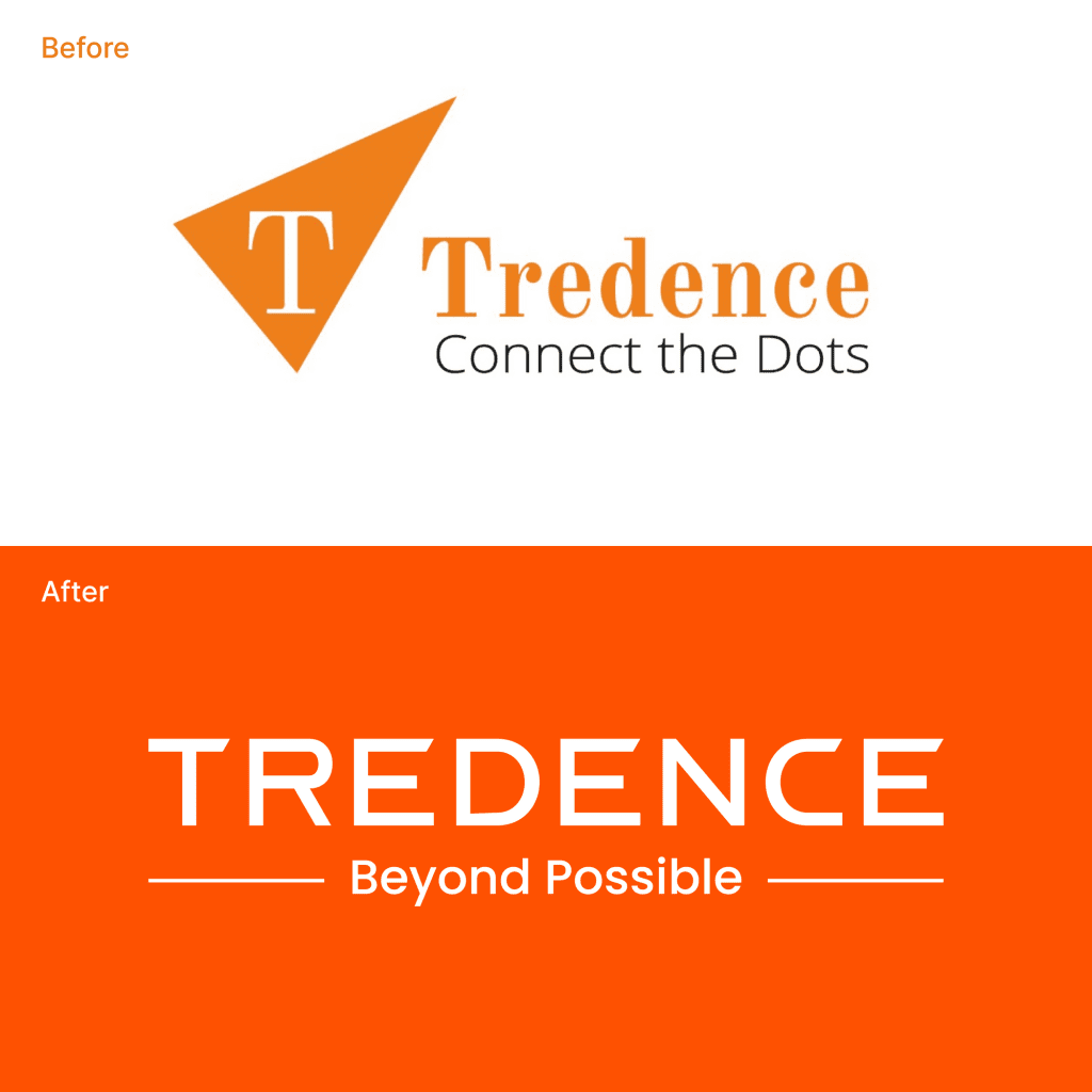
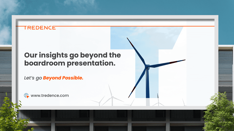
This blog highlights Tredence’s journey of rebranding from an insights-driven company to a leader in end-to-end data science solutions. Through interviews, client conversations, and workshops, a new identity was born, embodying strength, confidence, and a legacy. The revamped logo, dynamic “T”, and the tagline “Beyond Possible” reflect a commitment to innovation and client growth. This strategic rebranding underscores a unified vision for transcending traditional boundaries in data science.
With over 10+ years of service, Tredence is a global data science solutions provider and has nearly 2500+ data scientists creating, innovating, and leading the last mile in analytics every day.
The task was to evolve Tredence’s identity from an insight-driven brand to one recognized for providing end-to-end implementation and driving real value for businesses.
we developed an identity that provided a meaningful and cohesive brand experience for its clients, partners, and employees.
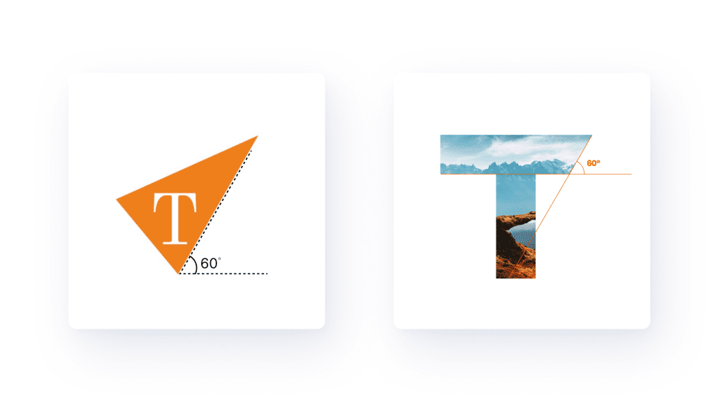
The superhero of the logo is the T. It’s designed to emote strength and confidence and has a 60-degree angled cut, not just as a design element; it’s to pay homage and carry forward the legacy of their old logo.
And here’s some more tea on the T; it stays dynamic, representing the dynamic nature of client issues that Tredence solves using data science.
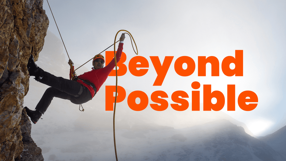
Embracing their core value of transcending ideas, possibilities, and expectations, we conceptualized the tagline – BEYOND POSSIBLE.
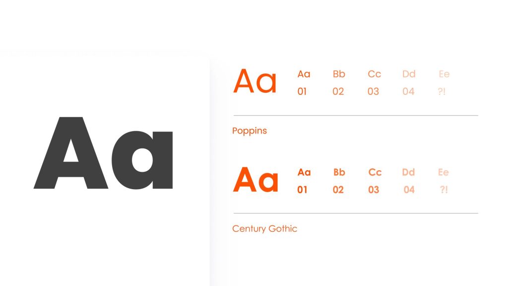
We’ve chosen Poppins as our primary font to communicate the brand’s strong identity, differentiating them from the crowd. The singular tone of voice is consistent and appeals to the audience to build long-term advocacy.
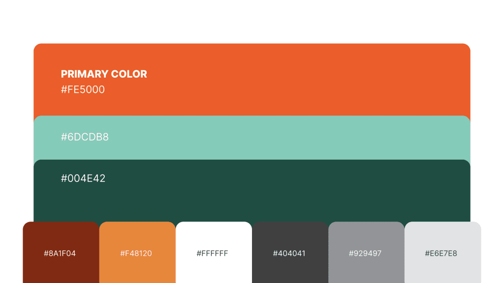
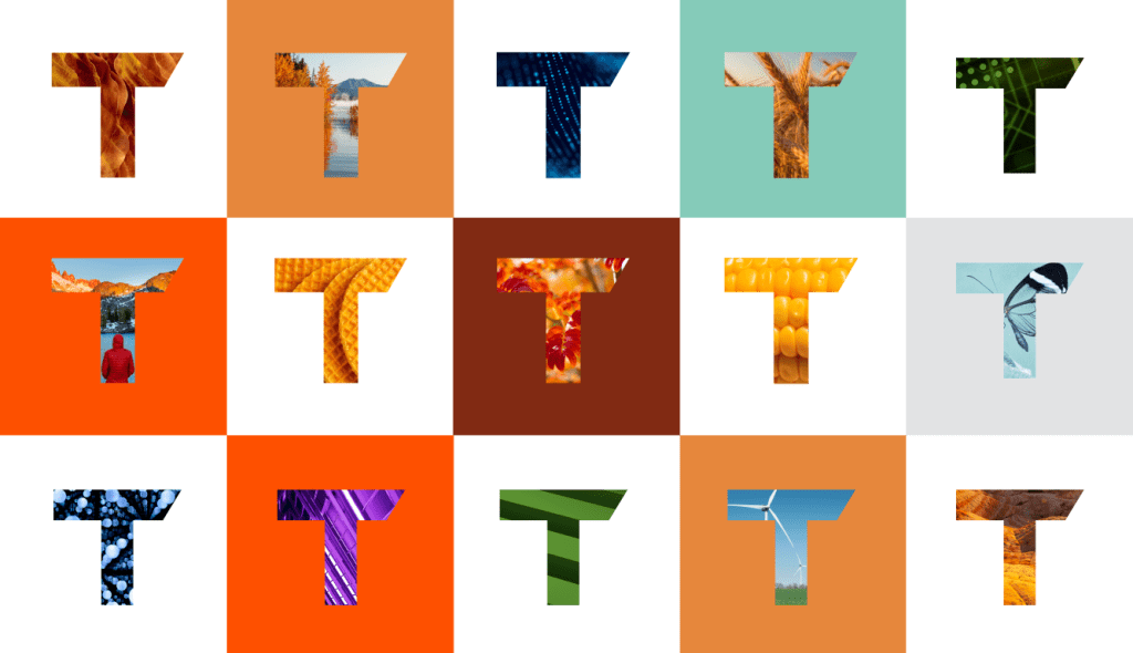
We also retained orange from the previous branding, complementing it with green and teal, signifying growth and an analytical mindset.
We used images that represent the adventurous attitude and friendly nature of Tredence to convey the brand essence of companionship, aspirations, and the thrill of exploration.
‘Beyond Possible’ perfectly encapsulates our aspirations, spirit, and current work, which extends beyond delivering just insights or making incremental adjustments.
We’re building a comprehensive identity together behind one vision and one strategy focused on growth for clients and ourselves, and Beyond Possible perfectly reflects this futuristic mindset.
Beyond possible is the right podium and the right platform for us to reflect our passion for helping our customers unleash the potential of data science in their respective industries.
This rebranding journey with Tredence was not just a project; it was a partnership in true transformation. Striving to craft a brand identity that resonates with their ethos, we aimed to reflect a modern yet familiar essence.


