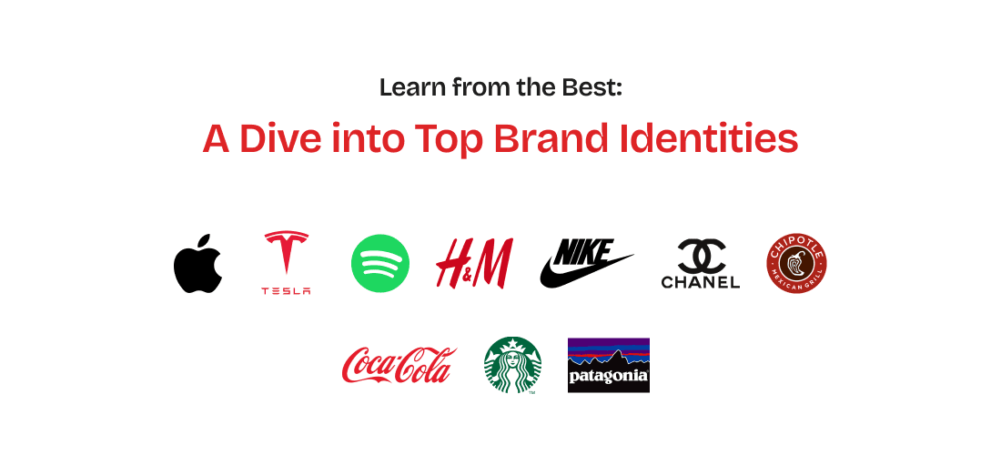
There are some brand identities that inspire you. With the way they are presented, how they are marketed, and how they reach a global audience. It’s brand identity design services done right. We have our list of awe-inspiring brand identities. Some iconic ones, like Coca-Cola or Apple, that have made their mark on a global scale, and crowd favorites like Nike that position themselves as the brand for athletic people.
Brand identity is like a chameleon changing colors. It’s the magic potion that transforms a business from a mere entity into a captivating personality. Just as a great novel needs a compelling protagonist, a successful brand requires a strong, distinctive identity.
This blog is an appreciation post for our favorite brands. See it as your backstage pass to the world of branding, where we’ll pull back the curtain on iconic brand identity design for global brands out there. From the tech titans to fashion’s finest, we’ll dissect their brand identities, uncovering the secret sauce that makes them so irresistible. So, grab your popcorn, and let’s embark on this visual feast of branding brilliance!
Understanding Brand Identity Design
Core Components of Brand Identity
Brand identity design services work their magic using a set of key components, each playing a crucial role in shaping how your brand is perceived by the public. These components include:
- Logo: The logo is the most recognizable element of your brand and is its visual symbolic representation. Your brand identity centres itself around the logo.
- Color Palette: A set of colors that convey the brand’s personality and evoke specific emotions. Colors play an important role in brand identity design. When we think of Starbucks, we think deep green and white!
- Typography: The style and arrangement of text, reflecting the brand’s character and tone. Close your eyes and think of the iconic Google logo – that’s the Product Sans font!
- Tone of Voice: The consistent way of speaking and writing that reflects the brand’s values and personality. Your brand needs to have a distinctive style with which it communicates.
Importance of Consistency
Why does consistency matter with brand identity? Because your brand should put up a united front across platforms and creatives. Maybe it is an outdoor billboard or a static on Instagram. All the elements of your brand from tone of style, design elements, and logo brand identity design should be presented in a professional and consistent manner.
What does consistency help with?
- Build Recognition: Repeated exposure to the same visual and verbal cues makes your brand more memorable.
- Establish Trust: Consistent branding signals reliability and professionalism, fostering trust among your audience.
- Reinforce Brand Values: A cohesive identity ensures that your brand’s core values are clearly communicated and understood.
- Enhance Marketing Efforts: Consistent branding creates a unified message across all marketing channels, increasing the effectiveness of your campaigns.
Technology and Innovation: Where Brains Meet Beauty

Let’s kick off the brand identity exploration with the tech world, with some examples of top global brands whose identities spark innovation and are aesthetically pleasing.
Apple
Apple’s brand identity is synonymous with innovation, simplicity, and elegance. Key elements of Apple’s brand identity include:
- Logo: The iconic apple with a bite taken out of it is instantly recognizable and symbolizes knowledge and innovation.
- Color Palette: Apple uses a minimalist color palette dominated by sleek, modern colors like silver, white, and black, reflecting its clean and high-tech aesthetic.
- Typography: Apple’s typography is sleek and modern. It uses the San Francisco typeface, which is designed for clarity and readability across its devices.
- Tone of Voice: Apple’s tone is confident, concise, and aspirational, emphasizing the high quality and innovation of its products.
The epitome of minimalist design, Apple has woven simplicity into its DNA. It’s a brand that whispers luxury while shouting functionality.
Tesla
The brand identity of Tesla is built around innovation, sustainability, and cutting-edge technology. Key elements of Tesla’s brand identity include:
- Logo: The sleek, stylized “T” logo represents a cross-section of an electric motor and reflects the brand’s focus on technology and innovation.
- Color Palette: Tesla uses a sophisticated color palette with dominant colors like red, black, and silver, symbolizing power, elegance, and modernity.
- Typography: Tesla’s typography is clean and modern, often using sans-serif fonts that align with its high-tech and futuristic image.
- Tone of Voice: Tesla’s tone is bold, visionary, and authoritative, emphasizing its leadership in electric vehicle technology and sustainability.
Breaking free from traditional automotive design, Tesla has carved a niche as a pioneer of sustainable, high-performance vehicles.
Spotify
Spotify’s brand identity design centers around music, creativity, and connectivity. Key elements of Spotify’s brand identity include:
- Logo: The simple, green circle with three curved lines represents sound waves, symbolizing music and audio streaming.
- Color Palette: Spotify uses a vibrant color palette with green as the primary color, conveying energy, creativity, and innovation.
- Typography: Spotify’s typography is modern and clean, often using the circular typeface which is designed for clarity and legibility across digital platforms.
- Tone of Voice: Spotify’s tone is friendly, engaging, and conversational, emphasizing its connection with music lovers and creators.
Music is an emotion, and Spotify’s brand captures that essence. Their focus on user experience has transformed music consumption, making Spotify a cultural touchstone.
Fashion and Luxury: Where Dreams are Made
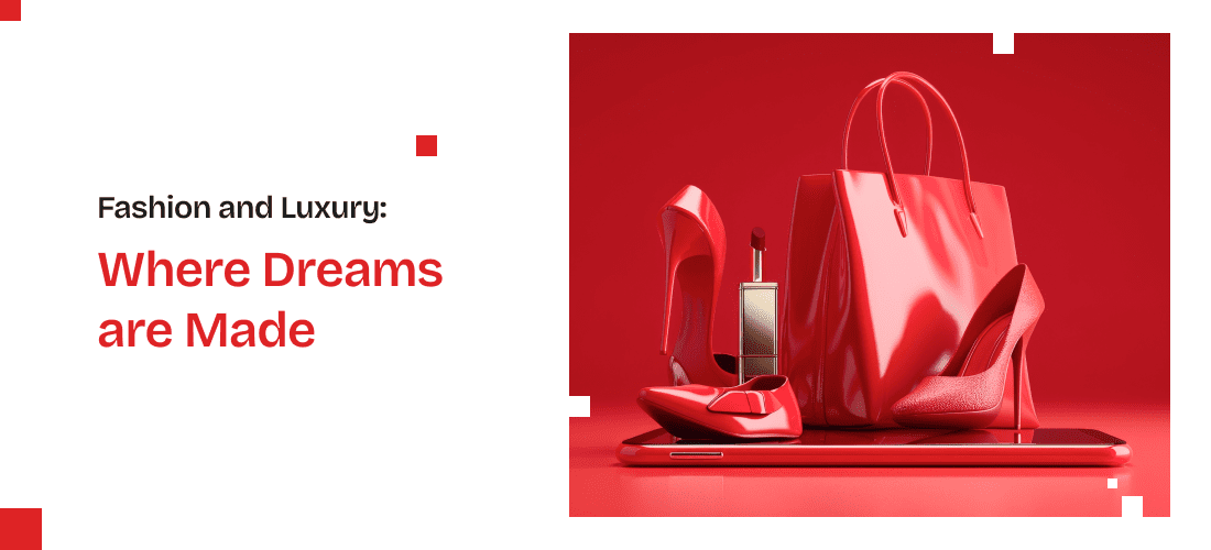
The fashion world is a playground for brand identity design services, where aesthetics reign supreme. Let’s explore a few brands that have mastered the art of luxury and desire. We’ve picked 3 examples of the fashion world from 3 different tiers – fast fashion, sportive, and luxury.
H&M
H&M’s brand identity is centered around fashion-forward, affordable clothing. Key elements of H&M’s brand identity include:
- Logo: The simple, bold “H&M” logo is clean and modern, reflecting the brand’s approach to accessible, stylish fashion.
- Color Palette: H&M uses a minimalist color palette, predominantly featuring red and white. The red signifies passion and energy, while white represents simplicity and clarity.
- Typography: H&M’s typography is straightforward and legible, often using sans-serif fonts that align with the brand’s modern and approachable image.
- Tone of Voice: H&M’s tone is inclusive, trendy, and young. Thus they target the newer generation.
In contrast to high-end luxury, H&M has built a brand around accessibility and trendiness. H&M’s brand identity is centered around affordability, inclusivity, and staying ahead of the fashion curve.
Nike
Nike’s brand identity is built on athletic performance, innovation, and inspiration. Key elements of Nike’s brand identity include:
- Logo: The iconic “Swoosh” logo brand identity design symbolizes movement and speed, reflecting Nike’s focus on athletic excellence.
- Color Palette: Nike’s color palette primarily includes bold colors like black, white, and vibrant accents, conveying strength, power, and energy.
- Typography: Nike’s typography is bold and impactful, often using strong, clean fonts that align with its powerful and dynamic image.
- Tone of Voice: Nike’s tone is motivational, empowering, and inspiring, encouraging athletes to push their limits and achieve greatness.
Beyond just athletic wear, Nike has cultivated a powerful identity centered around empowerment and achievement.
Chanel
Chanel’s identity is synonymous with timeless elegance, luxury, and sophistication. Key elements of Chanel’s brand identity design include:
- Logo: The interlocking “CC” logo is an enduring symbol of luxury and high fashion, representing the brand’s founder, Coco Chanel.
- Color Palette: Chanel’s color palette is classic and elegant, featuring black, white, and gold. These colors symbolize sophistication, luxury, and timeless style.
- Typography: Chanel’s typography is refined and elegant, often using serif fonts that reflect the brand’s timeless and luxurious image.
- Tone of Voice: Chanel’s tone is sophisticated, chic, and refined, emphasizing elegance and exclusivity.
Chanel epitomizes timeless luxury. Their minimalist aesthetic, combined with iconic elements like the quilted pattern and the little black dress, has solidified their status as a fashion powerhouse.
Food and Beverage: Savor the Brand
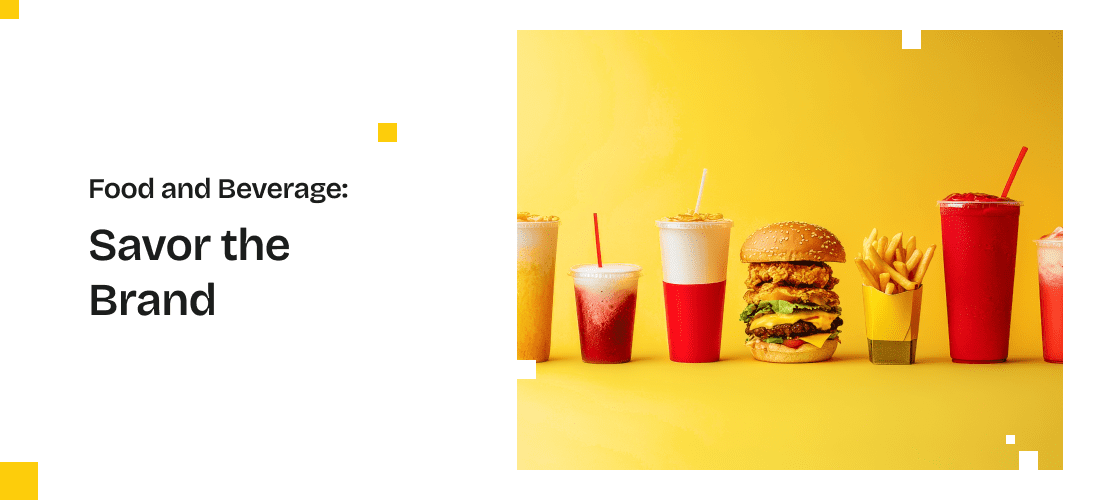
The food and beverage industry is a flavor-packed world where brands must tantalize the senses. Let’s explore some iconic examples of jaw-dropping brand identity design services.
Coca-Cola
Coca-Cola’s brand identity is one of the most iconic and enduring in the world. Key elements of Coca-Cola’s brand identity include:
- Logo: The timeless red and white script logo is instantly recognizable and evokes feelings of nostalgia and happiness.
- Color Palette: Coca-Cola’s color palette is dominated by red and white, symbolizing energy, excitement, and purity.
- Typography: The flowing, cursive typography of the Coca-Cola logo conveys a sense of tradition and friendliness.
- Tone of Voice: Coca-Cola’s tone is positive, uplifting, and inclusive, promoting messages of happiness, togetherness, and refreshment.
A global icon, Coca-Cola’s brand identity is synonymous with happiness and refreshment. Their classic look creates a sense of nostalgia and comfort for consumers of all generations.
Starbucks
Starbucks’ identity is centered around community, quality, and a premium coffee experience. Key elements of Starbucks’ brand identity include:
- Logo: The green siren logo is a symbol of the brand’s commitment to high-quality coffee and global presence.
- Color Palette: Starbucks uses a green and white color palette, reflecting its connection to nature and sustainability.
- Typography: Starbucks’ typography is clean and modern, using sans-serif fonts that convey a sense of approachability and sophistication.
- Tone of Voice: Starbucks’ tone is warm, inviting, and conversational, emphasizing the brand’s commitment to community and personalized customer experience.
Beyond coffee, Starbucks has cultivated a cozy, atmosphere. Their green color palette and comfortable store design evoke a sense of relaxation and belonging.
Chipotle
Chipotle’s brand identity is built around fresh ingredients, sustainability, and a commitment to real food. Key elements of Chipotle’s brand identity include:
- Logo: The simple, bold logo featuring a chili pepper symbolizes the brand’s focus on fresh, flavorful ingredients.
- Color Palette: Chipotle uses a warm color palette with shades of red, brown, and beige, reflecting its earthy, wholesome brand values.
- Typography: Chipotle’s typography is straightforward and modern, using clean sans-serif fonts that are easy to read and convey a sense of transparency.
- Tone of Voice: Chipotle’s tone is honest, down-to-earth, and engaging, emphasizing its commitment to sustainability and high-quality ingredients.
This fast-casual giant has built a brand around fresh, wholesome ingredients. Their focus on transparency and sustainability has resonated with health-conscious consumers.
Sustainability and Environment: A Greener Tomorrow

Sustainability is no longer a trend; it’s a necessity. Let’s explore brands that have made environmental responsibility a core part of their identity.
Patagonia
Patagonia’s identity is deeply rooted in its commitment to environmental sustainability, adventure, and ethical business practices.
- Logo: The distinctive mountain logo reflects Patagonia’s connection to the great outdoors and its commitment to protecting natural environments.
- Color Palette: Patagonia uses a natural color palette inspired by earth tones and vibrant outdoor landscapes, symbolizing its dedication to environmental conservation.
- Typography: Patagonia’s typography is clean and straightforward, using sans-serif fonts that convey a sense of simplicity and clarity.
- Tone of Voice: Patagonia’s tone is passionate, authentic, and socially responsible, emphasizing its commitment to environmental activism and ethical business practices.
Patagonia has built a brand around sustainability. Their focus on durability reflects their core values. They’ve successfully transformed a love for the outdoors into a powerful brand identity.
Key Takeaways: Lessons from Brand Identity Masters
From the tech world’s innovation to the fashion industry’s glamour, we’ve explored a diverse range of brand identities. So, what can we learn from these masters of their craft?
- Consistency reinforces brand recognition.
- Know your audience
- Storytelling matters
- Consumers crave genuine brands that align with their values.
- Strong visual elements leave a lasting impression.
- Evolution is inevitable. Adapt to changing times, but preserve your core identity.
In the business of brand identity design services, it is important to know what sells and what your target audience will want from the brand. These brands we have highlighted here follow these takeaways in order to strengthen their brand.
Conclusion
Now that you’ve had a taste of brand identity excellence, it’s time to turn inspiration into action. Remember, every successful brand started with a single spark of an idea.
Keep evolving. Brands are living entities. As your business grows and changes, so too should your brand identity. Stay open to adapting and evolving while maintaining your core values. Choose brand identity design services that can give your brand new life.
Remember, your brand identity is a powerful tool for building customer loyalty and driving business growth. By drawing inspiration from the examples we’ve explored, you can create a brand that leaves a lasting impression!