


Dec 5, 2025
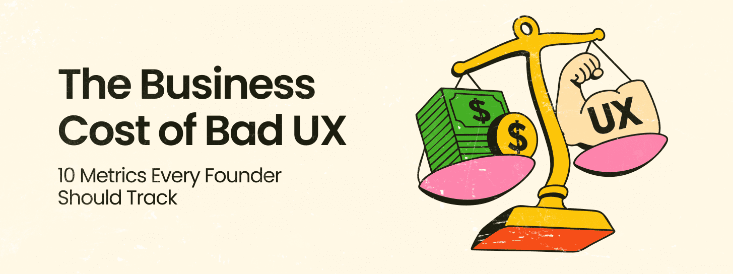
The contemporary economic landscape for digital products has transitioned from a phase of rapid feature expansion to one of rigorous efficiency and strategic differentiation. For founders, product leaders, and executive decision-makers, the digital interface is no longer a mere layer of aesthetic preference but a fundamental driver of business value, customer retention, and operational scalability. The financial data surrounding user experience (UX) and brand design in 2025 suggests that the integration of design into the core business strategy is the most significant lever for achieving a sustainable competitive advantage.
The quantitative justification for investing in high-fidelity user experience design is rooted in a compelling return on investment (ROI) profile. Historical and current market data indicates that every $1 invested in user experience design yields a return of approximately $100, which translates to a 9,900% ROI. This multiplier effect is not a result of superficial improvements but is driven by the systematic reduction of friction in the user journey and the alignment of product functionality with latent user needs.
The cost of design negligence is equally quantifiable. Approximately 88% of internet users report they are significantly less likely to return to a platform or website after encountering a poor user experience. In the highly competitive digital ecosystem of 2025, where switching costs are often low and alternative options are abundant, one negative interaction can shatter customer loyalty. Research suggests that 32% of customers will walk away from a brand they previously loved after just one bad experience.
For product leaders, these statistics are not just user metrics; they are leading indicators of churn and revenue loss. The impact of optimized UX on conversion rates is profound, with studies showing that improving the usability of a platform can boost conversion rates by up to 200%, while a fully optimized UX design can drive improvements of up to 400%.
The relationship between visual design and business credibility is immediate and visceral. First impressions are powerful, and in the digital realm, they are shaped within moments of the initial encounter. Data suggests that 94% of these first impressions are design-related, and 75% of users admit to making judgments about a company’s credibility based solely on the quality of its website design. This suggests that a lack of a well-designed online presence is a direct detriment to growth in customers and revenue.
| Metric Category | Business Impact Value | Strategic Implication |
| UX Investment ROI | 9,900% ($1 to $100) |
Design is a high-yield capital allocation |
| Conversion Rate (Optimized UX) | Up to 400% increase |
Direct impact on top-line revenue |
| Conversion Rate (Usability) | Up to 200% increase |
Usability is a baseline requirement for growth |
| Customer Retention | 42% improvement |
UX research reduces long-term churn |
| First Impression Weight | 94% design-based |
Visual identity is the primary trust builder |
| Brand Abandonment Rate | 32% after one bad experience |
Consistency is critical for brand equity |
The mathematical reality of design-driven growth can be represented by the relationship between investment in research ($I_r$) and the resulting increase in conversion ($C_i$) and retention ($R_i$). For an enterprise, the total value derived ($V_d$) from a strategic design intervention can be modeled as:
This formula underscores that the value of design is cumulative over the product lifecycle, influencing both the acquisition and the lifetime value (CLTV) of the customer.
Founded in 2015, Redbaton is a design and human experience agency that operates with the core objective of simplifying the complexity of life through design. Headquartered in India with a global presence, including locations in Sunnyvale, California, the agency has established itself as a turnkey consultant for brands seeking new-age innovation. The agency’s approach is guided by research and led by business strategy to create solutions rooted in a synthesis of science, design, and emotions.
The methodology employed by the agency emphasizes the immersion of its team into the uniqueness of individual projects. By combining scientific data analysis with artistic design qualities, the goal is to make life easier for individual users while helping companies retain and expand their customer base. This dual focus on the user and the business ensures that design interventions are not just aesthetic but are strategically aligned with market positioning and value propositions.
The agency positions its work as being “designed with purpose,” where brand experience design is deeply intentional. This involves a “Data-Driven Creativity” model that blends artistic vision with analytical insights to tailor experiences that captivate and convert. The foundational step in this process is “Discovery and Research,” which ensures that all strategies are rooted in a deep understanding of the brand’s current positioning, the target audience, and the competitive environment.
This methodical and structured workflow has been noted by clients for its ability to cut down on back-and-forth between teams. By asking critical questions and understanding every detail of a problem before starting the design phase, the agency identifies potential friction points early in the process.
| Agency Core Pillar | Strategic Function | Business Outcome |
| Strategy & Positioning | Defining unique value propositions |
Impactful market presence |
| Brand Identity | Logo, color, and typography design |
Recognition across touchpoints |
| Brand Governance | Maintaining consistency at scale |
Long-term brand trust |
| Discovery & Research | Deep dives into market realities |
Tailored experience design |
| Visual Communication | Marketing and corporate materials |
Directly engages target audience |
For founders and decision-makers, a brand is more than a visual mark; it is a strategic asset that defines how the market perceives the company’s value. Comprehensive brand strategies must define the target audience and market positioning to ensure a consistent presence. This involves crafting a cohesive brand identity that encompasses creative logo design, color palettes, and typography.
The relationship between branding and consumer trust is a primary driver of conversion. Professional brand experience design is intentional, aiming for strong resonance with the audience. This is particularly important for startups where “Rebranding Without Losing Identity” is a critical challenge as they scale. Color psychology and typography are not just artistic choices; they are tools used to build trust and ensure readability, which are essential for conversion. For example, big brands often invest in custom fonts specifically to improve typography and readability, recognizing that these elements impact how a brand is perceived in terms of professionalism and reliability.
As companies grow, maintaining a consistent brand voice across multiple markets and distributed teams becomes increasingly difficult. The agency provides services in “Brand Governance” to ensure that the brand identity remains recognizable across all touchpoints. This includes building scalable brand asset libraries that allow distributed teams to access the correct resources, ensuring that the brand identity does not become diluted as the organization expands.
User interface (UI) design is a critical component of the product development lifecycle. It is about crafting intuitive, user-friendly interfaces that guide users through their digital journey. A well-executed UI design can simplify complex processes and enhance overall usability, creating a lasting impression on the user.
Professional UI design services bring a wealth of expertise in several specialized areas:
Visual Design: Crafting layouts, color schemes, and imagery to create an appealing and consistent look.
Interaction Design: Designing elements like buttons, sliders, and forms to facilitate smooth interactions.
Prototyping: Developing interactive models that allow stakeholders to experience the design and provide feedback before full-scale development.
Usability Testing: Conducting tests with real users to identify and resolve potential issues in the design.
Responsive Design: Ensuring the interface functions well across all devices and screen sizes, which is crucial for both user experience and SEO.
Choosing the right UI design service matters because professional designers prioritize user experience, ensuring the interface is intuitive and optimized for engagement. This focus on usability and accessibility drives better outcomes for the business by enhancing user satisfaction.
The agency utilizes a methodical approach characterized by clear points of contact and weekly sprints. This workflow ensures that projects are delivered on time and within budget, which is a significant factor for stakeholders. For example, in a project for an airline company, the agency revamped the user flow from sign-up to payment, working in one-week sprints. The result was positive feedback and a fourfold increase in social media engagement.
Another case study involving the redesign of nine WordPress and PHP websites for a business management company showed a 30% improvement in on-page time and an overall improvement in performance. This demonstrates that the initial phase of asking questions and conducting discovery meetings is essential for cutting down on later revisions and ensuring high-quality deliverables.
In 2025, the role of UX research has shifted from being a periodic check-in to being the fuel for business growth. Organizations that integrate research deeply into their decision-making processes see significantly better results, including 3.6 times more active users and 3.2 times better product-market fit.
Leading product teams are moving away from large, quarterly studies in favor of “Continuous Discovery”. This involves:
Lightweight tests performed weekly or bi-weekly.
Always-on user listening channels to capture real-time feedback.
Democratized access to research so that all team members can make informed decisions.
This shift emphasizes “Time to Right” over “Time to Market”. While speed remains important, accuracy has become the ultimate competitive advantage. Fixing a poorly designed product after launch is significantly more expensive than validating it through early research.
To capture a complete picture of user needs, 2025 research strategies rely on a blend of quantitative and qualitative methods. This “Mixed Methods” approach helps teams understand not just what is happening with their users, but why.
| Research Method | Usage Rate (2025) | Primary Strategic Goal |
| User Interviews | 86% |
Understanding underlying motivations and “Why” |
| Usability Testing | 84% |
Identifying friction points and interface clarity |
| Surveys | 77% |
Capturing broad sentiment and quantitative data |
| Diary Studies | Emerging |
Capturing longitudinal user behavior over time |
UX researchers are increasingly spending less time running every individual project and more time enabling others within the organization to conduct basic research. This includes driving a customer-centric culture, leading research strategy, and training non-researchers. This “Enablement” model is critical for digital-first organizations that need to scale their design and product teams efficiently.
Artificial intelligence has become a central component of the UX design and research workflow. By 2025, 58% of research teams are using AI tools, a significant increase from previous years. AI is primarily used to speed up repetitive tasks like transcription, coding, and data analysis, allowing researchers to focus on high-level interpretation and strategy.
Product teams are implementing AI-driven research in several high-impact ways:
Predictive Usability Testing: Identifying potential friction points before they impact key performance indicators (KPIs).
Automated Behavior Analysis: Surfacing patterns in user data that might be missed during manual reviews.
Feedback Synthesis: Turning thousands of user comments into actionable insights at the speed modern development cycles require.
According to McKinsey, AI-powered analytics can reduce the time spent on data analysis by up to 70%, boosting overall team efficiency.
The integration of AI into products introduces new design challenges. Founders and product leaders must address “AI Explainability”—designing systems that are transparent about how they make decisions. This is crucial for building trust in enterprise settings where AI behavior must align with brand personality.
Furthermore, as AI assistants become more prevalent, designers must focus on the “UX Foundations for Agentic Systems”. This involves creating interfaces that can handle predictive and generative interactions while maintaining user control. The “Personalization Paradox” is also a key consideration: users want relevant experiences but are concerned about invasive data collection. Designers must balance personalization with privacy by using transparent data usage practices and contextual personalization.

The effectiveness of a design strategy is heavily dependent on the tools and infrastructure used to execute it. The 2025 landscape is dominated by a stack that emphasizes collaboration, performance, and scalability.
| Tool Name | Strategic Benefit | Key Features for Leaders |
| Figma | Collaborative design and prototyping |
Real-time feedback, design systems, iterative testing |
| GitHub | Version control and workflow automation |
CI/CD pipelines, code quality reviews via pull requests |
| Webflow | Visual development and CMS |
Fast deployment, clean code, easy maintenance |
| Bootstrap | Responsive design efficiency |
Pre-built components, flexible grid systems |
| Tailwind CSS | Scalable styling architecture |
Utility-first CSS for rapid, consistent UI building |
| Lighthouse | Performance and SEO auditing |
Metrics for speed, accessibility, and mobile-friendliness |
Web design trends for 2025 emphasize that aesthetics must be balanced with functionality. A minimalist approach remains popular, but designers are adding bold twists to this style while ensuring that sites remain clean and functional. Mobile optimization is no longer optional; it is a necessity for SEO and user retention. Google favors mobile-friendly sites, and a slow-loading mobile page—taking more than three seconds—can result in 53% of users leaving.
Additionally, sustainability in design is an emerging trend. This includes optimizing websites to reduce their digital carbon footprint and using sustainable hosting solutions. Accessibility remains at the forefront, shaping how websites are built to be inclusive of all users.
The agency’s portfolio provides clear evidence of its ability to handle complex requirements across diverse industries, from e-commerce to highly regulated enterprise software.
The agency worked closely with Unilever’s tech team to deliver UX for Shikhar, an online ordering platform designed exclusively for over a million small shop owners and Unilever retailers in India. This project required a deep understanding of the unique requirements of retail users, translating complex logistics and ordering into a simplified, usable interface. Additionally, they supported Unilever’s Automation Factory, which delivers intelligent automation at scale with a focus on agility and cost.
The agency reimagined Deloitte’s transfer pricing software to enable collaboration across more than 18 countries. This involved taking an extremely complex financial and legal process and streamlining the user experience to facilitate better evaluation and global teamwork.
For Swiggy, the agency leveraged data-driven insights and AI technologies to craft engaging performance marketing visuals. The goal was to revolutionize ads tailored for Swiggy’s dynamic platform, driving conversions and enhancing brand visibility through visuals that resonate with their specific audience.
In the maritime sector, the agency developed Geoperform ETS for Geoserve, a SaaS solution designed to streamline emissions calculation and tax management—a highly complex and regulated task. In the field of AI, they worked with Entropik Tech, a leading Emotion AI company, helping them redefine experiences through interfaces that can read human emotions.
The agency’s work also extends to social and community-focused platforms. Grit is a platform enabling daily wage workers with immediate access to earned pay, providing essential financial services. For Yulu, India’s leading provider of shared micro-mobility solutions, the agency’s design services have won more than seven international awards, demonstrating the link between high-quality design and project success.
| Client Project | Domain | Key Strategic Intervention |
| Unilever Shikhar | Retail / E-commerce |
UX for 1 million+ retail shop owners |
| Deloitte Transfer Pricing | FinTech / Enterprise |
Reimagined collaboration across 18+ countries |
| Geoserve Geoperform ETS | Maritime SaaS |
Streamlined emissions and tax management |
| Swiggy | Performance Marketing |
AI-driven engaging visuals for conversion |
| Tally | Business Software |
Improved readability for tier-2 and tier-3 cities |
| Entropik Tech | Emotion AI |
Redefining experiences through Emotion AI |
| Yulu | Micro-mobility |
7+ awards for design in green transport |
| Dhruv TS | IT / Innovation |
Turnkey business transformation solutions |
The data from the 2025 landscape suggests that founders and product leaders must move beyond viewing design as a support function and instead integrate it as a core driver of the product strategy.
Product leaders should empower their teams by adopting a “Research Enablement” model. This involves investing in tools and training that allow non-researchers to run basic usability tests, freeing up specialized UX researchers to focus on long-term strategy and high-impact decisions. This approach scales user empathy across the entire organization.
In a market where 32% of users will leave after one bad experience, being “right to market” is more important than being first to market. Leaders should embed research into every sprint, not just major releases, to validate feature concepts before they reach the development phase. This reduces development rework and ensures that engineering resources are spent on features that provide real value.
Successfully showcasing the ROI of design requires storytelling that uses metrics that resonate with senior leadership. UX metrics like Task Success Rate, Time on Task, and User Retention should be directly tied to business outcomes like reduced support costs, higher conversion rates, and increased Customer Lifetime Value (CLTV). When UX metrics become business KPIs, it becomes easier to justify research investment and prioritize the user experience in the product roadmap.
As digital interactions become more transactional, organizations that focus on building relationships with their users will have a significant advantage. Engaging your most active users in the research process and using their testimonials is far more impactful than relying solely on third-party samples. This direct access to rich insights from verified users removes the need for lengthy research processes and creates more effective product outcomes.
While emerging trends like AI personalization, 3D elements, and motion design can enhance the user experience, overusing them can lead to cluttered and overwhelming interfaces. Designers and product leaders must strike a balance between innovation and simplicity, focusing on trends that align with the brand and the specific needs of the user. The ultimate goal of design is to simplify life’s complexities, not to add to them.


