


Dec 29, 2025
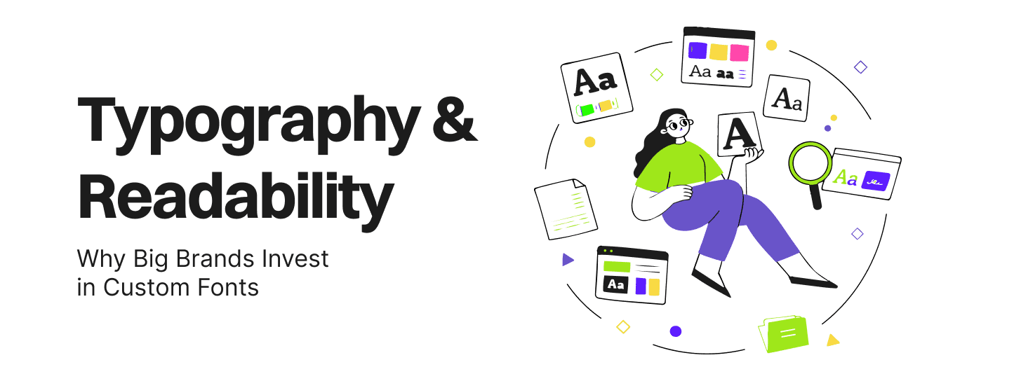
Typography shapes how audiences perceive a brand before a single word is read. For UX/UI leads and brand managers at scaling companies, brand typography represents a strategic lever that influences trust, usability, and differentiation far beyond aesthetic choices. Big brands like Airbnb and Google invest heavily in custom fonts not for vanity, but to own their visual identity across every touchpoint, ensuring font readability and consistent impact in a crowded digital landscape.
Brand typography encompasses the strategic selection, customization, and application of typefaces to create a cohesive visual language. It includes core components such as typeface selection (serif vs sans-serif), typographic hierarchy (headings, body text, captions), spacing (kerning, leading, tracking), and consistency guidelines enforced across platforms.
Unlike generic fonts like Arial or Helvetica—widely available but visually indistinguishable—brand typography systems are tailored to align with a company’s personality and performance needs. A complete system might feature multiple weights (light to black), optical sizes for different scales, and custom ligatures that enhance readability while reinforcing uniqueness. This approach transforms typography from a utility into a proprietary asset, much like a logo or color palette.
Font choices trigger subconscious responses that affect comprehension and emotional connection. Studies from the Software Usability Research Laboratory show that sans-serif fonts like those in brand typography often convey modernity and trustworthiness, while serif faces suggest tradition and authority. Readability plays a pivotal role: optimal font readability reduces cognitive load, allowing users to process information 20-30% faster according to Nielsen Norman Group research.
Emotional impact varies by context—bold, condensed fonts energize calls-to-action, while open, high-contrast body text builds comfort during long reads. Across devices, poor font readability leads to higher bounce rates; mobile screens demand larger x-heights and generous line heights to maintain legibility. Accessibility standards like WCAG emphasize sufficient contrast (at least 4.5:1) and scalable text, making typography a non-negotiable for inclusive design. Brands ignoring these principles risk alienating users and damaging perception.
Custom fonts offer unmatched differentiation in a world of commoditized design tools. While off-the-shelf options suffice for startups, enterprises scale across websites, apps, emails, print, and even product packaging—demanding flawless consistency that generic fonts can’t guarantee due to rendering variations across browsers and operating systems.
Key drivers include:
Long-term, custom font branding benefits outweigh upfront costs by embedding typography as intellectual property, deterring copycats and enhancing legal protections.
Investing in custom fonts yields tangible returns in recall and engagement. Brands with proprietary typefaces see 15-25% higher recognition rates, per branding agency data, as unique letterforms become synonymous with the identity—like Coca-Cola’s iconic script.
Improved UX stems from font readability tailored to the brand’s content. For instance, a fintech might design wider apertures for numerical clarity, boosting comprehension in dashboards. This control extends to expressive nuances: subtle weight shifts convey hierarchy without color reliance, ideal for dark modes or low-contrast themes.
High-level examples illustrate the shift:
These custom font branding benefits compound, turning typography into a competitive moat.
In digital products, typography drives conversion and retention. Optimal line height (1.5-1.8x font size), sizes (16px minimum for body text), and contrast ensure scannability—critical when users skim 20% of content, per Jakob Nielsen.
Hierarchy guides the eye: H1s at 2-3rem draw attention, subheads at 1.25rem segment ideas, body at 1rem maintains flow. Common pitfalls include:
Brands fixing these see uplift: refined font readability on checkout flows can lift completions by 10-15%. Tools like FontDebug or browser dev tools help audit, but custom fonts preempt issues by baking in digital-first metrics from inception.
Custom fonts suit brands at maturity inflection points: annual revenue exceeding $50M, multi-channel presence (web, app, print), or frequent rebrands demanding fresh identity. Early signals include generic fonts feeling “off-brand” or rendering complaints from global teams.
UX and brand leads should ask:
If yes to three or more, ROI models favor investment. Collaborate with foundries like Fontself or Collab for phased development: start with a core family, iterate based on A/B tests.
Typography anchors design systems as the foundational token set. Variables like –font-primary-bold cascade through components, ensuring buttons, cards, and modals inherit consistent weights and scales.
Alignment with UI kits means:
This modularity accelerates handoff—developers pull from Figma tokens without custom CSS. Brands like IBM’s Plex demonstrate how custom typography evolves with systems, supporting Plex Mono for code alongside display variants.
Brand typography transcends decoration, serving as a strategic pillar for perception, usability, and differentiation. Big brands invest in custom fonts to secure font readability, consistency, and custom font branding benefits that generic alternatives can’t match—delivering measurable gains in engagement and efficiency.
For mid-to-large teams, treat typography as a long-term asset: audit your stack, weigh maturity signals, and prioritize systems integration. The result? A visual language that scales, converts, and endures.


