


Dec 30, 2025
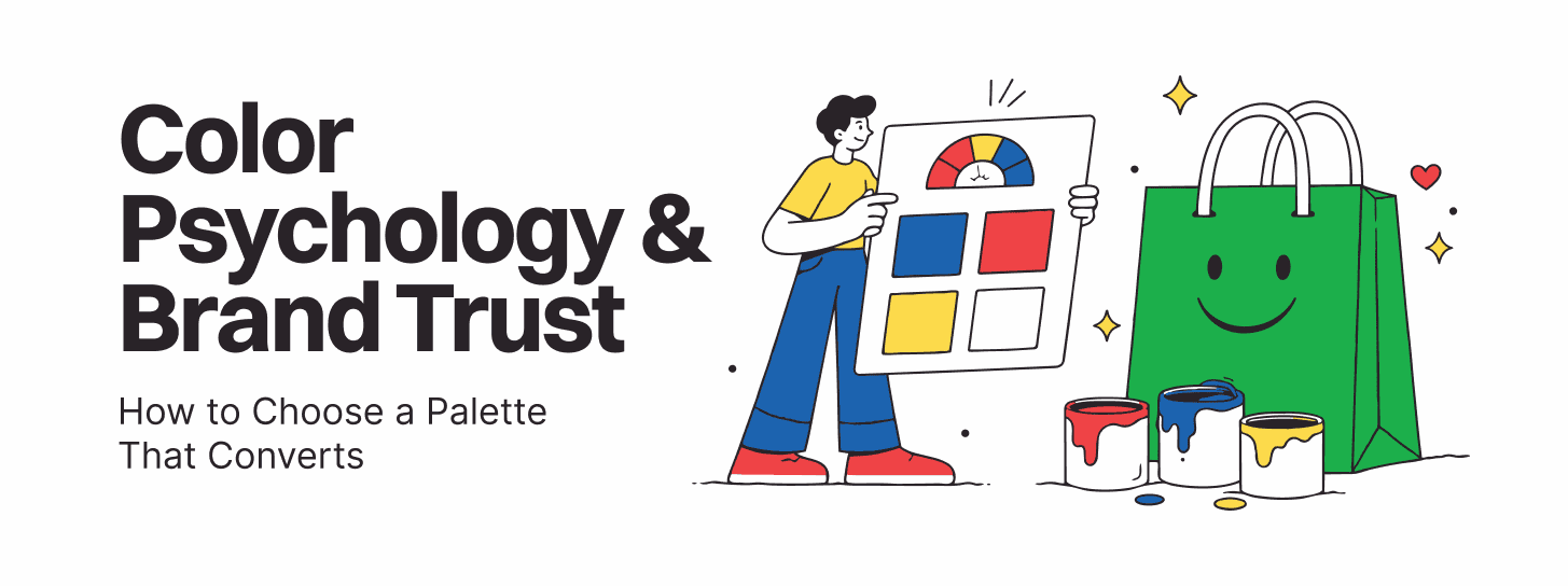
Color psychology branding isn’t just about aesthetics—it’s a strategic tool that directly influences buyer perception, trust, and conversion behavior. For CMOs and product marketing leaders in competitive markets, selecting the right color palette is a critical business decision that can significantly impact brand trust and revenue.
When CMOs and product teams invest in intentional color psychology branding, they’re not simply choosing hues. They’re architecting visual signals that resonate with their ideal customer profile, establish credibility, and drive conversion across digital touchpoints. This blog explores the science, strategy, and real-world impact of strategic color selection in branding design.
Color shapes emotional responses in milliseconds. Research in branding design and neuromarketing shows that between 62% and 90% of brand assessment is based solely on color alone. This demonstrates that color psychology branding isn’t peripheral—it’s central to how buyers perceive trust.
Different colors trigger specific psychological and physiological responses:
For CMOs, the key insight is that color palette selection isn’t about personal preference—it’s about matching brand colors with audience psychology and positioning strategy.
On digital touchpoints, color palette trust impact is measurable. Research shows:
For SaaS and tech brands, where users make snap trust judgments, color palette trust impact directly influences whether prospects explore further or abandon the landing page. A professional, cohesive color system signals operational maturity and competence.
While each brand’s color psychology journey is unique, patterns demonstrate real ROI:
These improvements stem not just from the color choice itself, but from cohesive visual branding design systems that reinforce color psychology across all touchpoints—from website to product UI to email marketing.
Selecting a high-converting color palette isn’t guesswork. Here’s a systematic approach for CMOs:
Step 1: Brand Personality & Positioning Audit
First, define your brand’s personality and positioning. Are you a trust-focused enterprise SaaS? A disruptive fintech? A health-conscious wellness platform? Your positioning dictates color direction. Financial services gravitate toward blue and black. Health tech favors green and teal. Growth-stage SaaS often chooses vibrant secondary colors to signal energy and innovation.
Step 2: Audience Psychology Mapping
Who is your ideal customer? What emotional outcomes do they seek? If your ICPis risk-averse enterprise buyers, blue and navy communicate stability. If your ICP values innovation and disruption, purple and electric colors may resonate more. This alignment between color psychology and audience psychology is critical.
Step 3: Competitive Color Audits
Analyze competitor color palettes. Identify whitespace. If all competitors in your space use blue, you might differentiate with green or purple (if it aligns with positioning). Color differentiation within a category builds distinctiveness and brand recall.
Step 4: Accessibility & Contrast Testing
Brand design best practices demand accessibility. Ensure sufficient contrast ratios (WCAG AA compliance) so color palette works for users with color blindness or low vision. This also improves readability and professionalism across all devices.
Step 5: A/B Testing for Conversion Impact
Once you’ve narrowed to 2-3 palettes, run A/B tests on landing pages, CTAs, and key conversion moments. Measure click-through rates, dwell time, and sign-up rates. Quantify which palette drives higher conversion before rolling out brand-wide.
Several mistakes undermine color psychology branding and conversion:
What colors build trust in SaaS brands?
Blue is the gold standard for B2B SaaS, signaling trust, stability, and professionalism. Dark blue, navy, and combinations with white communicate reliability. However, context matters: health tech benefits from green and teal; fintech can use deep blue with accents; product-led SaaS often pairs blue with vibrant secondary colors to signal innovation alongside trust.
How much budget should I allocate to color psychology branding and brand design services?
Treat strategic color and brand design as an investment proportional to growth goals. Early-stage startups can allocate $5K-$15K for professional color palette development. Scale-stage companies should budget $25K-$100K+ for comprehensive visual identity systems and testing. The ROI typically appears within 6-12 months through improved conversion, reduced CAC, and brand lift.
Color psychology branding is not a cosmetic exercise. For CMOs and product marketing leaders, strategic color selection is a business decision that directly impacts brand trust, conversion rates, and revenue. When anchored in clear positioning, aligned with audience psychology, and executed consistently across digital touchpoints, color palettes become powerful ROI drivers.
The framework presented here—from positioning audit through A/B testing to ongoing optimization—transforms color psychology branding from intuition-driven art into measurable, strategic science.
The next step: Audit your current color palette against your positioning and ICP psychology. If gaps exist, or if you haven’t formally tested color impact on conversion, now is the time to invest in professional branding design services and unlock the latent trust and conversion potential sitting in your visual identity.


