











Sep 15, 2026
In the UI vs UX debate, UI is the interface people operate; UX is the broader experience of reaching an outcome. A polished interface cannot rescue a confusing journey, while a sound workflow can still fail through unclear controls or poor feedback. We recommend diagnosing the friction before choosing a visual refresh, UX redesign, design system, or new hire.

A user opens a polished dashboard, admires its clean design, then cannot find the action they need. The UI may look successful. The UX is not.
“UI is how it looks and UX is how it works” is useful but incomplete. UI is the interface through which people act. UX is the wider experience of understanding what to do, completing the task, and reaching a worthwhile outcome.
UI includes layout, visual hierarchy, controls, labels, typography, color, spacing, responsiveness, feedback, and accessible states. UX includes research, information architecture, content, workflows, navigation, service touchpoints, and the outcome surrounding the interaction.
| Dimension | UI | UX |
|---|---|---|
| Focus | Interface and interactive behavior | End-to-end journey and outcome |
| Core question | Can people understand and operate it? | Does it solve the right problem effectively? |
| Activities | Visual and interaction design, accessibility | Research, journey mapping, architecture, validation |
| Outputs | Screens, states, components, design tokens | Findings, flows, wireframes, prototypes |
| Common failure | Attractive but unclear controls | Confusing sequence or unmet need |
Users experience UI and UX as one product. A confusing label may be an interface detail, a content issue, and a journey blocker at the same time.
“It feels clunky” is an observation, not a diagnosis. We need to find where friction occurs, who encounters it, and what evidence explains it.
A useful audit combines product data, customer feedback, usability observation, accessibility checks, support themes, and expert review.
Start with UI when people understand their goal but struggle to act. Signals include missed actions, inconsistent components, unclear error states, weak feedback, accessibility barriers, or an interface that feels disconnected from the brand.
Investigate UX when people cannot understand the value, sequence, or next step. Abandoned onboarding, confusing navigation, repeated support questions, and manual workarounds often point to deeper workflow or information problems.
A refined interface can make an untested product feel finished. Teams may then debate colors while avoiding harder questions about value, content, and workflow. We recommend validating priority journeys before scaling visual decisions. A component library can standardize weak patterns as easily as effective ones.
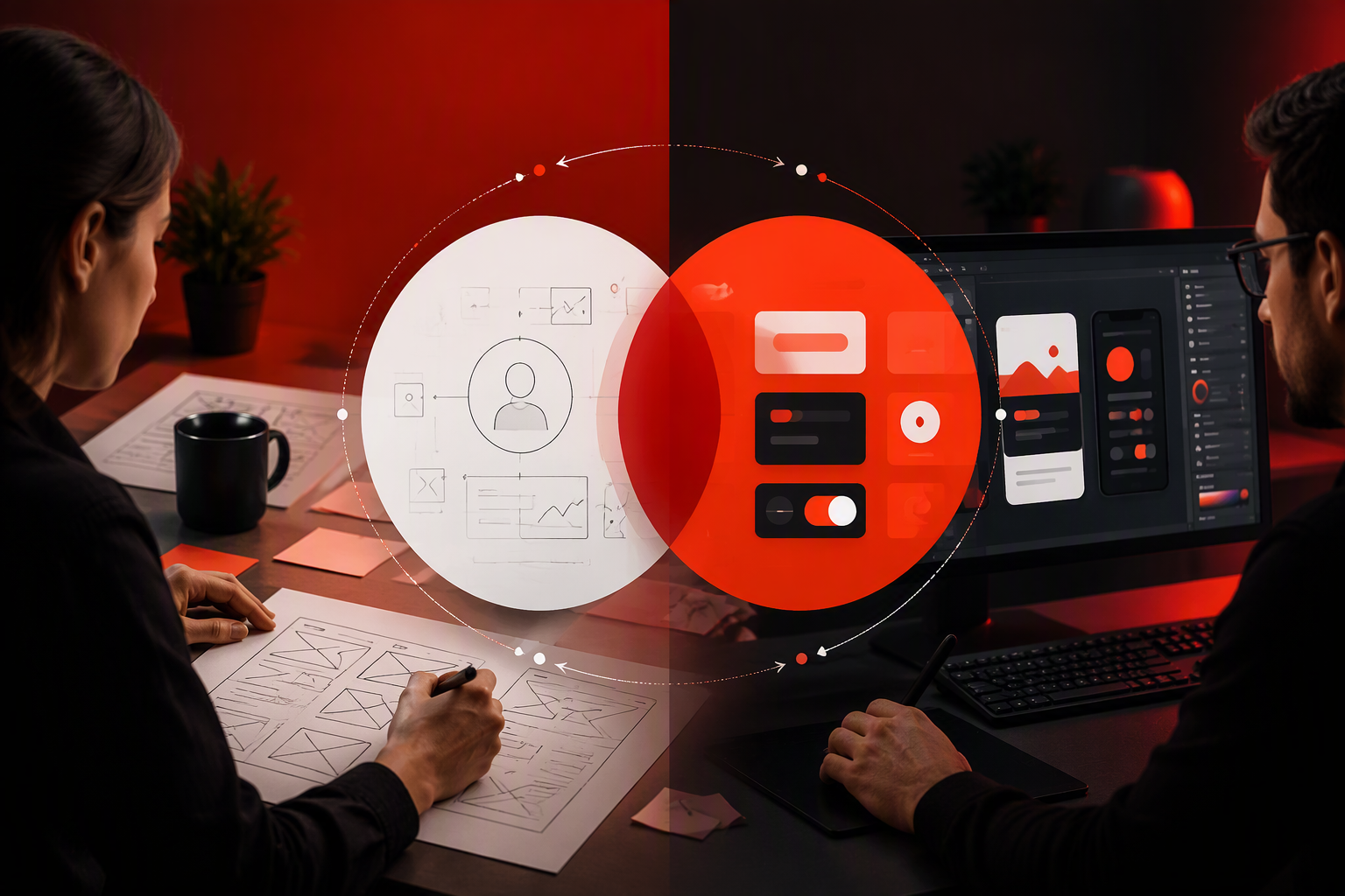
UI and UX design is not a relay race. Research, interaction design, visual decisions, technical constraints, and validation overlap.
We begin with business goals, product evidence, customer feedback, market context, and user constraints. “Improve the UX” must become a defined challenge, such as reducing onboarding confusion or making a priority task easier to complete.
Flows, wireframes, and prototypes expose structural decisions before development makes them harder to change. A prototype does not need visual perfection; it needs enough realism to answer the question being tested.
Once the journey is credible, UI design shapes hierarchy, components, content, motion, responsive behavior, accessibility, and brand expression. Our branding and interface work supports recognition and trust without replacing clear architecture.
After release, we examine where people hesitate, fail, recover, or seek support. Product data and usability evidence should guide iteration—not the loudest internal opinion.
Deliverables make decisions visible, testable, and implementable. They reduce uncertainty; they are not the goal themselves.
Depending on the problem, UX work may include research findings, journey maps, service blueprints, information architecture, user flows, wireframes, prototypes, and usability recommendations. We select artifacts according to the decision and risk rather than producing documents by default.
UI outputs may include visual directions, responsive screens, interaction states, components, design tokens, motion guidance, and accessibility annotations.
Polished mockups do not automatically form a design system. A working system needs reusable patterns, documented behavior, governance, and a connection to implemented components.
Validated prototypes, content patterns, experiment plans, design QA, and implementation guidance often span both disciplines. Close designer-engineer collaboration also exposes constraints early and protects quality after handoff.
Titles vary, so we recommend assessing portfolios, methods, collaboration habits, and outcomes. Choose the role based on the product’s current risk.
Hire a UI specialist when the journey is understood but hierarchy, responsiveness, accessibility, interaction states, brand expression, or consistency needs focused attention. UI designers can also establish a scalable component language.
Choose UX expertise when evidence about user needs, terminology, workflows, or abandonment is missing. Researchers uncover evidence; UX designers turn it into structures and testable interactions, though the roles often overlap.
A product-design generalist can suit an early-stage company that needs research, flows, prototypes, visual design, and iteration from one role. The model fails when speed becomes an excuse to skip validation.
An agency can provide multidisciplinary capacity across research, product strategy, branding, UI design, and design systems. We recommend judging partners by their problem framing, accessibility practice, validation methods, collaboration model, and evidence of relevant outcomes.
Design does not guarantee revenue growth. It can clarify value, reduce uncertainty, prevent errors, and remove friction that affects commercial performance.
Clear hierarchy, relevant content, credible branding, and predictable interactions support confident decisions. Useful measures may include checkout completion, trial starts, qualified enquiries, errors, and abandonment points.
For activation, teams can examine onboarding completion, time to value, first-success events, errors, and task completion. If a SaaS product demands complex setup before showing value, the main issue is sequencing—not color choice.
Confusing terminology and inconsistent patterns can increase training and support needs. Feature adoption, repeat-task success, help-centre use, support themes, and churn signals provide a broader view of recurring friction.
We combine funnel data, usability testing, accessibility checks, customer feedback, design-system adoption, and consistency reviews. Leading indicators such as fewer usability errors should be distinguished from later business outcomes such as retention.
Context changes the risk. Device constraints, task complexity, permissions, frequency of use, and the consequences of error all shape design priorities.
Websites rely on clear messaging, navigation, responsive hierarchy, credibility, performance, and conversion paths. Strong branding should help visitors understand the offer, not compete with it.
Mobile products must account for platform conventions, touch interactions, interruptions, permissions, connectivity problems, and immediate feedback. We recommend testing critical journeys on real devices and with assistive technology.
SaaS design should prioritise onboarding, time to value, empty states, recurring workflows, roles, and feature discovery. The interface often needs to guide new users without slowing down experienced ones.
Enterprise UX must handle dense information, permissions, auditability, specialist terminology, legacy constraints, and cross-role workflows. Consistent tables, filters, states, and language can reduce avoidable complexity.
UI accessibility includes contrast, focus visibility, target sizing, hierarchy, and distinguishable states. UX accessibility includes understandable content, logical navigation, error recovery, inclusive research, and support for varied interaction methods.
The correct scope depends on whether friction sits in the proposition, journey, content, interface, or several layers.
Refresh the UI when workflows are validated but visual language, responsiveness, accessibility, brand expression, or consistency is holding the experience back.
Start with a UX audit when people abandon core tasks, miss the product’s value, depend heavily on support, or use external workarounds. Research and workflow validation should come before high-fidelity design.
An integrated redesign fits products whose brand, content, architecture, workflows, and interface patterns have drifted together. Structural decisions should guide the visual system rather than being hidden beneath it.
Use a design system when teams need shared, reusable, accessible patterns and governance. Validate important workflows first. Consistency only helps when the repeated pattern is worth repeating.
A capable agency diagnoses the problem before prescribing deliverables. At redbaton.digital, we connect product thinking, research, brand expression, interface design, and implementation rather than treating design as screen production.
Ask how the partner will:
Strong engagements tie scope to risks and outcomes, not an arbitrary screen count. The team should explain trade-offs, challenge weak assumptions, and involve stakeholders without turning design into opinion voting.
A useful starting brief includes the affected journey, available evidence, user or customer feedback, technical constraints, and the business outcome that matters. We use that context to recommend an audit, targeted refresh, journey redesign, or integrated engagement.
UI covers the interface people see and operate. UX covers the broader journey of understanding the product, completing a task, and reaching an outcome. They use different methods, but people experience them together.
No. Visual polish may create initial trust, but it cannot repair a confusing workflow, weak proposition, or poorly sequenced journey. It may even make the underlying problem less obvious.
Not always. A strong product-design generalist may cover research, flows, prototyping, visual design, and iteration. What matters is that evidence and validation are not sacrificed for faster screen production.
Start with a UX audit when people abandon tasks, miss the product’s value, need extensive support, or rely on workarounds. Choose a visual refresh when workflows are sound but accessibility, hierarchy, responsiveness, branding, or consistency needs improvement.
No. A design system supports consistency through reusable components, standards, documentation, and governance. It does not prove that the underlying journey or interaction pattern is effective.
Bring redbaton.digital your difficult workflow, underperforming interface, and business goal. Let’s diagnose whether the problem is UI, UX, content, positioning, or a combination—and define the right design engagement.


