


Jan 27, 2026
Most SaaS platforms don’t fail because they lack features. They fail because users can’t find the features that matter. Ask any product team running a mature B2B platform and the same frustration appears:
“We’ve built powerful capabilities, but most users only touch a fraction of them.”
Menus grow. Filters multiply. Dashboards become dense grids of widgets. Eventually the product becomes harder to use than the workflow it was meant to simplify. What many teams are discovering is that the real bottleneck isn’t usability.
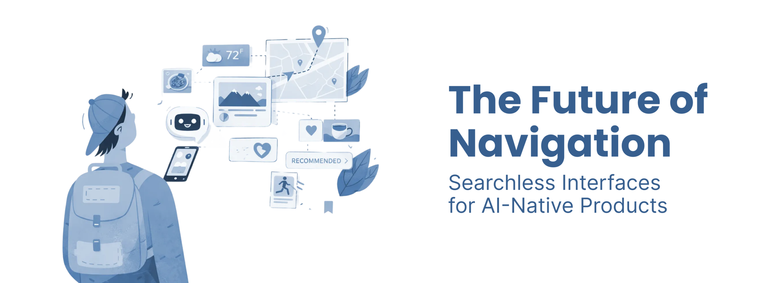
It’s navigation. As conversational tools reset user expectations, a new model is emerging where software no longer waits for commands. It interprets intent.But simply adding a chatbot on top of a legacy UI doesn’t solve the problem. In fact, it often creates new friction.
The real shift happening in AI native products is structural. Navigation is moving from a fixed menu system to an adaptive interface that assembles itself around what the user is trying to achieve.This is the architecture of intent.
Traditional software is command based. Users navigate through menus, choose actions, and manually assemble information before reaching a decision. This model breaks down as products scale.
The core issue is discovery. In complex SaaS platforms:
When someone says:
“I just need to check our exposure to Q3 fuel price fluctuations.”
The system shouldn’t require:
An intent based interface collapses that process. The system interprets the goal and assembles the relevant data automatically. Instead of navigating the tool, the user interacts with outcomes.
Many teams try to solve this problem with a universal search box. Unfortunately this often replaces one friction with another. Users end up thinking: “What exactly am I supposed to type here?”
Natural language is powerful, but it’s also inefficient for repetitive tasks.
Typing the same request every day is slower than clicking a well placed control.
The future interface isn’t chat. It’s adaptive UI. Search becomes invisible infrastructure.
The biggest mistake teams make when building AI navigation is assuming the problem is interface design. In reality the failure happens much earlier. Most AI pilots collapse because the data architecture cannot support reliable reasoning.
AI interfaces depend on a semantic layer. This layer translates business language into data queries. Without it, the system cannot distinguish between:
Instead it guesses. That’s where hallucinations come from. A chatbot without semantic grounding is simply matching words rather than understanding meaning. This is why many companies discover the uncomfortable truth: their backend architecture determines what UI they can build.
Not all AI interfaces look the same. In practice we see three distinct surfaces emerging.
The simplest form. A threaded conversation interface similar to messaging apps. Useful for:
But chat alone becomes slow for professional workflows.
A hybrid workspace. The conversation lives alongside a visual canvas where results appear dynamically. Think of:
Users talk to the system while simultaneously manipulating visual outputs. This works well for analytical and creative tasks.
The most advanced model. Generative components appear directly inside existing screens. The interface rearranges itself based on inferred intent. There is no visible AI interface. The UI simply adapts. This is where searchless navigation actually becomes practical.
Most companies assume they must rebuild their product to implement generative interfaces. In practice the transition often happens gradually.
A typical path looks like this:
Over time the navigation becomes less menu driven and more outcome driven. The screen starts behaving like a cockpit. Instead of browsing data, users are presented with:
A maritime compliance platform redesigned this way moved from dense dashboards to proactive alerts that surfaced regulatory risks automatically. The result was dramatic increases in engagement and product adoption.
The insight was simple. Users didn’t need more data. They needed the system to identify what mattered.
Classic UX heuristics assumed the computer was a predictable machine. AI systems behave differently. They are probabilistic partners that changes the design rules.
AI should communicate uncertainty clearly. When results are probabilistic, the system should signal that. Users need to understand when the system is confident and when it is guessing.
Generative systems think before responding. Good design manages that waiting period with:
Latency becomes tolerable when users understand what the system is doing.
Autonomous actions require checkpoints. High stakes tasks should always include:
Automation without oversight destroys trust.
In AI products the semantic layer replaces traditional information architecture. Instead of organizing screens, you organize meaning.
Every organization has its own terminology. The semantic layer ensures that when users reference a concept the system knows:
Without this mapping the interface becomes unreliable.
Flat schemas treat data as isolated tables. Knowledge graphs represent relationships between concepts. That structure allows AI systems to reason about context rather than just retrieve rows. For AI navigation, relational understanding is far more powerful than simple search.
Many teams obsess over eliminating friction from every interaction. In AI systems that instinct can backfire. When automation becomes too seamless, users stop paying attention. Eventually the system makes a mistake. If no governance checkpoint exists, the consequences can be serious. Strategic friction creates safety.
Examples include:
This is not bad UX. It’s responsible system design.
A B2B influencer discovery platform managing millions of profiles faced a familiar problem. Users searching for fashion influencers in London had to:
The first attempt at improvement was an AI search bar. It still returned hundreds of results. The real breakthrough came when the interface shifted from search to triage. Instead of listing profiles, the system surfaced the top candidates and automatically generated:
The user moved from browsing to deciding in under a minute. That is what intent based navigation actually looks like.
Building AI native interfaces isn’t just a UI challenge. It requires aligning data architecture, product logic, and user behavior. This is why design engagements increasingly look different from traditional UI projects.
At Redbaton, for example, the process often starts with intent mapping rather than wireframes. Teams map the outcomes users want before designing the system behaviors that deliver them.That same approach shaped work on complex platforms like the maritime emissions systems built with Entropik and Geoserve, where dense regulatory data had to be translated into actionable interfaces.
The goal isn’t to design screens. It’s to orchestrate a system that understands context.
Generative UI is a design approach where an interface dynamically adapts in real time based on user intent, context, and behavior instead of relying on fixed layouts.
Intent based navigation focuses on the outcome a user wants to achieve. AI interprets the goal and executes tasks or surfaces the relevant interface automatically.
Most AI pilots fail due to poor data readiness. Without a semantic layer that maps business concepts to reliable data sources, AI interfaces cannot produce trustworthy results.
Agentic UX describes interfaces where AI systems proactively perform tasks on behalf of the user, turning the product from a passive tool into an active collaborator.
Yes, and that is usually positive. When users reach outcomes faster, time to value improves and long term retention increases.


