


Dec 3, 2025
Conversion design is the strategic orchestration of the user experience to turn curious prospects into committed, paying customers. In the modern SaaS market, where 74% of customers say experience influences buying decisions and 83% of leaders risk losing revenue due to poor UX, features are no longer the primary competitive advantage; the experience is. While traditional web design might focus on visual flair, conversion design for SaaS is a revenue-focused discipline that encompasses everything from website messaging clarity to in-product activation touchpoints. It requires a shift from viewing the product as a set of features to viewing it as a journey toward an outcome.
Unlike traditional website UX, SaaS products must support long-term, recurring usage and often accommodate multiple user roles and permissions. Conversion design manages these complexities by ensuring that the user’s forward motion is never interrupted by friction or uncertainty. Every design decision must support the realization of value. This includes the landing page experience, where messaging must be clear, and the early onboarding stages, where the time-to-value (TTV) must be minimized to prevent churn. If users do not feel progress quickly, they will not wait to discover the product’s full potential.
Effective conversion design recognizes that trust is a UX responsibility. SaaS buyers are inherently risk-aware, and the design must actively reduce uncertainty by providing a sense of reliability and competence from the first interaction. This involves creating a consistent experience across the user journey—from the initial landing page to the core product dashboard—to reduce cognitive load and build confidence. At Redbaton, we view conversion design as a system-level challenge where every micro-interaction is an opportunity to validate the user’s decision to move forward.
The discipline moves toward usage-based experiences, prioritizing the actions users perform most often and highlighting insights based on real behavior rather than generic, one-size-fits-all templates. It is about helping users achieve goals efficiently, ensuring they feel productive and confident within the system.
The gap between a free signup and a paying customer is often filled with psychological and functional barriers that product teams misdiagnose. Founders often assume that adding more features will increase the product’s value and thus its conversion rate, but in many cases, adding features without focusing on adoption only increases the cognitive load, making the product feel more intimidating. When 66% of B2B customers stop making purchases after a poor onboarding experience, it becomes clear that the initial friction is the primary killer of revenue.
Most free-to-paid conversion problems are activation failures. Users sign up because the marketing promised a solution, but if they are dropped into a dense dashboard without a clear path to success, they disappear. This failure to reach a meaningful outcome quickly—the “Aha!” moment—is the most common reason for low upgrades. In a subscription-first economy, users buy outcomes, not tools. If the first session does not demonstrate value, no pricing tweak will fix the conversion rate.
Activation is the critical milestone where a user performs a core action that predicts long-term usage, such as completing a setup step or engaging with a primary workflow. If the time-to-value is too high, the perceived risk of the product increases, and the user’s motivation to upgrade vanishes. Many enterprise SaaS tools with 40+ features suffer from this because they prioritize power over the speed of execution.
Feature-heavy products often create massive cognitive overload. When too many options, settings, or data points are shown at once, user confidence drops. This is often a result of ignoring Hick’s Law, which states that decision-making time increases with the number of choices available. A user who feels like they are looking at a puzzle will likely get annoyed and drop out rather than persist to find the value.
Designers must manage this complexity through progressive disclosure—showing only what is necessary for the current task and hiding advanced options until the user is ready. Without this structure, the product feels like a burden rather than a solution.
Onboarding is often where powerful SaaS products lose the most potential revenue. Many teams rely on heavy tours or intrusive pop-ups that users instinctively skip. Effective onboarding design should focus less on explaining everything and more on helping the user succeed early through contextual guidance and outcome-driven experiences.
A major failure in onboarding is the “one-size-fits-all” dashboard. Modern SaaS platforms serve diverse roles, and forcing an administrator to see the same initial interface as an end-user leads to confusion. Role-aware onboarding is essential to reduce anxiety and build confidence from day one. If the product requires users to read documentation just to get started, the UX is failing to support the self-serve conversion model.
Upgrade triggers are often implemented as an afterthought, gating random features behind paywalls in a way that feels arbitrary. When a user hits a paywall for a basic feature they haven’t yet used, it creates friction. Better conversion design uses value-based gating—triggering an upgrade prompt when the user reaches a meaningful limit while they are already experiencing value. For example, gating the number of team members or projects is more effective than gating the ability to export a file, as it allows the user to form a habit before the paywall appears.
UX is the strongest lever for driving ROI in SaaS because it directly impacts the variables that define revenue growth: trial conversion, renewals, and upsells. Experience quality asks how easy, clear, and confidence-inspiring it is to get value from the product. When the experience is seamless, it encourages feature adoption and validates the user’s purchase decision.
Time-to-value has become a core UX metric for growth. Feature-heavy platforms often delay value by requiring extensive configuration before a user sees results. Designing for speed to value involves surfacing meaningful outcomes immediately through smart defaults and intentional empty states. If a user can reach a core action within minutes, the psychological barrier to paying for the product is significantly lowered.
Good SaaS UX reduces hesitation and supports forward motion. This is achieved by creating “Behavioral Momentum,” where the interface guides the user toward the next right action without requiring them to beat their brains out figuring out where to go. When a product uses familiar patterns and conventions, it accesses the “neural pathways of previous learning,” making the journey feel intuitive. Conversely, a journey that breaks these conventions—such as placing a menu in an unexpected location—creates cognitive overload and leads to abandonment.
Conversion is as much about emotion as it is about utility. User confidence signals—such as the certainty that a task was completed correctly—are highly predictive of growth. High task success with low confidence is a red flag; it means the user might have finished the click-path but felt the process was risky or confusing. UX design increases this confidence through clear feedback, transparent decision systems, and consistency across the entire user journey.
Many startups and enterprise teams fall into common traps that silently degrade their conversion rates. One of the most pervasive is prioritizing visual polish and aesthetics over hierarchy and intent. While an “off-white” aesthetic or complex gradients can make a product look modern, they introduce unnecessary load if the primary call to action is lost in the design.
UX feels broken when there is a lack of consistency across the user journey. Often, the marketing team designs the website, a different product team builds the dashboard, and a third team handles the billing portal. This fragmentation results in inconsistent labels, different navigation patterns, and a general lack of cohesion that erodes buyer trust. A consistent experience is critical for B2B buyers who are evaluating multiple tools simultaneously.
Many product teams “measure UX” by filling dashboards with clicks and page views, creating an illusion of control while saying almost nothing about experience quality. Over-instrumenting without a clear behavioral model leads to data noise that nobody trusts. The focus should be on :
Depth of feature adoption (not just “used once”).
Friction drop-off points in key workflows.
Outcome confidence (via post-task micro-surveys).
SaaS products that fail to scale across different user roles often struggle with conversion. If a platform tries to serve everyone with the exact same interface, it becomes flexible but unusable. The best SaaS UX moves toward role-based interfaces that adapt to the user’s specific goals, ensuring each role sees only what is relevant to them without confusion.
Founders often spend months testing button colors or headline variants on a landing page while the core product experience remains unchanged. A/B testing cannot fix a fundamental lack of value realization. If the user doesn’t understand the product’s value proposition because the onboarding is failing, no headline variant will increase long-term revenue.
Effective monetization UX doesn’t rely on blocking the user; it relies on empowering them. The goal is to design upgrade triggers that feel like a natural extension of the user’s current workflow rather than a forced interruption. When triggers are contextual and value-based, they validate the purchase decision rather than appearing as a penalty for usage.
A common mistake is gating basic tools, which prevents users from experiencing the product’s power. A more effective strategy is gating outcomes. For example, letting a user generate a report for free but requiring a paid plan to export or share it ensures they have already seen the value before being asked to pay.
Instead of a generic “Upgrade Now” banner, natural triggers appear when a user is actively engaging with a feature that would be enhanced by a paid plan. If a user is manually performing a repetitive task, a subtle visual cue can suggest an automation tool available in the premium tier. This uses the principle of “Behavioral Momentum,” suggesting the next right action at the moment of highest intent.
SaaS buyers need to feel confident that the upgrade process is straightforward and that they won’t regret the purchase. Trust-building UX includes transparent pricing, clear trial terms, and an easy-to-navigate billing portal. If the pricing and packaging UX is confusing, it introduces hesitation that costs conversion. At Redbaton, we emphasize building “Two-Sided Trust” through designs that prioritize clarity over cleverness.
Onboarding is the most critical lever for revenue because it defines the user’s first impression and sets the stage for trial conversion. It is the foundation of SaaS success, building the trust and engagement necessary for long-term ROI. A successful onboarding process guides users through the complexity of the product without overwhelming them, using a structured approach to reduce anxiety.
Modern SaaS onboarding is moving away from instruction-heavy approaches toward clean, minimal initial setups. This includes:
Easy Registration: Reducing fields to the bare essentials to lower the barrier to entry.
Outcome-Driven Onboarding: Focusing the user’s attention on completing one core task that provides immediate value.
Smart Defaults: Pre-configuring common settings so users reach a functioning state faster.
For B2B SaaS with data-heavy interfaces, organizing content into modular, compartmentalized sections (Bento grids) helps users digest information more easily. This brings order to complex dashboards, ensuring that even in a feature-rich environment, the user remains confident and productive.
Teams should track the “Time to First Meaningful Action” as a primary KPI for onboarding quality. If users are spending too long in the setup phase without reaching an activation signal, the onboarding UX needs a redesign to focus on simplicity and speed. Redbaton’s approach to() involves identifying these friction points and redesigning the flow to prioritize “Speed to Value”.
To improve conversion, teams must look beyond standard usability and focus on “Experience Quality.” This requires a multidimensional view that combines behavioral signals with user attitudes. If a product is technically “usable” but requires too much cognitive effort, it will fail to retain users in the long term.
Cognitive Effort: Are users having to think too hard to progress? Spikes in time-on-step or misclick rates indicate high cognitive load.
Behavioral Momentum: Does the user’s behavior flow forward, or are they constantly backtracking and re-checking settings?.
Outcome Confidence: Do users feel sure that their actions within the system achieved the intended result? Post-task surveys can capture this attitudinal data.
Feature Adoption Depth: How many distinct value-creating actions are users taking per feature? Shallow adoption signals that the UX isn’t intuitive enough to become part of the actual workflow.
External design agencies add significant value when internal teams are biased by roadmap pressure or feature ownership. A professional engagement typically follows a structured process:
Conversion Funnel Analysis: Mapping the journey from signup to paywall to identify drop-off points.
User Behavior Research: Analyzing session recordings and product analytics to understand where users fail to experience value.
Opportunity Mapping: Identifying specific design moments—like empty states or usage limits—where upgrades can naturally occur.
Conversion-Focused Design: Implementing progressive onboarding and contextual discovery to drive monetization through value.
This objective diagnosis helps founders move away from internal hypotheses (like “pricing is wrong”) and toward data-driven UX improvements that actually move the needle on revenue.
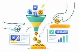
Conversion design is the process of optimizing the product experience to guide users from free trials to paid subscriptions. It involves streamlining onboarding, reducing cognitive load, and placing upgrade prompts where they align with the user’s realization of product value.
For most freemium SaaS products, a conversion rate of 2% to 5% is typical. Companies with strong product-led growth (PLG) strategies can see rates between 5% and 10%. Improving activation—getting users to their first “win”—often increases this rate more than pricing changes.
The most common reasons are activation failure and high cognitive load. If the first session is too complex or doesn’t show immediate value, users disappear. Conversion improves when the product demonstrates clear value before the paywall appears.
Focus on metrics like Time to Value (TTV), feature adoption depth, and outcome confidence signals rather than just DAUs or page views. If users reach their first meaningful action faster and with more confidence, your conversion rate will naturally rise.
Choose UX optimization when your core workflows are functional but feel cluttered. A full redesign is necessary when users are fundamentally confused, onboarding failure rates are high, or core metrics are declining.
Onboarding determines if a user stays long enough to reach the activation milestone. Poor onboarding accounts for a significant portion of churn. A simplified, role-aware onboarding flow reduces friction and increases the probability of a trial converting into a paid plan.
The most dangerous assumption a SaaS leader can make is that a powerful product will sell itself. In reality, power without clarity is just complexity, and complexity is the enemy of conversion. When users feel overwhelmed by your product’s capabilities, they aren’t admiring your engineering prowess—they are looking for the exit. True conversion design is the art of hiding that complexity until the exact moment it’s needed, ensuring every session feels like a victory for the user. If your growth has plateaued, stop looking at your pricing page and start looking at your first-session experience. The question isn’t whether your product is worth the price; it’s whether your product is worth the user’s time. Until you prove the latter, the former won’t matter.
If you are seeing high volume but low commitment, your product experience is failing to deliver on your marketing’s promise. Redbaton helps complex SaaS products find their “Aha!” moment and turn activation into a revenue engine through strategic(). Let’s identify where your users are getting stuck.


