


Dec 29, 2025
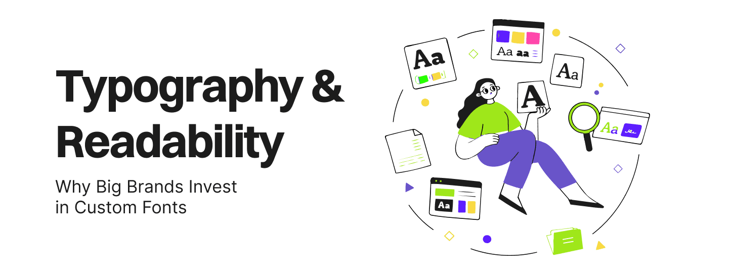
The transition from a licensed font to a custom typeface represents a fundamental shift in how a business views its digital infrastructure. For established brands, typography is increasingly treated as a capital asset rather than a recurring operational expense. The financial logic is rooted in the escalating nature of modern font licensing.
Off-the-shelf fonts typically operate on licensing models that penalize success. As a brand’s website traffic increases or its application is installed on more devices, the licensing fees rise proportionally. This is particularly evident in digital advertising, where foundries have moved toward impression-based licensing. For a global entity, these fees can quickly become unsustainable.
| License Type | Standard Off-the-Shelf | Custom/Bespoke |
| Initial Cost | Low to Moderate (£10k+ for enterprise) | High (Long-term investment) |
| Recurring Fees | Yes (Annual or per impression) | No (One-time development cost) |
| Ownership | Rented/Restricted | Outright ownership of the software |
| Scalability | Costs increase with traffic/users | Unlimited use across all platforms |
| Legal Risk | High (Tracking usage limits) | Zero (Exclusive brand asset) |
The financial burden is not limited to page views. Most professional licenses cover only a specific variation of a font. A brand requiring an entire family—light, thin, regular, medium, bold, and black—must often purchase separate licenses for each weight, each platform (web vs. app), and sometimes even different geographic regions.
By commissioning a bespoke corporate typeface, a brand eliminates these recurring fees entirely. While the development process is intensive—sometimes taking up to three years—it provides unparalleled uniqueness. The typeface becomes a central component of brand equity, building value with every letter displayed.
Redbaton emphasizes a science-led approach where design decisions are rooted in business strategy. This involves a comprehensive development lifecycle:
Consultation & Problem Solving: Identifying specific brand needs and technical issues.
Strategy & Planning: Defining the scope of character sets and language support.
Testing & Optimization: Ensuring the font performs across all digital and physical touchpoints.
Technical Documentation: Providing a clear manual for internal teams and partners.
A significant challenge for modern founders is maintaining brand distinction in a saturated market. The reliance on free libraries like Google Fonts has led to “typographic ubiquity,” where brands lack a unique visual voice.
The typeface Roboto serves as a cautionary example of functionality over uniqueness. It is currently utilized on over 726 million websites globally, including industry leaders like Google and Spotify. While Roboto is technically proficient—featuring a geometric structure and open curves—it is far from unique. When a startup chooses Roboto or Open Sans, they are essentially speaking with a “borrowed voice” that is indistinguishable from millions of others.
Typography is the “glue” of a brand system, appearing on packaging, products, campaigns, and interfaces. A custom typeface makes a brand instantly recognizable without even showing a logo. Research indicates that an increasing number of rebrands now prioritize custom typography because it significantly drives recall.
The strategic argument is that type is invisible until it is wrong. With custom design, it becomes a narrative tool, carrying the history and energy of the brand into every published word. This is fundamentally impossible to achieve when renting the same font as a competitor.
The shift toward custom fonts is most visible among tech giants who have quantified the benefits of typographic ownership.
In 2018, Netflix transitioned from the font Gotham to its own Netflix Sans, developed with Dalton Maag. The primary driver was cost efficiency. Due to the global scale of the business, licensing Gotham for digital advertising and cross-platform use had become prohibitively expensive.
The design of Netflix Sans balanced aesthetics with pragmatic functionality:
Proportions: Uppercase letters were designed to appear “cinematic,” while lowercase letters were made “compact and efficient”.
Unique Details: The arched cut on the lowercase “t” was directly inspired by the “cinemascopic curve” of the brand’s wordmark.
ROI: This transition reportedly saves Netflix millions of dollars annually by eliminating impression-based licensing fees.
IBM replaced the ubiquitous Helvetica with IBM Plex to escape the typographic homogenization of corporate design. IBM also cited millions of dollars in annual savings as a result of moving away from expensive third-party licensing. IBM Plex was engineered to reflect the brand’s unique history of “man and machine,” providing a voice that Helvetica simply could not replicate.
Intel’s move to Intel Clear addressed a critical technical hurdle: language support. Their previous fonts only covered Latin scripts, forcing the company to use lookalike fonts for markets in Greece, Russia, China, and the Middle East. This “fragmented” approach locked them into expensive annual licenses for multiple lookalike fonts while diluting brand exclusivity. Intel Clear solved this by providing a unified, ownable character set across all global markets.
| Brand | Motivations | Strategic Outcome |
| Airbnb | Online-to-offline unity, accessibility | Consistent identity from “button to billboard” |
| Goldman Sachs | Clarity in data-rich environments | Enhanced legibility in tiny spreadsheet cells |
| Mozilla | Screen readability | Improved on-screen legibility vs. standard fonts |
| Apple | Portfolio-wide consistency | Reinvented rendering from hardware to software |
For product leaders, the technical advantages of custom fonts often outweigh the aesthetic benefits. A bespoke font can be engineered specifically for the constraints of modern digital products.
Inaccessible typography is a significant business risk. In the US, failure to conform to WCAG standards can result in severe legal and financial penalties, including lawsuits under the ADA. With 32 million Americans experiencing vision loss and up to 20% of the population affected by dyslexia, choosing an accessible font is critical for commercial success and brand reputation.
Accessible fonts improve legibility and reading speed by incorporating:
Distinct Letterforms: Ensuring ‘I’, ‘l’, and ‘1’ are easily distinguishable.
Consistent Stroke Thickness: Maintaining visibility for users with low vision.
Adequate Spacing: Preventing character overlap that slows down the reader.
A common misconception among founders is that custom fonts negatively impact site performance. In reality, properly optimized custom fonts (using the WOFF2 format) can be more efficient than generic libraries.
Poor font implementation often causes “Flash of Unstyled Content” (FOUC) and negatively affects Cumulative Layout Shift (CLS)—a core ranking factor for Google SEO. By subsetting fonts to include only the required characters and using variable fonts to reduce file size, businesses can improve Core Web Vitals and search rankings.
Variable fonts represent a major leap in typographic technology. Instead of loading six separate files for different weights (light, regular, bold, etc.), a variable font uses a single file that allows designers to adjust weight, width, and slant on a continuous scale. This reduces HTTP requests, enhancing user experience and supporting SEO efforts by making websites more efficient.
Typography is more than graphic design; it is an expression of technology and order. For global brands like Airbnb, it is a building block for creating meaningful connections.
The development of Airbnb Cereal demonstrates how typography can carry a brand’s history. The name “Cereal” refers to the company’s early days in 2008, when the founders created collectible cereals to save the business from financial collapse.
The typeface was designed to solve specific business needs:
Offline-to-Online Fluidity: The goal was a font that could “leap off the screen to a magazine,” maintaining consistency from a digital button to a physical billboard.
Scalability: The font needed to be “locally relevant but cohesively designed” across diverse mediums.
Character: It imbues a “playful, open, and simple” feel with a “touch of quirk,” reflecting the company’s core values.
Investment bank Goldman Sachs commissioned Goldman Sans with three guiding attributes: clean, modern, and credible. Unlike consumer-facing brands that might prioritize quirkiness, Goldman Sachs required a typeface that functioned perfectly in “dense, data-rich environments” like tiny spreadsheet cells. This demonstrates that custom typography is not an indulgence; it is a tool for precision and trust in high-stakes industries.
For enterprise brands and agencies, managing font licenses is a perpetual headache. As team members and partners fluctuate, it is easy to lose track of which license covers what use case, leading to significant legal vulnerabilities.
Scope Creep: Using a “Personal Use Only” or “Shareware” font for a commercial project.
Platform Restrictions: A font licensed for desktop use being embedded in a mobile application without the proper app license.
Regional Limitations: Licenses that are only valid for certain countries or specific numbers of monthly visitors.
Discontinuation: Adobe’s decision to disable PostScript Type 1 fonts serves as a reminder that “rented” voices can be discontinued, disrupting brand consistency.
Owning a custom font suite simplifies the operational workflow. There is no need to juggle multiple licenses or settle for “almost-right” fonts. It provides a single, consistent system that works everywhere, backed by legal agreements that protect the brand from future litigation.
Founders and product leaders must recognize that even the most expensive custom font cannot fix poor typographic implementation. Redbaton’s UI/UX design methodology prioritizes clarity over visual noise, which requires avoiding several common mistakes.
Beginners often use multiple typefaces and styles to “stand out,” but this only leads to user confusion and distraction. Best practice dictates limiting a project to two typefaces: one for body text and one for display.
Decision-making should not be left to the design software. Active adjustments for leading (line spacing), kerning (space between letters), and tracking are essential for professional results.
Kerning is a hallmark of high-quality design. Large headings that have not been kerned—adjusting the space between specific letter pairs—signal a lack of attention to detail and can damage brand credibility.
Negative space is not “empty” or “wasted.” It allows design elements to breathe and is essential for the principle of proximity. Over-filling a workspace with type or graphics makes the interface harder to process.
Hierarchy is not about randomly making text larger; it is about understanding the importance and relevance of information and making visual decisions that reflect that priority.
| Practice | Outcome | Recommendation |
| Using 3+ fonts | Cognitive overload | Stick to 2 fonts (Display & Body) |
| Fixed-size fonts (px) | Accessibility failure | Use relative units (rem/em) |
| Decorative body text | Slow reading speed | Choose high-legibility sans-serifs |
| Low color contrast | Legal risk (WCAG) | Ensure high contrast for low-vision users |
Investing in typography requires a framework that aligns design decisions with business outcomes. Product leaders should move beyond “looking good” to “performing well.”
When selecting or designing a font, apply the(https://redbaton.in/blog/): what “job” is the user hiring this font to do?
Functional Job: “I need to read this data in a spreadsheet without straining my eyes.”
Emotional Job: “I want to feel like I am using a premium, trustworthy banking app.”
Social Job: “I want to belong to a community of global travelers.”
Airbnb discovered that their job of “reliable local stays” transcended traveler types, necessitating a font that worked across all languages and contexts.
Calculating the ROI of typography is not guesswork; it is strategic modeling. By analyzing reduced licensing costs, improved accessibility (expanding the reachable audience), and enhanced site performance (faster load times), product leaders can justify the investment with data.
For a Redbaton client, a website redesign resulted in a 30% improvement in on-page time, driven by better performance and a more structured, legible UI.
As we approach 2025, the role of typography in digital marketing and UX design is evolving. AI-powered design tools are beginning to play an increasingly important role in typography selection and optimization.
SEO in 2025 is no longer just about keywords; it is about user intent and comprehensive content. AI search engines prioritize expert, evidence-backed content that is easy for both humans and machines to read. Clear, well-structured typography with a logical hierarchy (H1, H2, H3) is essential for AI systems to “understand” and cite your content in summaries.
With mobile devices accounting for the majority of web traffic, “tap-friendly” navigation and fonts that are legible without zooming are mandatory. Variable fonts will become the standard for adaptive designs, allowing weight and width to shift dynamically based on screen size and user preference.
Google’s emphasis on Experience, Expertise, Authoritativeness, and Trustworthiness (E-E-A-T) means that every visual signal counts. Inconsistent or “leaky” design—such as using mismatched fonts across a site—signals unprofessionalism and damages the trust required to convert leads.
It depends on the scaling goals. If the company is operating in multiple languages or experiencing high traffic that triggers escalating licensing fees, the ROI of a custom font can be achieved in as little as 2-3 years.
Success should be measured through Core Web Vitals (specifically CLS and LCP), accessibility audit scores, on-page time, and a reduction in recurring licensing expenditures.
WOFF2 is the current industry standard. It offers superior compression, reducing file sizes and improving load times while maintaining high-quality rendering.
Yes. For global platforms like Netflix or IBM, licensing a popular font like Gotham or Helvetica for every digital impression across millions of devices can cost millions annually. Owning the asset outright eliminates this recurring cost entirely.
While system fonts are extremely fast-loading and compatible, they offer zero brand differentiation. Using them for body text is safe, but using them for brand identity makes your business look like a generic commodity.


