


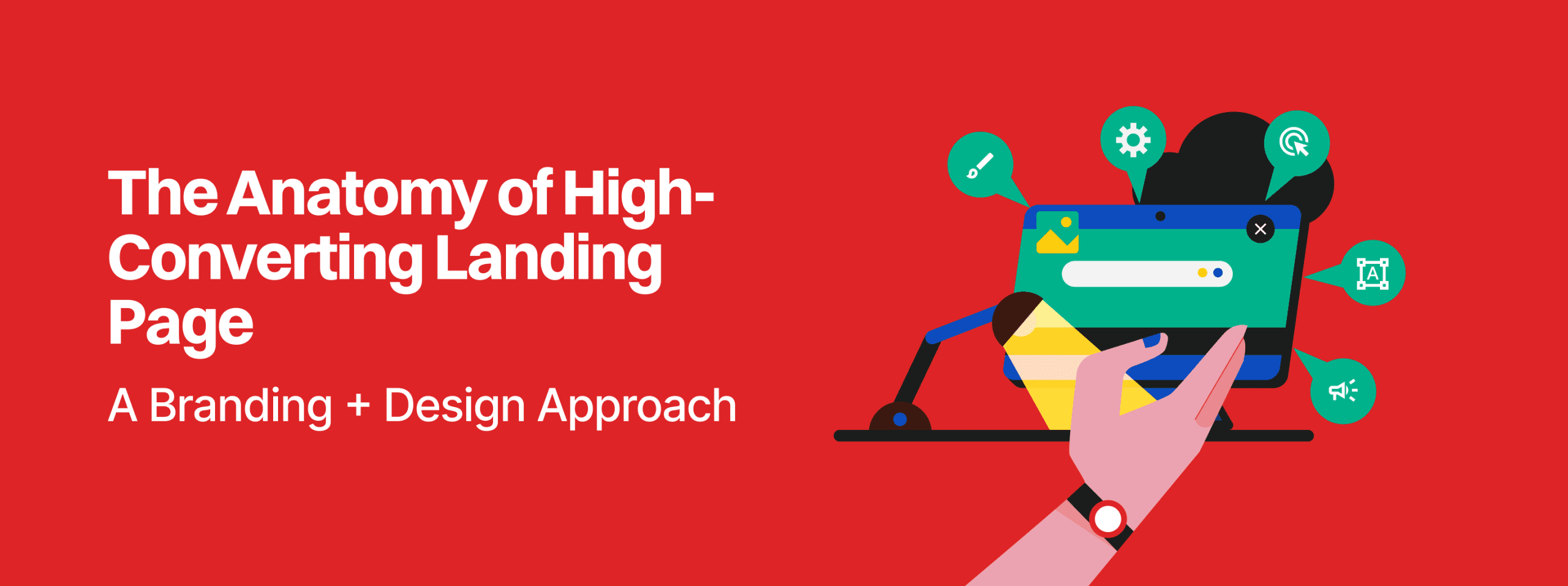
Jan 12, 2026
For senior decision-makers, the value of UX design must be measured in its ability to drive revenue and scale. Conversion-focused UX design is defined as the strategic practice of designing user experiences that guide visitors toward specific business goals while providing exceptional value. This is distinct from traditional UX, which might focus solely on usability; here, the objective is to balance user satisfaction with measurable commercial outcomes.
The return on investment for high-quality UX is not speculative. Data indicates that every dollar invested in strategic UX design can return significantly more in revenue, with some studies suggesting a 100:1 ratio. Conversely, 88% of websites still fail to implement basic conversion optimization principles, leaving substantial growth on the table.
| Metric | Impact of Poor Design | Impact of Optimized Design |
| Conversion Rate |
Median 2%–5% |
Can reach 15%–25% |
| Revenue (per 1k visitors) |
~$6,000 at median rates |
Compounded 400%+ growth |
| User Judgment |
Credibility judged in 0.05s |
Immediate trust and familiarity |
| Retention |
79% bounce if UX is poor |
Increased on-page time and engagement |
When a landing page is treated as a pipeline, even minor leaks like a confusing headline or a hidden call-to-action (CTA) reduce the flow of leads and sales. This is why a senior consultant views the website not as a static online presence, but as an intentional pathway that guides visitors smoothly toward a purchase, thereby reducing reliance on costly ad spend with underwhelming returns.
The debate between brand-led and performance-led design often creates a false dichotomy in startup boardrooms. Founders fear that a “performance” focus will make the brand feel “salesy” or cheap, while marketing leads fear that a “brand” focus will prioritize aesthetics over action. In reality, the highest-performing pages often feel like a calm, supportive dialogue rather than a high-pressure sales pitch.
In 2025, brand experience and brand-led content have emerged as top marketing shifts, outranking even AI adoption in some sectors. This is because people do not just search for solutions; they search for names they trust. A brand-led story—detailing new launches, partnerships, or missions—helps fill the “middle-of-funnel” trust gap.
However, brand-led design becomes a liability when it relies on “shapeshifting objects”—elements that change their look and feel across different parts of the site, confusing the user’s “lizard brain” which is constantly scanning for potential threats or inconsistencies.
Performance-led design is about clarity over creativity. It hinges on relevance and alignment with user intent. When someone lands on your page, they should immediately grasp what you offer, who it is for, and what they should do next. If an element does not actively reduce uncertainty or support a specific action, it is merely ornamental.
At Redbaton, we emphasize the(), ensuring that the visual brand identity is identifiable across physical and digital media while maintaining a relentless focus on the user’s next step.
The hero section is the most critical real estate on your landing page. Users decide whether to stay or leave within approximately 50 milliseconds to 7 seconds. If your hero section doesn’t work, the rest of the page doesn’t matter.
Imagery should communicate the key message at a glance. For software products, high-quality product screenshots or mockups work better than generic stock photos because they immediately communicate what the visitor will get. The visual should show the solution in context—using product demos or interactive elements to bridge the gap between curiosity and understanding.
The headline must lead with a crystal-clear value proposition that answers “What’s in it for me?”.
Header: Aim for 5–7 words. It should be benefit-driven (e.g., “Build landing pages 10x faster”) rather than technical or vague.
Subheading: Expand on the promise with supporting details. Aim for 20–25 words max.
Your CTA button is the driving force of the hero section. It should be the most visually prominent element, using a color that contrasts sharply with the background. Labels should be verb-based and action-oriented: “Start Free Trial” consistently outperforms passive phrases like “Learn More” or “Submit”.
| Component | Strategic Requirement | Desktop Specification | Mobile Specification |
| Headline Font | High contrast, bold weight |
48px to 72px |
36px to 42px |
| CTA Target | Thumb-friendly, distinct |
High contrast color |
44px minimum height |
| Whitespace | Reduce cognitive load |
Generous surrounding space |
Minimal clutter |
High-converting design minimizes mental effort. This is achieved by adhering to laws of psychology that govern how humans interact with digital environments.
Hick’s Law: The time it takes to make a decision increases with the number and complexity of choices. A landing page should have one single focus. Multiple competing CTAs—like asking a user to “Buy Now” and “Download a Whitepaper” simultaneously—create decision paralysis.
Von Restorff Effect: Also known as the isolation effect, this suggests that when multiple similar objects are present, the one that differs from the rest is most likely to be remembered. This is why primary CTAs must be visually distinct from secondary actions.
Cognitive Ease: Familiarity triggers a state of cognitive ease, allowing users to browse quickly without feeling threatened or confused. Consistency in branding, color palettes, and fonts across the ad and the landing page ensures this transition is seamless.
To manage cognitive load effectively, companies should implement the F.I.R.S.T. framework :
Friction Reduction: Minimize form fields and eliminate unnecessary steps in the flow.
Intuitive Pathing: Use meaningful visual hierarchy and scannable layouts.
Relevance: Target content for specific user segments rather than a generic audience.
Social Proof: Use strategic placement of trust signals near conversion points.
Timing: Use progressive disclosure to provide information only when the user is ready for it.
A striking design cannot fix a slow-loading script or a buggy form. Speed is a main pillar of trust in landing page design; a fast page is perceived as professional and reliable. Research shows that a 1-second delay reduces conversions by 7%, and 53% of visitors will leave if a page takes more than three seconds to load.
Engineering for conversion requires a “full-stack” approach where UX defines the need and code defines the achievement. Key techniques include:
Lazy Loading: Deferring the loading of non-critical resources until they are actually needed.
Code Splitting: Breaking down large JavaScript bundles into smaller chunks that load only when required.
Static Site Generation (SSG): Pre-building pages to be served instantly from a Content Delivery Network (CDN), minimizing server-side delays.
SSL Implementation: Ensuring HTTPS is correctly implemented to avoid security warnings that kill trust instantly.
At Redbaton, we emphasize building solid foundations for digital success through robust , ensuring that enterprise-level products maintain speed and compliance across all devices.
Since its founding in 2015, Redbaton has operated as a turnkey consultant for brands seeking innovation through science, design, and emotions. Our approach is characterized by prioritizing quality over speed and grounding every design decision in deep discovery.
Every project begins with detailed discussions on business goals and an in-depth immersion into the client’s vision. This “patient” initial phase of asking questions helps cut down back-and-forth between teams and ensures that the final product is not just aesthetic but strategically aligned with market needs.
Yulu: For the micro-mobility platform Yulu, Redbaton created a unified brand experience that transitioned from physical scooters to digital screen designs. The result was a 5x increase in sign-up goals and a quadrupling of social media engagement.
Swiggy: Working with India’s food-tech unicorn, Redbaton focused on revolutionizing performance marketing ads using data-driven insights to create engaging visuals that drive conversions and brand visibility. We also revamped onboarding flows to establish Swiggy as a “hyperlocal convenience app” rather than just a food delivery service.
Our methodology is built on(), ensuring that complex data remains easy to consume for decision-makers.
Effective landing page design is only as good as the journey that brings users to it. The conversion process should be viewed as a 5-stage journey that moves the user from initial awareness to long-term advocacy.
Awareness: Introduce the offer and establish curiosity. The hero section must immediately confirm the user is in the right place.
Consideration: Deepen the narrative through audience-specific reasons to act. Use smaller chunks of social proof, like client logos, here.
Conversion: Remove friction and amplify urgency. This is where simple, short forms and clear CTAs are non-negotiable.
Retention: Onboarding emails and “thank you” pages should provide the “pajamas and hygiene products” to make the new guest feel at home.
Advocacy: Encouraging users to share their experience or use the product in a way that creates a cycle of growth.
Even with high-quality traffic, certain design “leaks” can destroy conversion velocity. Senior consultants must be able to spot these anti-patterns:
The False Bottom: Designing a hero section that looks like the end of the page, preventing users from scrolling down to see critical social proof or detailed benefits.
Fake Scarcity: Using artificial countdown timers or blaring autoplay videos. While these might inflate short-term numbers, they damage long-term trust—and once trust is lost, no amount of A/B testing can restore it.
The Visual Jolt: A lack of consistency where the ad imagery does not match the landing page imagery. This “teleportation” effect causes an immediate drop-off.
CTA Overload: Having multiple buttons of the same visual weight (e.g., “Sign Up” and “Learn More” looking identical). Users should never have to guess which action is the primary one.
Customer Logos: Reassuring symbols of familiarity.
Testimonial Walls: Detailed quotes from real people, preferably with headshots and titles.
Specific Outcomes: Quantifiable results (e.g., “crossed sign-up goal by 5x”) are more powerful than generic praise.
Trust Badges: Security certifications (SSL) and media mentions (“As seen on”) reduce hesitation during the “fragile act” of conversion.
Social proof should be placed near decision points. For instance, placing a trust badge or a guarantee (e.g., “No credit card required”) near the CTA button can significantly lift completion rates.
Landing pages do not exist in isolation. Their success depends heavily on the quality of traffic and the channel through which it arrives.
While SEO is a long-term strategy that builds credibility and trust, PPC offers immediate results and precise targeting. A balanced approach leverages both:
PPC Landing Pages: Must be highly tailored to the specific keywords and ad copy to ensure a “seamless user experience”.
SEO Landing Pages: Focus on topical relevance, authoritative content, and building “branded search”.
| Feature | PPC Focus | SEO Focus |
| Primary Driver | Immediate Visibility | Long-term Organic Growth |
| Sustainability |
Ends when spend stops |
Compounding results over time |
| Trust Factor | Can be seen as intrusive |
Often perceived as more credible |
| Tailoring |
Tailored to specific ad campaigns |
Tailored to search intent and authority |
For businesses managing complex offerings, the() becomes a critical part of this alignment, ensuring that users can understand value before they are asked to convert.
Failing to clearly communicate the value proposition above the fold is the most critical error. If a user cannot understand what you do and why it matters within five seconds, they will leave.
The length depends on the complexity of the offer. A high-cost B2B solution requires more education, social proof, and objection handling (a longer page), whereas a free newsletter sign-up can be much shorter.
No. You should have one primary action. While you can repeat the button at different scroll depths, they should all point to the same conversion goal to maintain focus and reduce cognitive load.
Speed is the first impression of your engineering quality. A 1-second delay can kill conversions by 7%, meaning your ad dollars are wasted on users who bounce before the page even loads.
B2B buyers are naturally wary of giving away sensitive data or personal details. Social proof and security credentials reassure them that your organization is credible and their data is safe.


