


Jan 5, 2026
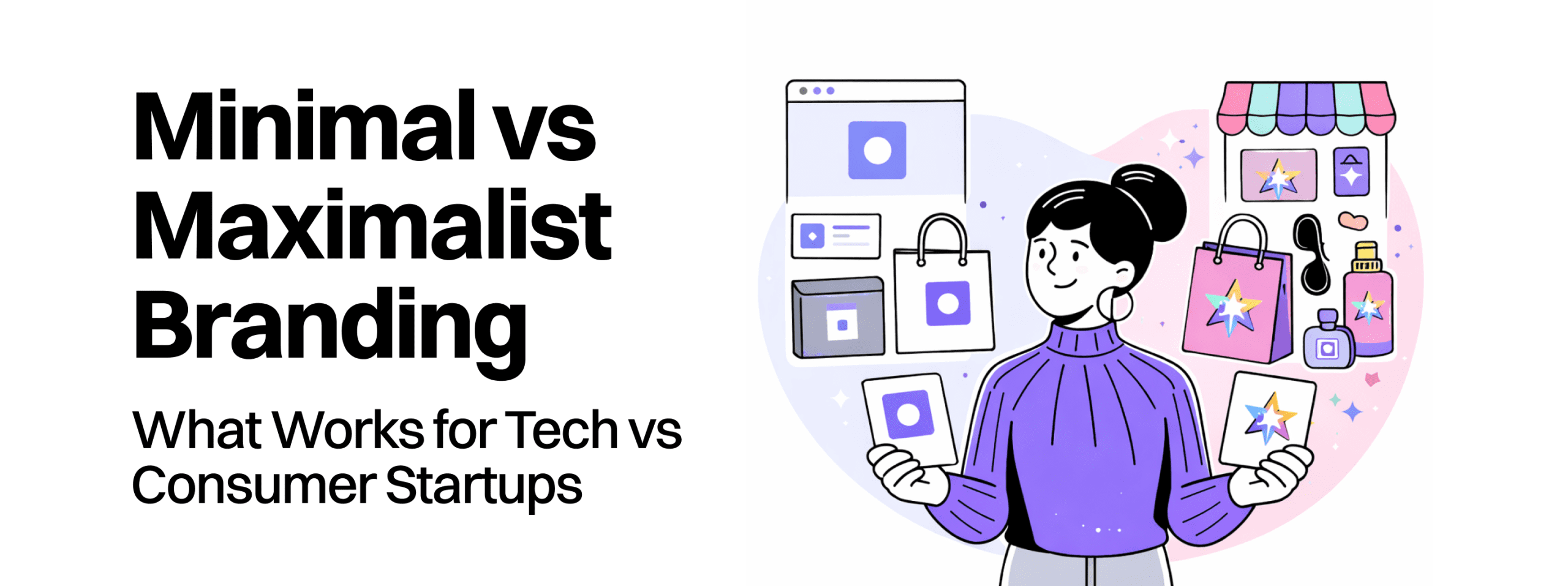
The tension between minimalism and maximalism represents a split in the creative world between refinement and explosive energy. Minimalism centers on the philosophy of “less is more,” stripping away unnecessary elements to focus on clarity and functionality. This style relies on limited color palettes, clean lines, and generous negative space to communicate professional credibility and premium value. In contrast, maximalism operates on the “more is more” principle, utilizing bold colors, clashing patterns, and decorative typography to dominate attention and evoke strong emotional reactions.
The decision to lean into one style or the other is often dictated by the emotional promise the product makes to its users. Brands requiring high levels of security and efficiency, such as those in finance or healthcare, typically lean toward minimalism to project calm and predictability. Brands aiming to disrupt traditional markets or spark joy, such as fashion or entertainment startups, embrace maximalism to create an immersive, high-energy experience.
| Feature | Minimalist Branding | Maximalist Branding |
| Primary Philosophy | Restraint with purpose | Controlled extravagance |
| Visual Language | Negative space, simple geometry | Layered textures, clashing patterns |
| Audience Signal | Expertise, sophistication, trust | Creativity, storytelling, uniqueness |
| Cognitive Goal | Reduce anxiety/stimuli | Reduce numbness/increase sensation |
| Technical Focus | Speed and mobile UX clarity | Memory structures and “thumb-stopping” |
Evidence suggests that the 2025 landscape is seeing a shift toward “warm minimalism”—which integrates natural textures into clean layouts—and “controlled maximalism,” where bold visuals are anchored by a structured framework. This evolution suggests that the smartest brands are no longer choosing sides but are instead choosing strategic alignment based on their core values and target audience expectations.
For technology and B2B startups, minimalism is often a strategic necessity driven by the need for cognitive ease and technical efficiency. In environments where users are bombarded with choices, a minimalist approach offers a sense of order and harmony. By focusing on one hero idea and a restrained palette, brands can ensure their core message remains impossible to ignore.
The performance reality of digital design heavily favors minimalist principles. Smaller file sizes lead to faster loading speeds, which are critical for both technical SEO and user retention. A 2023 study by W3Lab found that 52% of web designers reported an increased demand for minimalist designs specifically because of their ease of navigation and focus on essential content. Furthermore, minimalist typography, often utilizing lighter font weights and clean sans-serifs, ensures legibility across diverse digital screens, from 16px favicons to large conference backdrops.
| Technical Attribute | Impact of Minimalism |
| Core Web Vitals | Improved LCP and FID due to fewer heavy assets |
| Mobile Accessibility | Better adaptation to smaller screens and touch interactions |
| Battery Consumption | Dark mode variants reduce OLED battery drain by up to 63% |
| Bounce Rates | Clean layouts can reduce bounce rates by up to 30% |
Minimalism also functions as a psychological trust signal. Stripping away distractions can suggest transparency, signaling to the consumer that the brand has nothing to hide. This is particularly relevant for startups handling sensitive data, where a structured and deliberate design mirrors the reliability of the underlying technology. However, the risk of minimalism lies in its potential to feel cold or impersonal if not balanced with warmth in tone of voice or micro-interactions.
Maximalism is making a significant comeback in response to a decade of “stripped-down” digital experiences that many consumers find sterile or corporate. This approach seeks to dominate the consumer’s mind through sensory richness, utilizing bold color combinations and complex layouts to create an adventure-like browsing experience. Maximalist design is particularly effective for brands targeting Gen Z, who often use visual style as a language for participation and self-expression.
The “more is more” philosophy allows for deep narrative weight. Through layered visuals and unconventional navigation, maximalist brands can tell “a story within a story,” forging a stronger emotional connection than a simple navy-and-white layout. On social platforms like TikTok and Instagram, these bold visuals earn the critical first three seconds of attention, solving the “distinctiveness gap” that many new brands face.
| Narrative Tool | Maximalist Application | Strategic Outcome |
| Color | High-contrast, vibrant, or clashing | Instant recognition and viral potential |
| Typography | Ornate, vintage, or exaggerated | Injects personality and amplifies brand voice |
| Composition | Layered textures and digital collage | Immersive and memorable “unboxing” experiences |
| Motion | Dynamic animations and custom cursors | Increases time on page and emotional resonance |
The primary challenge of maximalism is managing “performance debt.” High-quality lifestyle content and rich modules can inflate page weight, potentially causing a slide in conversion if not optimized correctly. Decision-makers must ensure that while the visuals are “chaotic,” the navigation remains intuitive to avoid overwhelming or confusing the user.
A critical error for many early-stage startups is the adoption of “Blanding”—a term referring to the trend of adopting minimalist, uniform, and often characterless sans-serif logos. This phenomenon creates a landscape where everything looks the same, making it nearly impossible for a new entrant to build distinctive memory structures.
Strategic mimicry occurs when a brand lacks a defined positioning and defaults to the industry’s tone of voice. This imitation dilute brand equity because the startup is essentially building on a competitor’s story rather than its own. When a brand smooths out its edges to appeal to everyone, it loses the sharpness that makes it meaningful to its target audience.
Research suggests that 13% more people are interested in simple logos that are unique rather than those that are merely complicated or generic. The key is to achieve a “distinctive identity” without overwhelming the audience. Redbaton’s approach to digital design and human experience focuses on this exact balance—using research-led strategies to simplify the complexity of life without stripping away the emotional core that makes a brand care-worthy.
In 2025, the most effective branding is not a static choice but a dynamic system—a “brand dial” that shifts between minimalist and maximalist poles depending on the channel and the KPI. This allows a startup to be both practical and memorable.
This setting is used for performance-critical moments where speed and clarity are the primary drivers of growth.
This setting is used for awareness and engagement, where the goal is to capture attention in crowded feeds.
For brand homepages and content hubs, the dial is often set in the middle, balancing structural scaffolding (minimalism) with expressive overlays like motion graphics or custom illustrations (maximalism). This split keeps funnels fast while ensuring the content remains memorable.
Decision-makers must view branding as a business initiative rather than a cosmetic marketing campaign. Data consistently demonstrates that professional branding delivers a material impact on the bottom line.
| Financial Metric | Conservative Branding Improvement | Data Source |
| ROI over 3 years | 2,000% – 3,500% | |
| Annual Revenue | 23% average increase | |
| CAC (Customer Acquisition Cost) | 15-30% decrease | |
| LTV (Customer Lifetime Value) | 20-40% increase | |
| Sales Cycle Length | 10-25% reduction | |
| Price Premium | 13% command over weak brands |
The mechanism behind this ROI is the reduction of friction. Prospects who recognize and trust a brand convert faster, shortening sales cycles and lowering the cost-per-click in auction-based ad platforms. In the B2B SaaS sector, SEO-driven content marketing—often supported by minimalist, high-clarity landing pages—can generate a 702% ROI with a break-even time of just seven months.
For financial institutions, the impact is even more pronounced. A report by Adrenaline found that rebranded banks achieved a compound annual growth rate (CAGR) of 13.6%, nearly double the 7.4% U.S. industry average. This is not an outlier but a reflection of the “catalytic” nature of brand strategy when it is born out of business goals.
The calculation for the ROI of a rebrand often follows a specific formula:
$$ROI = \frac{(\text{Gain from Rebrand} – \text{Cost of Rebrand})}{\text{Cost of Rebrand}} \times 100$$
Startups often see payback within 6 to 18 months, as the brand earns a spot in the customer’s “consideration set” more efficiently.
The choice of aesthetic must be grounded in the industry’s relationship with trust and innovation.
In sectors where “money is emotional” and “security is table stakes,” design must feel controlled and professional.
Consumer brands succeed by moving their center of gravity toward the customer’s unmet needs and emotional aspirations.
Stripe sells payment infrastructure, a highly complex product. Their landing page uses a vibrant mesh gradient over a dark background with a live code snippet. The key takeaway is showing the product rather than a metaphor; the “4 lines of code” visual communicates simplicity on the backend while maintaining trust through high-quality visual execution.
Klarna famously rejected the “sea of boring blue” in finance by embracing pink as their primary brand color. Their “Smoooth” series of videos featured celebrities like Snoop Dogg in visually appealing, sometimes bizarre, settings. This playful, high-energy approach made finance trendy and resonance deeply with younger consumers, proving that maximalism can work even in regulated industries if the goal is market disruption.
Plaid handles sensitive bank data and intentionally uses a calm design with muted blues and plenty of whitespace. By avoiding flashy animations and using structured layouts that mirror their API’s reliability, Plaid’s design communicates care and control, which is essential for a brand that acts as “invisible infrastructure”.
The Whole Truth built its brand on “radical transparency,” which is reflected in its minimalist yet authentic packaging. Their engagement strategy relies on community-led campaigns rather than large-scale ad spends, achieving 3X growth in 24 months by empowering users to make informed choices.
The future of website design promises deeper integration of AI to automate routine tasks and provide hyper-personalized interactions. By 2025, 80% of B2B sales interactions are expected to happen digitally, making the website the most frequent and critical brand interaction.
Startups often move fast to get a product to market, but building without a design system creates “design debt” that becomes a growth blocker. A unified design system—using frameworks like Ant Design or Material-UI—yields significant returns, with businesses seeing an average 135% ROI within five years. Redbaton’s methodical approach to creating user-centric digital landscapes involves an initial phase of detailed questioning and wireframing, which reduces back-and-forth and ensures a consistent UI.
Minimalist branding often aligns with modern cultural values such as conscious consumption and efficiency. Eco-friendly design practices, such as reducing the digital carbon footprint by optimizing assets, not only appeal to 54% of consumers who feel loyal to brands speaking up on societal issues but also improve overall site performance.
AI avatars and generative tools are increasingly used for creative research and production, allowing founders to maintain a personal brand without constant filming. However, authenticity remains the ultimate test; 73% of decision-makers still trust peer recommendations over vendor-provided content, suggesting that AI should amplify human expertise rather than replace it.
No. Minimalism remains the “success mantra” for digital marketing because it reduces content noise. It is particularly effective for speed-critical journeys like checkout and lead-gen flows where scannability and trust are the primary goals.
Maximalism is “controlled extravagance,” not chaos. To keep it tidy, brands should use a structured layout (scaffolding) and ensure that every visual element, however bold, serves the core brand story.
Minimalist logos (e.g., Apple, Nike) actually enhance recognition because they are built around simple, memorable geometric forms that are easy to remember. The risk only arises when the logo becomes so generic (“Blanding”) that it lacks any ownable characteristic.
Minimalism is a strategic necessity for mobile-first branding due to smaller screens. However, “short-form video commerce” (maximalist in nature) is driving the most engagement across mobile feeds in 2025.
Yes, by treating branding as a “dial”. A startup can maintain its core identifiers (logo, colors) while updating its “communicators” (imagery, social content type) to be more expressive or minimalist as the market requires.


