


Jan 8, 2026

Cognitive friction is the mental resistance encountered when the gap between a user’s intent and the required action becomes too wide. For founders, this friction is not just a design grievance; it is a direct hit to the company’s output and bottom line. When software overwhelms a user’s short-term memory, the focus shifts from the task to the tool. This transition marks the moment productivity dies. In software development specifically, unmanaged cognitive load results in a 40% loss in productivity due to constant interruptions and context switching.
High cognitive load manifests as task abandonment, increased error rates, and permanent damage to brand reputation. If a user feels mentally taxed every time they log in, they will eventually look for simpler alternatives or revert to manual methods like email and spreadsheets. This is particularly dangerous in the B2B sector, where complexity is often mistaken for power. True sophistication lies in structuring that complexity so it feels manageable through thoughtful design, not stripping away essential functionality.
The impact of unmanaged cognitive load is quantifiable and severe. Research suggests that constant interruptions and the resulting context switching for developers and high-level knowledge workers cause a massive drag on delivery speed. Every time a user is forced to interpret a cryptic JIRA ticket or navigate a convoluted deployment process, they are spending “attention capital” that should have been reserved for solving hard engineering problems.
| Business Impact of High Cognitive Load | Consequence to Organization |
| Increased Support Volume | Higher operational costs due to users unable to self-serve. |
| Delayed Time-to-Value (TTV) | Slower adoption rates as users struggle to find the “aha” moment. |
| Employee Burnout and Attrition | Chronic friction leads to frustration, particularly in technical teams. |
| Churn and Retention Leaks | 1-second delays or confusing workflows correlate with higher churn probability. |
| Decision Fatigue | Users stop making high-value decisions and start avoiding the platform. |
To manage cognitive load, product leaders must understand its constituent parts. Cognitive Load Theory posits that working memory has a finite capacity, and overloading it hinders performance. In user experience, this load is categorized into three distinct types: intrinsic, extraneous, and germane.
Intrinsic load refers to the difficulty inherent in the task itself. For example, learning to use a complex medical study parsing platform has a naturally higher intrinsic load than using a simple mobile app. While the fundamental complexity of a business task (like ordering a pizza vs. learning calculus) cannot always be altered, it can be mitigated. Designers reduce intrinsic load by breaking complex tasks into simpler, manageable steps—a process known as “chunking”.
Extraneous load is the mental effort required to process information that does not help the user achieve their goal. This is caused by poor interface design, cluttered layouts, unnecessary features, or “data vomit”—the practice of showing 50 metrics on one screen when only one supports a decision. This load is the primary target for reduction. Every unnecessary click, flashy animation, or cryptic icon adds to this burden, draining the user’s focus without providing value.
Germane load is the “good” kind of mental effort. It is the energy invested in understanding, learning, and building mental models. A well-designed onboarding tutorial or a smooth new feature discovery flow uses germane load to help the user master the tool. The strategic goal is to minimize extraneous load to free up cognitive resources for germane activities that enhance task mastery.
Designing for Enterprise UX differs significantly from B2C because it must cater to professional “power users” who operate in dense, high-stakes environments. These users require a depth of functionality and integration that consumer apps rarely touch. However, modern B2B users now expect the same level of visual appeal and seamless access found in consumer products.
Enterprise systems often sit at the intersection of vast data and intricate workflows. The common mistake is assuming that because the domain is complex, the UI must be equally complicated. We approach this by focusing on task-based navigation that groups features around user goals rather than the internal software architecture. By prioritizing user-centered design, designers can hide features that are not relevant to specific roles, revealing complexity only as needed through progressive disclosure.
A robust enterprise platform must serve both the novice, who needs guidance, and the expert, who needs speed. This is achieved by offering:
| B2B vs. B2C UX Requirements | B2B (Enterprise) | B2C (Consumer) |
| User Goal | Efficiency, depth, and integration. | Engagement, ease of purchase, and aesthetics. |
| Information Architecture | Dense, domain-specific, aiding findability. | Clean, intuitive, supporting straightforward flows. |
| Customization | Critical for diverse roles and preferences. | Generally limited to simple personalization. |
| Learning Curve | Often requires onboarding or training. | Expected to be usable instantly. |
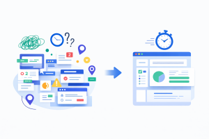
The fastest way to lose a user’s trust is showing them 50 metrics on one screen. This is “Data Vomit”—the mistaken belief that more information equals more value. In reality, it equals paralysis. Great dashboard design follows the principle of progressive disclosure: show the big number first, and let them drill down for details.
The most data-literate person in the room should not be the baseline for design. An executive checking in once a day needs a high-level trend at a glance, while an analyst needs granular, filterable tables they can drill into to identify trends across multiple data sources. Companies that invest in user-centric dashboard design consistently report higher adoption rates and better decision-making outcomes.
Research into scanning patterns, such as the F-pattern, reveals that users start at the top left and scan across. In dashboard design, this means placing primary indicators at the top-left to ensure the most critical “health check” happens in the first three seconds. By using size, color, and contrast to create a visual hierarchy, we guide the user’s eye through the data like a roadmap.
When dealing with forms and data entry, the EAS framework provides a structured approach to reducing effort.
Rather than overwhelming users with all features at once, progressive disclosure involves showing only what is necessary at each stage of interaction. This approach, utilized by platforms like Dropbox and LinkedIn, allows users to acclimate to the system gradually. Wayfinding through hierarchy—using bold headings, meaningful iconography, and consistent spacing—ensures that the user never feels “lost” in the data.
In behavioral economics, every hurdle or extra click is considered a “friction cost”. Simplicity cuts through this, acting as a shortcut to “yes.” According to the goal-gradient effect, people speed up when the finish line feels close. Providing a “quick win” early in the user journey—such as a 90-minute strategy session or a one-week result—earns the trust needed for deeper engagement.
A heuristic evaluation is a systematic UX audit where experts assess an interface against established usability principles to identify leaks in the revenue funnel. This method is faster and often more cost-effective than regular usability tests, particularly for identifying surface-level violations.
A professional audit focuses on heuristics tailored for revenue growth and enterprise stability :
Heuristic analysis typically takes 3-5 days and can yield a 20% conversion uplift by identifying obvious usability problems. For more complex workflow issues, an expert review is required, which links business objectives with user goals to address churn-driving experience gaps.
Quantifying the impact of UX design requires more than just intuition. It requires the integration of user feedback and behavioral analytics into the development strategy. By tracking how users navigate and experience the design, we can identify patterns in behavior that indicate where the cognitive load has become a barrier.
Speed is not a nice-to-have; it is a retention strategy. A 1-second delay in load time correlates with a 5% increase in churn probability. Redbaton focuses on optimizing for “flow state,” minimizing the interruptions—such as Slack pings or convoluted deployment processes—that shatter focus.
For founders, the ultimate question is how these UX improvements translate to business success. Strategic UX design is a growth lever that teams often overlook until activation stalls or churn spikes.
| Case Study Metric | Outcome Post-Redesign |
| On-Page Time (Business Management) | 30% improvement through performance and wireframe overhaul. |
| Sign-up Conversion (Aviation Recruitment) | 5x improvement over initial benchmarks. |
| Activation Metric (General SaaS) | Reduction in TTV (Time-to-Value) from 14 days to 4 days. |
| Retention Metric (General SaaS) | 23% better 90-day retention following UX optimization. |
Watch for red flags such as users taking longer than expected to complete tasks, high drop-off rates on key pages, and recurring feedback that the tool is “confusing” or “cluttered”. If support volume is increasing because users can’t find core features, your extraneous load is likely too high.
No. “Purposeful UX friction” is necessary for sensitive or irreversible operations, such as deleting data or making large financial transactions. Strategic friction prevents accidental errors and ensures that users are making conscious, well-thought-out decisions in high-stakes environments.
Cognitive load directly impacts the “Activation” phase. If a user signs up and sees a “blank dashboard” (the Empty State Paradox), they experience decision fatigue and questioning the learning curve. This leads to activation stalls and churn at the 30-day mark.
Heuristic analysis uses experts to identify surface-level usability violations against 10-12 established rules. It is fast and cost-effective. An expert review is deeper, analyzing complex workflows and feature adoption challenges to uncover nuanced pain points that drive churn.
Success should be mapped to specific business outcomes, not just vague “user satisfaction”. Key metrics include reduction in time-to-value, increased task success rates, improved net promoter scores (NPS), and tangible increases in revenue per user.


