


Nov 26, 2025
The most painful metric for any SaaS founder is not the churn rate—it is the activation gap. There is a specific kind of frustration that comes from seeing 10,000 new signups in a month, only to realize that 90% of those users never performed a single meaningful action. The marketing team is hitting its targets, the sales pipeline looks healthy, and the product is objectively powerful. Yet, the dashboard remains a graveyard of “ghost” accounts. Most leadership teams react to this by doubling down on “onboarding hacks”—more tooltips, more automated emails, and more persistent checklists. However, these are often digital band-aids on a broken product architecture. When users abandon a product before reaching the “Aha moment,” it is rarely a marketing problem and almost always a workflow design problem.
User activation represents the critical juncture where a new user experiences the core value of a product for the first time. While many teams treat activation as a growth or marketing responsibility, it is fundamentally rooted in the user experience. UX determines the velocity and ease with which a user moves from initial curiosity to meaningful product usage. When a product requires excessive configuration, manual inputs, or complex navigation to achieve a basic result, the activation rate inevitably suffers regardless of how many “welcome” emails are sent.
The relationship between UX and activation is best understood through the lens of friction. Poor UX creates invisible barriers such as overwhelming interfaces, unclear information hierarchy, and non-intuitive setup sequences. In contrast, a well-executed UX strategy simplifies complex processes and creates a seamless path to the first successful outcome. This is particularly vital in competitive markets where users have little patience for learning curves. In fact, studies in branding show that inconsistency or mismatched experiences can erode customer confidence by 20-30%, a logic that applies directly to the cognitive dissonance a user feels when a slick marketing site leads into a clunky, confusing product interface.
| UX Component | Impact on Activation | Primary Metric Affected |
| Workflow Simplification | Reduces steps to reach value | Time to Value (TTV) |
| Information Hierarchy | Helps users identify the “next best action” | Feature Adoption Rate |
| Contextual Guidance | Provides help exactly when needed | Onboarding Completion |
| Visual Consistency | Builds trust and reduces cognitive load | Early Retention Rate |
The goal of UX in an activation context is to move the user from “What is this?” to “This solves my problem” in the shortest possible time. This requires a shift from thinking about “onboarding screens” to thinking about “value journeys”. This is not merely about aesthetics; it is about experience architecture—the combination of information modeling, interaction patterns, and cross-platform functionality.
A recurring mistake among SaaS leaders is the assumption that high signup volume signifies product-market fit. In reality, signups are a measure of marketing effectiveness; activation is the measure of product effectiveness. Many teams find themselves in a cycle where they increase marketing spend to compensate for low engagement, not realizing that the leak is happening within the product’s core architecture.
The misdiagnosis often stems from how teams define “onboarding.” Traditional onboarding is frequently viewed as a series of tutorials or walkthroughs. However, the data suggests that users learn by doing, not by watching product tours. If the core workflow is fundamentally confusing, no amount of tooltips can fix it. Activation problems are often symptomatic of deeper issues:
Feature Sprawl: The product has become internally logical to the developers but externally confusing to the user, with too many features competing for attention.
Manual Input Fatigue: Forcing users to connect multiple data sources or fill out lengthy profiles before they see any value.
Artificial Sequences: Onboarding flows that force users to complete tasks in a specific order that doesn’t align with their immediate needs.
At Redbaton, the approach involves looking beyond the surface-level UI to analyze the entire journey architecture. Experience has shown that improving activation requires a redesign of the user journey itself, rather than just polishing the visual elements. The focus must be on whether the interface is intuitive, easy to navigate, and optimized for user engagement.
Time to Value (TTV) is the definitive metric for SaaS success. It measures the duration between a user’s first login and their first experience of meaningful benefit. In the current SaaS landscape, users expect to reach this moment in five minutes or less. If the TTV extends beyond 30 to 60 minutes, the likelihood of abandonment increases exponentially. Shortening TTV leads directly to higher activation rates, better retention, and stronger product adoption.
Shortening TTV is a direct outcome of effective UX design. This involves identifying the “Aha moment”—the specific action that correlates with long-term retention—and removing every possible obstacle between the user and that action.
Most SaaS products lack a clear definition of what “activated” actually means. A vague metric like “logged in twice” is useless. Activation must be tied to a core value milestone—like sending the first invoice or completing the first team collaboration task. For a project management tool, this might be the first task completed; for an email platform, it is the first campaign sent.
| Product Type | Example Activation Event | UX Strategy to Accelerate TTV |
| CRM | First contact added/lead qualified |
Automated lead import |
| Analytics | First insight generated |
Instant sample dashboards |
| E-commerce | First product digitally purchased |
Low data consumption for weak networks |
| Project Management | First task assigned |
Preconfigured templates |
To move activation metrics, one must move beyond intuition. Several structured frameworks allow design teams to audit and optimize the path to value.
Instead of focusing solely on user demographics (Personas), the JTBD framework focuses on the specific “job” the user is hiring the product to do. For example, a sales representative in a high-velocity environment doesn’t just want a CRM; they “hire” it because they are facing deal overload and need to prioritize hot leads automatically to hit quota without burnout. Designing the activation flow around the completion of this specific “job” ensures that every step feels relevant and necessary. JTBD provides stable, context-rich insights for strategy, while personas offer vivid, actionable empathy for execution.
This involves mapping every micro-interaction from signup to value realization. By visualizing this journey—also known as a UX flow—designers can demonstrate where site visitors enter and how they interact with the architecture. This process exposes friction points, unnecessary configuration steps, and moments of cognitive overload. It ensures that the basic structure focuses on and supports the specific problem the user is trying to solve.
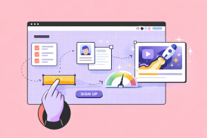
Activation is driven by behavior. Design teams must identify the “value triggers”—specific prompts or UI elements like Call-to-Action (CTA) buttons—that encourage the user to take the next step. These triggers must be contextual and timely. If a user is stalled, the system should offer a message box or a modal that provides information or confirms an action without being intrusive.
The first-use experience should be treated differently from the “expert” experience. A common mistake is presenting a new user with the full, complex dashboard immediately after signup. This often leads to feature overwhelm.
Instead of a massive information dump, progressive onboarding reveals features and settings as they become relevant to the user’s journey. This keeps the interface clean and allows the user to focus on the task at hand. This approach was highly effective in projects like the Shikhar app for Unilever, where retailers needed a simplified digital purchasing process that didn’t overwhelm them with technical complexity. By focusing on usability and accessibility, designers create interfaces that enhance the overall user experience and drive better outcomes.
Reducing manual work is the fastest way to accelerate activation. By using preconfigured templates, pre-filled data, or smart defaults, products can show users what a “successful” setup looks like without requiring them to build it from scratch. This is particularly crucial for complex tools where the value is only apparent once data is populated. For example, an analytics platform might offer automated integrations and instant sample dashboards, allowing users to see insights before they even finish their own configuration.
Rather than a global “how-to” guide, contextual guidance provides micro-copy and visual prompts at the exact point of interaction. If a user is hovering over a “connect data” button, the UI should explain why this matters. This requires a deep understanding of Pricing and Configurator UX, where complex decisions must be guided by clear information hierarchy to avoid cognitive overload. Every element—from typography size to the placement of breadcrumbs—must serve to guide the user toward their first success.
Success in user activation is rarely the result of a single feature; it is the result of a methodical, multi-phase process. Leading companies often follow a structured optimization cycle.
Before hiring a design agency, strong teams usually analyze their activation rate, time to value, and early churn. However, they often lack the behavioral insight needed to understand why users are dropping off. An agency begins with an activation funnel audit to identify where the friction lies.
The design team maps the first-use experience: signup, first login, onboarding, and the first meaningful action. This reveals cognitive overload moments where the user is asked to do too much too soon.
As discussed, this must be the first moment the user experiences real product value. For a project tool, it is the first task completed; for an analytics tool, it is the first dashboard insight.
UX teams redesign product flows and setup steps. Typical improvements include reducing configuration steps and pre-filling data to reduce the distance between signup and value. This is a core part of achieving, as a structured system allows for faster iteration and less rework when simplifying these journeys.
Only after the core workflow is fixed does the team focus on onboarding UI. This involves guided action flows and contextual prompts while avoiding long, boring product tours.
Activation improvements require testing. Common experiments include variations in the onboarding path or different default templates. A/B testing is a valuable method for gathering insights into which design elements—from color schemes to typography—resonate most with the audience.
After the redesign, the team tracks the new activation rate, time to value, and early retention. Continuous refinement follows based on user feedback and data analysis.
Despite the availability of design frameworks, many SaaS products continue to fall into predictable traps that alienate new users.
Walkthroughs and tooltips often increase cognitive load rather than decreasing it. They force the user into a passive role, asking them to remember a sequence of actions before they even understand the context. When users are interrupted by multiple pop-ups, they often click “dismiss” as quickly as possible, missing the information entirely. Users activate faster when the product naturally guides actions through its own interface.
Product checklists are trendy, but they only work when the tasks represent real value milestones. If a checklist is filled with arbitrary steps like “Upload a profile picture,” it becomes a chore. Each item on a checklist should be a value trigger that moves the user closer to their “Aha moment”.
In the rush to activate users, many teams ignore. If your onboarding flow isn’t accessible to people with visual or motor impairments, you are immediately cutting off a portion of your market and creating friction for others. Inclusive design ensures that products are usable by as many people as possible, regardless of cognitive or physical limitations.
Many founders design for the version of the user that exists six months after signup. They forget that the new user is skeptical and busy. The UX must bridge the gap between initial curiosity and meaningful usage. This often means simplifying the entry experience even if the full product is incredibly complex.
A specialized design agency like Redbaton brings a unique perspective to activation problems. While internal teams are often too close to the product to see its flaws, an agency provides an objective, behavioral lens. With over 200 projects delivered across 12 countries, Redbaton focuses on creating designs that last and strategies that simplify the complexity of life.
Scenario 1: High Traffic, Low Activation. A SaaS tool had 30k signups a month but only 8% activated. The root cause was a setup process requiring too many manual inputs. By introducing preconfigured templates and a guided first task, activation improved to 30%.
Scenario 2: The Complex Analytics Platform. Users were expected to build dashboards from scratch. By implementing automated integrations and instant value previews, users saw the product’s power before they had to do any work.
Scenario 3: Confusing B2B UI. A feature-heavy dashboard led to a lack of clear hierarchy. A redesign focused on a “first success” pathway allowed users to reach their goals in minutes. Redesigning 9 websites for one client resulted in a 30% improvement in on-page time.
Scenario 4: The Onboarding Band-aid. A startup added tooltips and tours, but activation stayed flat because the core flow was broken. Redesigning the core journey allowed the team to reduce onboarding complexity significantly. In one case, revamping the user flow from signup to payment exceeded the signup benchmark by 5x.
| Client Scenario | Problem | Intervention | Business Result |
| Global Retail (Unilever) | Complex purchasing for shop owners | Shikhar App: Low-data, intuitive UI |
Digitized wholesaler purchases |
| Logistics (Yulu) | High-traffic user navigation | Transformative UI/UX with simplified navigation |
7+ International Awards |
| Recruitment Platform | Poor signup-to-payment conversion | Revamped user flow in 1-page sprints |
5x Signup growth; 4x Social engagement |
| Tech Hub Branding | Low visibility in Tier 2/3 cities | Readability and desirability overhaul |
Improved Tally website performance |
Activation improvements come from analyzing user behavior and optimizing workflows at a micro-level. This is rarely solved by growth hacks alone. Agencies act as neutral facilitators, aligning product design, growth, and engineering teams to ensure the journey architecture is sound. By emphasizing research to develop strategies, they help companies retain and expand their customer base while making life easier for the individual user.
What is user activation in SaaS? User activation is the moment when a new user experiences the core value of a product for the first time. It involves completing a key action—such as sending a first campaign or generating a first report—that demonstrates how the product solves their problem. It is different from simply signing up or finishing a tutorial.
Why is UX important for user activation? UX determines how quickly and easily users move from signup to value. Poor UX—characterized by complex setup, unclear workflows, and overwhelming interfaces—creates friction. Well-designed UX reduces these barriers and shortens the time to value.
What is “time to value” (TTV) in SaaS products? Time to value is the duration it takes for a new user to realize the first meaningful benefit of a product. Shorter TTV leads to higher activation rates, better retention, and stronger product adoption. UX design directly impacts this metric by streamlining the path to the first success.
What UX patterns help increase activation rates? Effective patterns include guided action flows, progressive onboarding (revealing features as they are needed), contextual help, preconfigured templates, and simplified first-use workflows. These patterns reduce the cognitive load on the user.
How can SaaS teams measure activation success? Teams should track the activation rate, time to first value, onboarding completion, feature adoption, and early retention. These metrics should be tied to meaningful usage, not just surface-level actions like logins.
Does onboarding completion equal activation? No. A user can complete an onboarding checklist without ever experiencing the product’s core value. True activation is measured by the user’s first successful outcome, not by how many tooltips they clicked through.


