










Sep 16, 2026
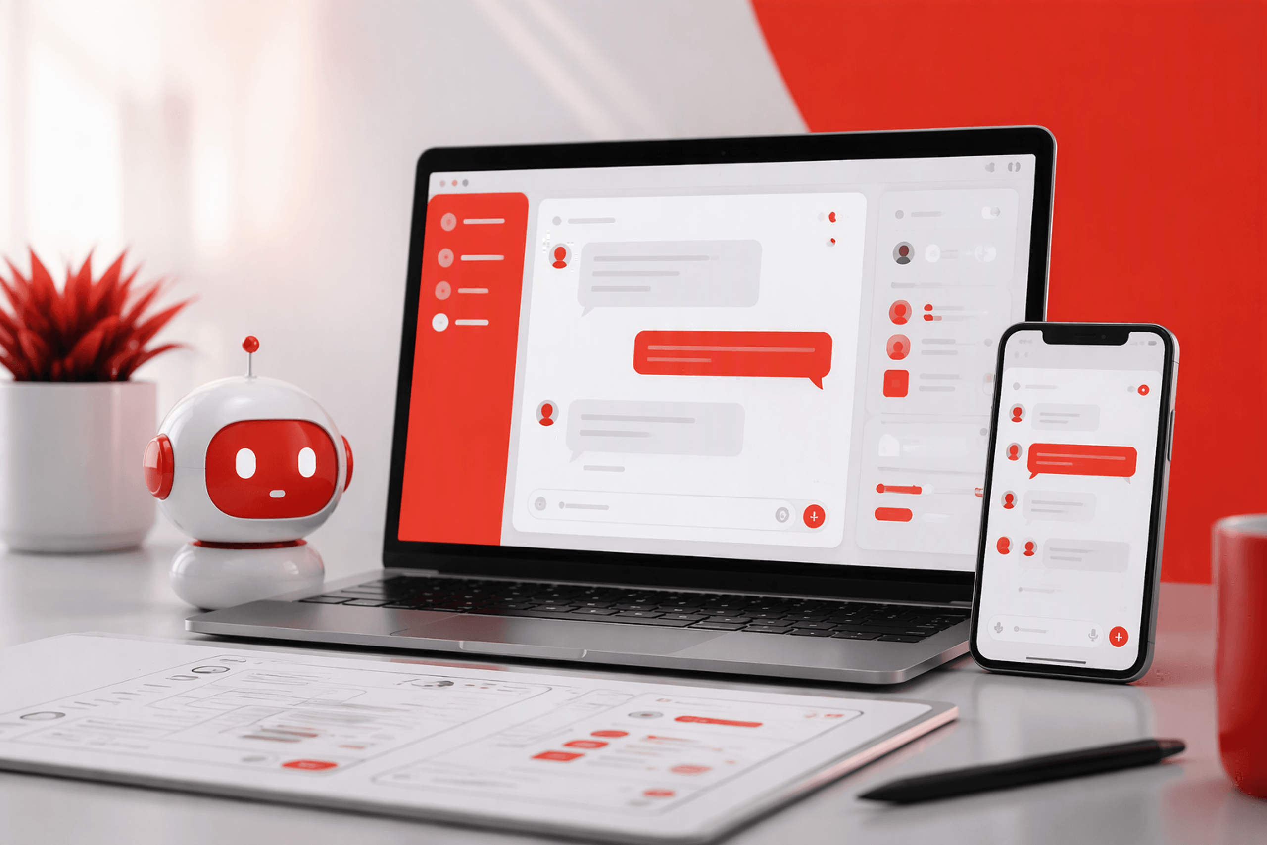
The best user interface for chatbot products is rarely just a blank chat box. We recommend combining conversation with structured controls, transparent system feedback, reliable recovery paths, and clear privacy choices. First decide whether chat suits the task, then design every state—from onboarding and loading to errors and human handoff.

A chatbot can understand natural language and still leave someone wondering what to type. That is often an interface problem rather than an AI problem.
A user interface for a chatbot is the complete interaction system around the conversation. It includes input controls, status feedback, response layouts, actions, history, privacy signals, memory controls, recovery, and escalation.
Strong chatbot UI design makes capabilities clear, explains what is happening, and presents a confident next step. When we assess friction, we distinguish surface problems from deeper experience issues through a structured UI versus UX diagnosis.
Capability and clarity come before tone, avatars, or playful language. A friendly personality cannot compensate for unclear scope, missing controls, unsupported requests, or weak recovery.
We use personality to reinforce an experience, not to disguise the technology. People should know they are interacting with a system, what it can access, and where its answers may be incomplete.
A strong chatbot interface should:
Not every AI-enabled workflow should become a conversation. Chat helps when intent is unclear, but it can hinder tasks that require scanning, comparison, validation, or predictable data entry.
We recommend choosing the interface for each user job rather than declaring an entire product “chat-first.” Consider the task’s structure, urgency, precision, complexity, and frequency.
Conversation suits situations where people need to describe goals in their own words, refine a question, troubleshoot uncertain causes, or synthesize information from several sources.
Relevant uses include product discovery, planning, knowledge exploration, and open-ended support. The interface should preserve context while allowing people to correct assumptions without restarting.
Forms, search, filters, tables, and selectors are generally better when required inputs and outcomes are predictable. Asking someone to type a date, subscription tier, delivery option, or account identifier adds avoidable effort.
Chatbots should not replace established patterns merely because conversation feels novel. If information is easier to scan or select, we provide the appropriate control.
We evaluate each task across several dimensions:
| Factor | Chat | Graphical UI | Hybrid |
|---|---|---|---|
| Ambiguous intent | Strong | Weak | Strong |
| Repeated structured input | Weak | Strong | Strong |
| High error cost | Limited alone | Strong | Strong |
| Exploration and follow-ups | Strong | Limited | Strong |
| Precise comparison | Weak | Strong | Strong |
| Auditability | Requires added structure | Strong | Strong |
A hybrid interface is often the most practical choice: chat captures intent, while cards, forms, tables, and confirmation screens complete the task.
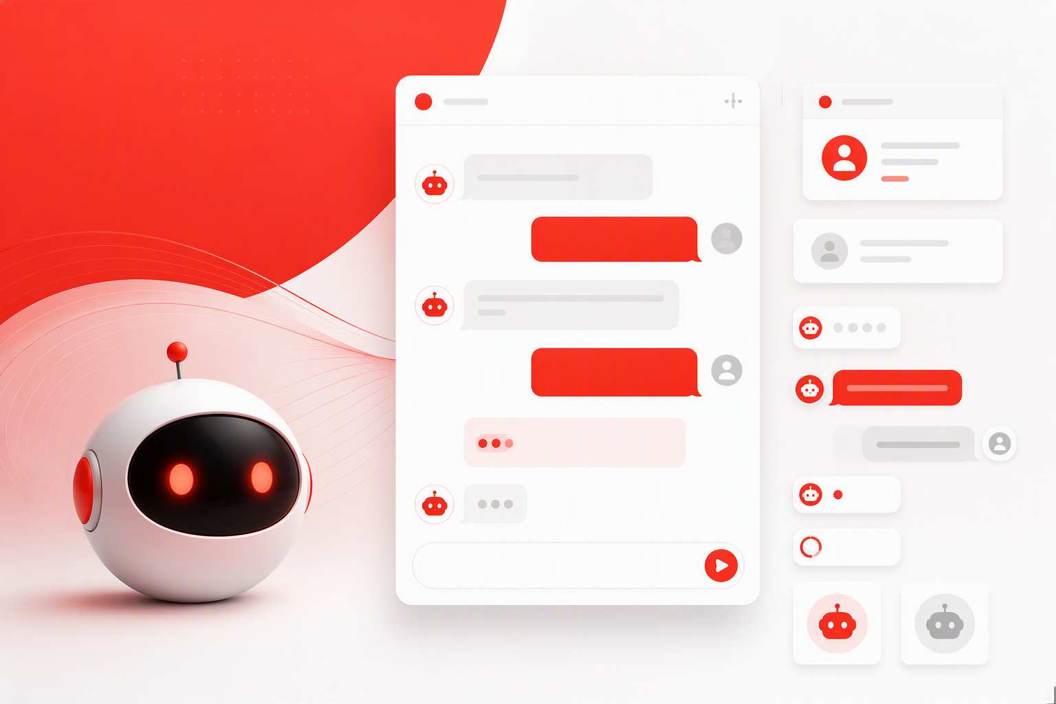
We map the experience from entry through completion, failure, handoff, or exit. Each element should communicate capability, status, control, or the next action.
Persistent controls, such as history and support, should remain accessible. Contextual actions should appear only when relevant.
Use a recognizable launcher and set expectations before the conversation starts. The entry point should briefly explain the chatbot’s purpose instead of relying on an unexplained icon.
The header should identify the assistant, define its scope, show availability, and link to help or privacy information. Secondary controls can sit in a menu to avoid clutter.
The composer may support text, attachments, voice, or structured inputs, but only when the system can process them reliably. Add send, stop, edit, retry, and attachment states according to the product’s actual capabilities.
Explain constraints—such as supported files or unavailable actions—before people invest time in a request.
Message bubbles remain useful, but AI interfaces need more than bubbles. Cards, tables, buttons, citations, previews, and progress indicators can make information easier to understand and use.
Persistent utilities may include:
A blank input field transfers the work of understanding the product to the user. We treat that as an onboarding problem, not proof of flexibility.
Design the opening state around common goals and outcomes. Starters may adapt to page context, role, or recent activity, but personalization should never feel hidden or unexpected.
State the value in one concise line, such as: “I can help you compare plans, understand billing, or troubleshoot your account.”
Mention limitations early when they affect safety, availability, accuracy, or task completion. The welcome should set realistic expectations rather than promise to answer anything.
Suggested prompts teach people how the system works. Write them in users’ language and clarify the expected outcome.
For SaaS onboarding, useful starters might include:
If setup follows predictable steps, we recommend a guided checklist instead of forcing the entire process through chat.
Quick replies support simple branching and clarification. Once someone selects a goal, switch to calendars, selectors, forms, or checklists when structured input is faster.
Conversation can explain the task while graphical controls handle precise choices. This preserves flexibility without sacrificing efficiency.
Accuracy is only part of the experience. People also need hierarchy, provenance, control, and a clear next step.
Generated text should become a usable interface object. Dense, unstructured paragraphs are particularly difficult to scan on small screens.
Lead with the direct answer or recommended action. Follow with short sections, bullets, and clearly labelled caveats.
Use progressive disclosure for detailed evidence, alternatives, or technical explanations. Keep essential information out of horizontally scrolling components where it may be missed.
Use cards for products, orders, documents, recommendations, comparisons, and task status. An order response, for example, should show shipment status alongside tracking, delivery, and support actions rather than burying them in prose.
Only display actions the system can complete reliably. Consequential changes should include review and confirmation.
Attach citations to the claims they support. For enterprise knowledge assistants, source titles, dates, document locations, and relevant evidence can help people assess an answer.
We also distinguish retrieved facts from generated synthesis. When evidence is missing or conflicting, the interface should say so instead of presenting false confidence.
Failure states belong in the core design. Preserve the user’s input and context whenever the system cannot complete a request.
Recovery should address the specific problem. A generic “I didn’t understand” loop provides no useful direction.
Reflect the part of the request the system understood, then ask a focused clarifying question. Show likely intents, allow editing, and keep human support visible.
Do not repeatedly ask people to rephrase. Explain what is missing or direct them to a more suitable workflow.
Use honest status labels such as “Searching approved policy documents” instead of a typing indicator that imitates human behaviour.
Where practical, allow people to:
Human handoff is not a failure; hiding it is. Make escalation visible and explain availability, waiting conditions, transferred data, and transcript sharing.
When live support is unavailable, offer a useful fallback, such as creating a ticket and confirming whether the transcript was attached.
Trust grows when people understand what the chatbot is, what it can access, and how it handles information. A privacy-policy link alone is not enough.
We place notices where they matter and separate chat history from saved memory so each can be controlled independently.
Use concise contextual notices for generated content, sensitive topics, external tools, and consequential actions. Detailed explanations can remain available through progressive disclosure.
Avoid anthropomorphism that obscures the system’s identity or limitations. Clear boundaries inspire more confidence than simulated personality.
Ask for consent before accessing personal records, sharing data with another system, storing information, or transferring a transcript.
The request should explain:
Visible conversation history is not the same as information retained for future personalization. Make that distinction explicit.
Where appropriate, let people view, rename, delete, export, or reset conversations. Show when memory is active, what has been remembered, and how it can be edited or cleared.
Accessible conversational UI design must account for dynamic behaviour, not just typography and contrast. We design for small screens, virtual keyboards, assistive technologies, and different input methods from the start.
Test complete tasks across devices. An accessible component does not guarantee an accessible conversation.
Keep primary actions within reach, and ensure the keyboard does not cover the latest message or composer. Secondary controls may collapse, but recovery, privacy, and escalation should remain findable.
Use readable line lengths, comfortable touch targets, and progressive disclosure for long answers.
Provide logical focus order, visible focus states, accessible labels, and predictable keyboard behaviour. Announce new messages and status changes without repeatedly interrupting screen-reader users.
Manage focus after errors, modal actions, confirmations, and handoffs. Streaming content should not trap focus or block navigation.
Do not rely on colour, motion, sound, or typing effects alone to communicate status. Pair visual signals with text and programmatically available labels.
Offer stop or pause controls for streaming, respect reduced-motion preferences, use plain language, and avoid unforgiving timeouts.
Teams often disagree because they prioritise different risks. We align stakeholders around user jobs, value, uncertainty, failure impact, implementation effort, and recovery readiness.
Treat the interface as an evolving product system. Test realistic prompts, content, delays, and edge cases.
A trustworthy chatbot MVP includes:
Defer elaborate personalities and low-value input methods until the basic experience is clear and dependable.
Prototype ambiguity, unsupported requests, long answers, delays, weak sources, destructive actions, and handoff before polishing the happy path.
Use realistic content and response timing. Placeholder conversations can conceal problems that become obvious in a functioning system.
Useful chatbot UX measures include task completion, time to outcome, prompt reformulation, fallback loops, abandonment, citation engagement, and handoff completion.
We combine analytics with transcript reviews, usability sessions, support feedback, and trust research. At redbaton.digital, we take this broader view because a technically correct answer still fails when people cannot understand, verify, or act on it.
A good interface makes capabilities discoverable, reduces unnecessary effort, and keeps people informed and in control. It combines conversation with suitable controls, presents answers clearly, identifies sources when relevant, and provides specific recovery paths.
Rarely. A blank composer offers no guidance about supported tasks, useful prompt structures, or likely outcomes. Even flexible assistants benefit from a concise capability statement and relevant suggested prompts.
Use chat when intent is ambiguous, people need to explain a situation, or the task involves exploration and follow-up questions. Use a form when inputs are predictable and require validation. A hybrid approach can capture intent through conversation and complete the task with structured controls.
The interface should acknowledge uncertainty, preserve the request, and offer a specific recovery route. It may ask a clarifying question, show likely interpretations, reveal sources, or connect the person with human support.
Start with capability onboarding, dependable workflows, clear status feedback, readable responses, error recovery, privacy information, and escalation. Personality, voice input, and elaborate animation can wait until the essential experience works reliably.
Build a chatbot that is clear, useful, and trustworthy without pretending the technology is infallible. Work with redbaton.digital to design an experience grounded in real user tasks, transparent interactions, and dependable recovery.


