











Aug 21, 2026
SaaS UX design shapes how people learn, use, and gain value from a cloud product over time. Strong UX clarifies essential workflows, shortens the path from signup to a useful outcome, and supports confident decisions. We measure those outcomes through task success, activation, errors, adoption, and retention—not visual polish alone.

SaaS UX design covers the recurring workflows through which people understand, operate, and benefit from cloud software. It connects user goals with product behavior, business priorities, and long-term use.
A customer can leave a promising demo, sign in, and face an empty dashboard, unfamiliar language, and several possible routes. That is more than a feature-discovery problem. The product has failed to show where value begins.
At redbaton.digital, we work with SMB and enterprise teams facing abandoned onboarding, difficult everyday tasks, feature clutter, and redesigns that were never measured. Our view is simple: visual quality builds confidence, but it cannot repair a weak workflow.
A marketing site mainly supports discovery, understanding, and conversion. An authenticated SaaS product must support repeated, role-dependent work involving live data, permissions, collaboration, errors, and potentially consequential decisions.
SaaS teams therefore need to account for learning curves, different expertise levels, handoffs, access boundaries, failure recovery, and the efficiency of frequent tasks.
UX defines the workflow, information architecture, behavior, evidence, and intended outcomes. UI expresses those decisions through hierarchy, typography, controls, color, spacing, and feedback.
Both matter, but consistency is not a substitute for usability. Our guide to building better digital products explains how strategy, research, interaction design, and validation work together.
We evaluate design through observable behavior rather than stakeholder preference. Relevant signals may include time to value, activation, task completion, errors, feature adoption, support demand, and retention.
UX is only one influence on those results. Product-market fit, reliability, pricing, acquisition, and customer success also affect whether people stay.
Account creation is not activation. A meaningful activation event represents a completed job, such as publishing a campaign, connecting a data source, inviting a collaborator, or producing a usable report.
Administrators, operators, and analysts may pursue different outcomes. In those cases, we define activation separately for each major role instead of forcing everyone into one funnel.
Before changing a workflow, establish a baseline. Depending on the task, we may track:
Analytics show what changed, while usability testing and qualitative feedback help explain why. Used together, they reduce the risk of mistaking speed for genuine improvement.
Funnel and cohort analysis can show whether people who complete a redesigned workflow are more likely to activate or return. It does not prove that UX alone caused the result.
We recommend defining hypotheses before launch and monitoring adjacent factors such as performance, pricing, acquisition source, and customer-success activity.
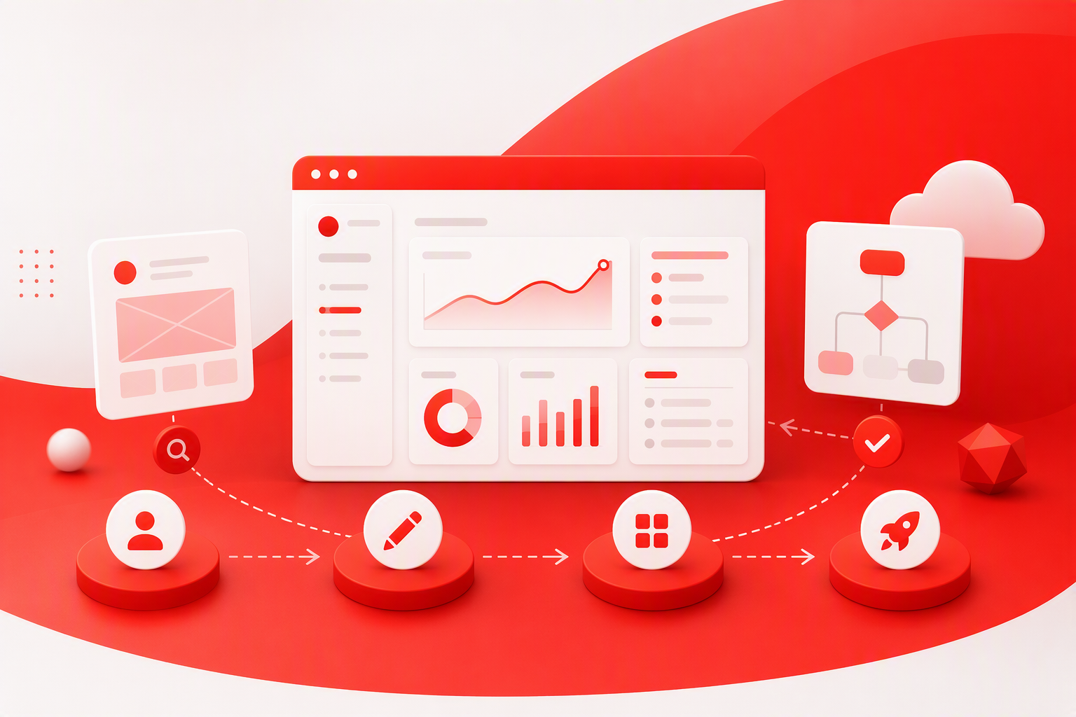
Our process replaces subjective screen debates with shared principles, user evidence, and measurable hypotheses. It can support a new product, a high-friction workflow, or a broader enterprise redesign.
Discovery can combine stakeholder interviews, user research, analytics, support themes, sales insights, and a structured product review. We examine what people need to accomplish, where the experience breaks down, and which technical or commercial constraints matter.
A focused SaaS UX audit also helps distinguish a broadly useful need from an isolated feature request that could add complexity for everyone else.
Journey maps should capture real steps, decisions, handoffs, delays, errors, and moments of value across roles—not just an ideal path.
We prioritize opportunities by user impact, business value, evidence strength, delivery risk, and implementation effort. This keeps attention on consequential problems rather than the loudest request.
Early prototypes help us test navigation, terminology, sequence, defaults, permissions, and recovery. Fidelity should suit the question: simple prototypes can validate structure, while denser interactions may require realistic content and behavior.
Testing before visual refinement makes changes easier and reveals whether a proposed workflow fits users’ language and operating conditions.
Delivery documentation should cover interactions, responsive behavior, accessibility, analytics events, and non-ideal states. We also recommend joint design and engineering reviews to protect intended behavior during implementation.
After launch, results should be compared with the baseline. Evidence then guides the next iteration.
Not every onboarding problem needs a longer product tour. Tours often compensate for confusing navigation, weak terminology, poor defaults, or empty screens with no clear next step.
Effective onboarding responds to role, intent, and available data. Rather than explaining the whole interface, it should guide people toward one meaningful outcome.
Ask only for information that changes setup, permissions, recommendations, or guidance. Users should also be able to skip, revisit, or change their selected path. Role-based onboarding is guidance, not a permanent restriction.
A useful empty state explains why an area matters, what to do next, and what a successful result looks like. Relevant examples, import options, or a focused primary action can help.
Contextual guidance should appear near the task. Front-loading explanations for every feature adds effort before the product has demonstrated value.
We look beyond checklist completion to time to first value, activation by persona, step abandonment, repeated use, and early support needs. The real test is whether people can continue independently once guided support disappears.
More features do not automatically create more value. B2B SaaS UX design should use task frequency, role, risk, and context to set hierarchy. Strong defaults and progressive disclosure often work better than exposing every configuration immediately.
Group capabilities around user goals and recognizable domain concepts, not internal departments or technical architecture. Validate labels, navigation depth, and findability with representative roles because administrators, approvers, and daily operators may need different routes.
Dashboards should emphasize status, exceptions, trends, and next actions rather than every available metric. We also design loading, empty, partial-data, stale-data, permission, and error states alongside the ideal view.
Data-heavy interfaces benefit from persistent filters, saved views, clear sorting, selection feedback, and visible bulk-action status. Forms need logical grouping, suitable defaults, inline validation, and preserved input after errors.
Show access boundaries before someone invests effort in an unavailable action. Separate everyday preferences from administrative configuration, and explain the consequences of high-risk changes before applying them.
A SaaS design system is shared product infrastructure for design, engineering, content, and accessibility. A Figma library alone cannot produce consistency without interaction rules, documented states, ownership, and governance.
Our practical design systems guide covers the foundations, while design system governance and scaling addresses adoption across products and teams.
Components should define loading, empty, success, validation, disabled, permission, warning, and failure states. Documentation should also cover content, keyboard behavior, focus, responsiveness, and implementation.
We create reusable patterns for recurring problems while allowing evidence-based extensions. Contribution criteria help prevent one-off components from gradually rebuilding inconsistency.
Accessible SaaS design includes keyboard access, sufficient contrast, useful labels, logical focus order, zoom support, screen-reader meaning, and reduced-motion options. When failures occur, preserve work and provide a safe way to retry, undo, correct the issue, or ask for help.
AI should support a workflow rather than replace every interface with an unpredictable chatbot. Deterministic controls may remain clearer for filtering, permissions, approvals, and consequential changes.
Explain what the AI can do, what information it uses, and where its output may be incomplete or wrong. Confidence indicators only help when people can understand and act on them.
People should be able to review, refine, and approve generated work before it changes records or affects others. For high-impact actions, we recommend previews, confirmations, undo options, version history, and escalation paths.
Measure the complete job, including completion time, correction effort, acceptance, errors, trust, and repeat use. Fast generation offers little value if checking and repairing the output takes longer than the previous process.
Examples and templates can speed up exploration, but they cannot replace workflow research. We assess patterns by clarity, hierarchy, feedback, accessibility, efficiency, and recovery—not visual novelty.
Inspect setup, empty states, permissions, edge cases, errors, and repeat use. A screenshot cannot show whether a product protects work or remains efficient over time.
Templates are useful for exploring familiar controls and creating early prototypes. Before adopting one, validate its terminology, data density, accessibility, permissions, and fit with the actual workflow.
Yes. Figma is primarily cloud-based software with collaborative and subscription capabilities. Files created in Figma are design assets; Figma is the service used to create, store, review, and manage them.
No. AI is changing SaaS workflows and interfaces, but products still need structured data, permissions, integrations, auditability, reliability, and controlled processes.
AI can assist with synthesis, ideation, prototyping, content, and interface production. Designers remain responsible for judgment, trade-offs, trust, ethics, stakeholder alignment, and user validation.
SaaS can be profitable when it solves a valuable problem with sustainable acquisition, retention, pricing, and operating economics. Neither a redesign nor AI can compensate for weak product-market fit or an absent core benefit.
It is the practice of shaping recurring workflows in cloud software so people can learn, complete tasks, and gain value efficiently. It includes research, information architecture, onboarding, interaction design, accessibility, recovery, and measurement.
A SaaS product supports repeated work involving live data, roles, permissions, collaboration, and errors. A marketing website usually concentrates on communicating an offer and encouraging conversion.
Start with a baseline, define a hypothesis, and monitor relevant task and business signals after release. Combine analytics with usability testing and feedback to understand both what changed and why.
Not necessarily. Small products may begin with a focused component library and basic standards. As products and teams grow, documented behavior, accessibility rules, governance, and ownership become more valuable.
Set clear expectations, expose uncertainty where relevant, keep outputs editable, and make consequential actions reviewable and reversible. Measure correction effort and errors as well as speed.
If people struggle to reach value, complete core tasks, or trust an AI-enabled workflow, our UX audit can identify the most consequential opportunities. Talk to redbaton.digital about a SaaS audit, product redesign, scalable design system, or focused workflow engagement.


