









Sep 16, 2026

A successful chatbot UI makes capabilities, limits, and next steps obvious. We recommend combining conversation with buttons, cards, filters, forms, evidence, recovery paths, and human support instead of relying on an empty text box. Success means helping users complete meaningful tasks, not simply keeping them inside the chat.

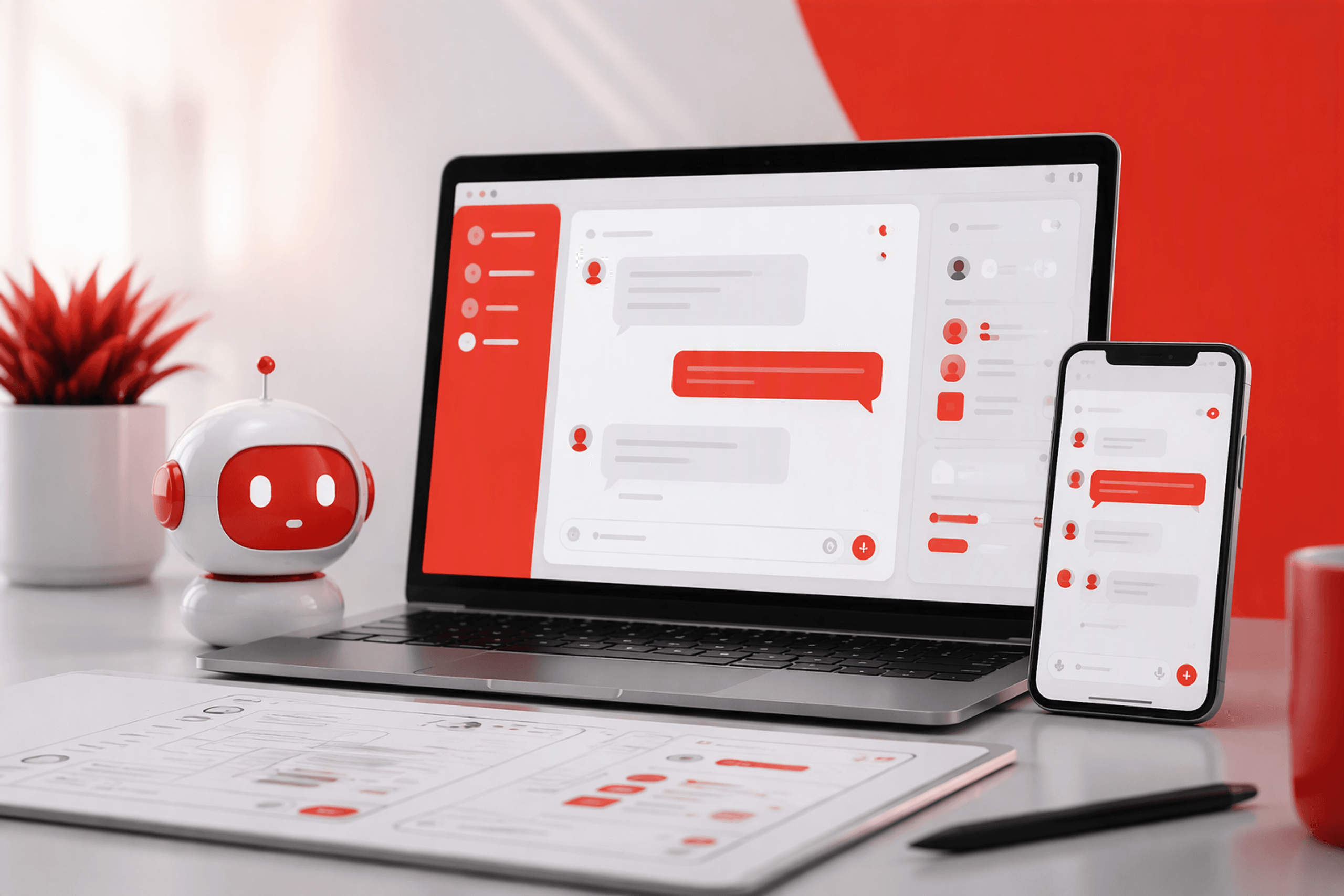
A chatbot UI is the visible layer through which someone communicates with an automated, AI-assisted, scripted, or human-supported system. It includes messages, controls, forms, status indicators, suggested actions, attachments, and handoff states.
The interface is not the model, conversation logic, data, or service operation behind it. Those systems determine what is possible. Chatbot interface design determines whether people can understand and use those capabilities.
We start with the user’s problem and intended outcome. A polished interface still fails when people cannot tell what it does, what information it needs, or what happens after they submit a request.
Conversational UI is a broader interaction model covering voice assistants, guided forms, messaging experiences, embedded copilots, and interfaces that mix natural language with conventional controls.
A chatbot UI is one expression of that model. The best experience may include search, cards, menus, forms, or voice rather than relying entirely on chat bubbles.
Before selecting components, we define:
This work separates cosmetic weaknesses from structural problems. Our guide to identifying UI vs UX friction explains why changing the surface rarely repairs a poorly defined workflow.
Every component should support a decision, explain system behaviour, or help complete a task. Avatars, gradients, and animated bubbles are not a strategy.
A launcher should be easy to find without obstructing the product. Its label should describe the available help, and notifications should communicate something useful rather than create artificial urgency.
The welcome state should also set expectations. “Ask about billing or troubleshoot your account” is clearer than a generic offer to help.
Messages need clear sender identities, readable grouping, and timestamps when timing matters. Depending on the task, people may also need attachments, editing, retrying, cancellation, and a safe way to reset the conversation.
Controls for closing, expanding, downloading, or deleting a chat should appear when relevant. Destructive actions need explicit labels and confirmation.
Status indicators should report real processing. If a response takes time, the interface can explain what is happening and let users cancel or continue browsing.
Citations, source links, feedback controls, copying, and regeneration may help people assess a response. We only include a control when its purpose and outcome are clear.

An empty composer makes users guess what the system understands. Visible choices expose its scope and make the first step easier.
We treat chat, buttons, cards, forms, menus, and filters as complementary tools. The right combination depends on how structured, repeatable, and consequential the task is.
Open input suits exploratory questions, ambiguous goals, natural-language search, and follow-up clarification. Even then, scope statements, examples, and suggested prompts help people form requests the system can handle.
Buttons suit limited choices, cards support comparison, and forms collect information that requires validation. Payments, authentication, dates, and addresses generally belong in conventional, structured interfaces. Conversational wording does not make precise data entry safer.
A hybrid interface should move between conversation and graphical controls without losing context. An ecommerce assistant might use chat for discovery, cards for comparison, filters for constraints, and a standard form for checkout. Conversation handles ambiguity; established controls handle precision.
The empty state introduces the chatbot’s capabilities, boundaries, and interaction model. It should reveal whether the user is dealing with AI, a scripted flow, a human team, or a combination.
We recommend including:
Context matters. A new user may need orientation, while someone opening chat from a billing page should see billing-related actions.
Prompts should use familiar language and predict a useful result. “Compare plans” or “Troubleshoot an issue” sets clearer expectations than “Explore.”
Each example must reflect a capability the system can perform reliably. An impressive but unrealistic prompt undermines trust at the start.
A conversation flow should account for goals, decisions, context, actions, interruptions, and recovery. Rigid scripts break when users revise an answer or change direction.
Onboarding assistants should respond to the user’s current product state instead of explaining everything upfront. An in-product copilot should not request information the product already holds.
We also recommend showing which records informed an answer, labelling generated content, and requesting confirmation before changing settings or publishing work.
Support chatbot UX should prioritise diagnosis, resolution, and status communication. Users need a route to human support when an issue is urgent, sensitive, or unsupported.
The handoff should retain attempted steps and relevant account context. Asking users to repeat everything turns escalation into another failure.
Lead-generation bots should request only information that affects recommendations, qualification, or routing. Commerce flows benefit from conversational discovery paired with graphical comparison and structured data entry.
A chatbot should explain what failed, preserve useful context, and offer a concrete next step. Misunderstandings, missing permissions, unsupported requests, and integration failures require different responses.
When helpful, state what the system understood. Ask a focused clarification question and offer likely interpretations instead of demanding a complete rewrite.
Recovery options might include editing the message, selecting a relevant topic, or contacting support. The original input should remain available.
Show an honest processing state and allow cancellation. If a response stops midway, preserve the completed portion and explain whether retrying is safe. Simulated typing should not hide delays.
Identify the file, record, or action that failed. Explain relevant format, permission, or availability requirements in the error state.
For consequential actions, prevent accidental resubmission and clarify whether the outcome failed or is still being verified.
People should know whether they are interacting with AI, a scripted flow, or a person. Any change in that status should be explicit.
We disclose AI involvement in plain language and show relevant sources or limitations when answers depend on records or external material.
Payments, publishing, account changes, and destructive actions need explicit confirmation. Higher-stakes tasks call for precision rather than playful copy.
A useful handoff transfers the transcript, collected details, attempted steps, and user intent. It should communicate human availability, likely next steps, any channel change, and what the user can do while waiting.
A chatbot should not imply memory, understanding, or empathy it does not have. Warm language can reflect the brand, but it cannot replace honest boundaries. “I couldn’t access that invoice” is more useful than a charming apology without a diagnosis.
Chatbot branding comes from behaviour and language, not an avatar added to generic responses. Accessibility and responsive behaviour must also be part of the interaction model from the start.
We define rules for vocabulary, response length, greetings, prompts, confirmations, errors, and escalation. Personality should recede during security issues, payments, account changes, and other sensitive tasks.
An accessible chatbot UI should support:
New messages should not repeatedly interrupt assistive technology or steal focus.
Embedded panels suit lightweight help, while full-screen modes better support long or document-heavy work. On mobile, we account for the virtual keyboard, safe areas, attachments, minimisation, and preserving context when users leave the chat.
Our process covers problem definition, research, prototyping, testing, launch, and iteration. We test the conversation and interface as one product system.
We review support logs, search queries, interviews, journey friction, and operational constraints. We then prioritise use cases by user value, feasibility, risk, data quality, and operational readiness.
Interest in AI is not itself a user need. We define the intended improvement before choosing chat as the solution.
Prototypes should include realistic content, ambiguity, delays, interruptions, failed actions, escalation, and returning sessions. Testing only ideal exchanges produces a convincing demonstration, not a dependable product.
Containment can be misleading if automation prevents users from reaching a resolution. We assess measures such as task completion, fallback patterns, successful escalation, resolution time, abandonment, repeat contact, and satisfaction.
Metrics need context. More handoffs may be beneficial when they lead to faster or more reliable resolutions.
We review failed conversations by intent, user group, surface, and risk. Then we update prompts, controls, content, integrations, and service workflows together. At redbaton.digital, we treat chatbot UI as a product design system because copy alone cannot fix every conversation problem.
A good interface makes its purpose, capabilities, status, and next actions clear. It combines conversation with suitable controls, preserves context, supports recovery, and offers accessible human escalation.
No. Open text suits exploratory requests, but prompts, buttons, cards, menus, and forms often provide a clearer starting point.
It should identify what failed, retain the user’s input, and offer relevant recovery actions. Generic apologies do not help users move forward.
We recommend handoff for urgent, sensitive, high-risk, unsupported, or repeatedly misunderstood requests. The transfer should include context and explain what happens next.
We assess task completion, fallback patterns, escalation outcomes, resolution time, abandonment, repeat contact, and satisfaction. No single metric gives a complete picture.
A useful chatbot is a coordinated product experience built around clear tasks, honest boundaries, resilient recovery, and measurable outcomes.
Talk to redbaton.digital to design a chatbot UI that fits your users, product, brand, and service operation.


