


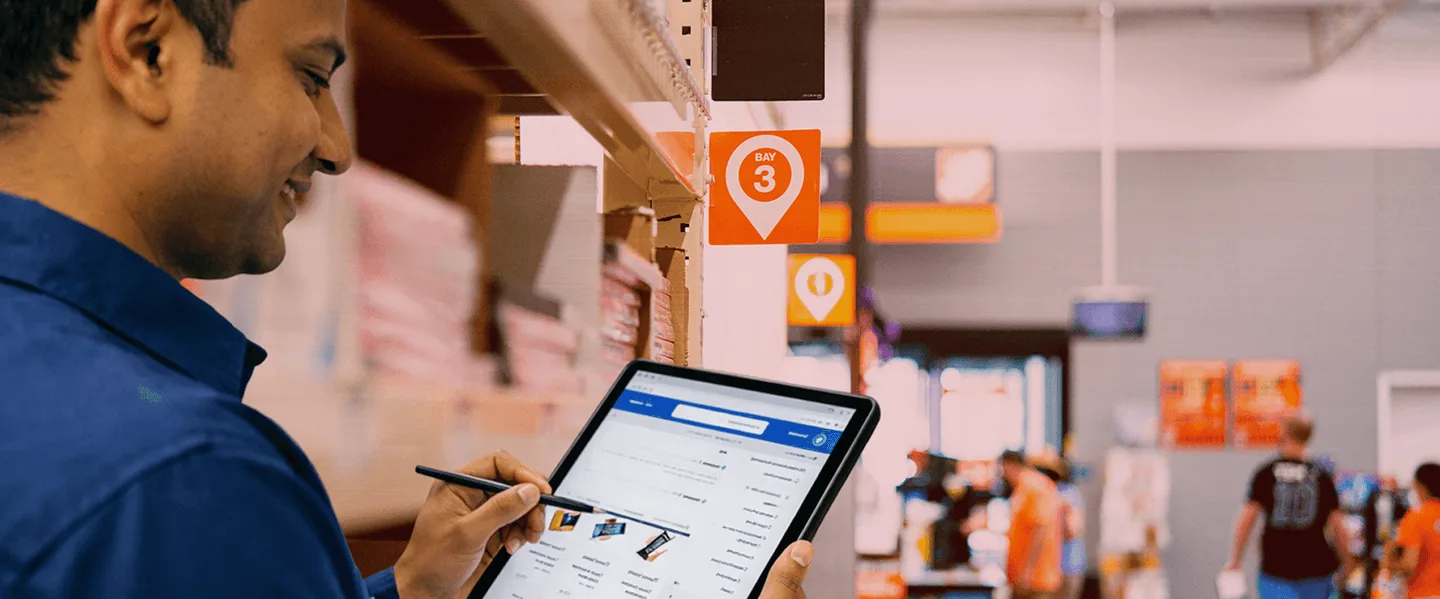
Problems we hear about the most
They browse. They add to the cart. They leave.
When e-commerce UX design isn’t intuitive, users leave midway, whether it’s browsing, adding to cart, or checking out.
Checkout feels harder than it should
A clunky e-commerce checkout design adds friction right when users are ready to buy.
Products are difficult to browse or compare
Weak or messy product listing page designs slow users down instead of helping them decide.
The product page isn't doing the selling
Product listing pages ignore customer logic and bury the trust signals and social proof that actually convert.
B2B journeys are overly complex
Distributor portals and field sales apps designed for system requirements create adoption failure. The tool exists. The team uses WhatsApp instead.
What better retail and e-commerce experiences look like
 Product listing pages that surface the right filters, images, and trust signals at the moment of decision.Checkout flows that remove every unnecessary step so the path from intent to payment is frictionless. Search and discovery experiences that understand what shoppers actually mean, not just what they typed.B2B commerce portals field teams actually adopt because the UX fits their real workflow.Post-purchase and loyalty moments designed to earn the second order, not just the first.
Some of the Clients we served




More success stories






Explore our suite
of services







Frequently Asked Questions
We offer all the retail & e-commerce design & development services you need for your product.
Get in touch
When conversion, retention, or repeat purchase metrics are declining, and the cause isn't technical, that's a design problem. Targeted fixes only work when a specific flow is broken. A full redesign makes sense when the product's core experience no longer matches how your customers actually shop, or when the platform has scaled past what the original design can hold.
Yes, and the B2B side is often the more neglected one. A distributor portal or field sales app that people won't use is as damaging as a broken consumer checkout. We've designed both surfaces for clients like HUL, and they need to be treated as connected systems, not separate projects.
We start with the drop-off points, where users leave, and why. That means reviewing real session data, running usability tests, and mapping the checkout and product listing flows against what users actually need at each step. Good ecommerce ui design isn't about aesthetics; it's about removing every reason a decided buyer finds not to complete the purchase.
D2C and marketplace design share the same goal, conversion, but different constraints. On D2C, you control every touchpoint, so the work is about trust end-to-end. On a marketplace, the focus is on the moments you do control: product presentation, imagery, and copy. The starting point is always which levers the brand actually owns.
Optimising the homepage at the expense of the product listing page. Teams pour effort into the first screen, but the decision to buy occurs on the PLP and in checkout. We've seen products where the homepage is immaculate, but the product page still uses default filters and no social proof. That's where sales are lost.
Yes, and it's where design has the most direct business impact. A portal that field teams won't use isn't a technology problem; it's a UX problem. The tool was built for compliance, not for someone placing 40 orders on a bus with bad connectivity. We've solved this for HUL and know what real field adoption requires.

Not sure where to start?
That's exactly where we begin.
